Graphics with ggplot2
Introduction
Goal: by the end of this lab, you will be able to use ggplot2 to build different data graphics.
Setting up
Remember: before we can use a library like ggplot2, we have to load it. In this case, we load the tidyerse package, which automatically loads ggplot2 for us.
library(tidyverse)Why ggplot2?
Advantages of ggplot2
- consistent underlying grammar of graphics (Wilkinson, 2005)
- plot specification at a high level of abstraction
- very flexible
themesystem for polishing plot appearance (more on this later)- mature and complete graphics system
- many users, active mailing list
What Is The Grammar Of Graphics?
The big idea: independently specify plot building blocks and combine them to create just about any kind of graphical display you want. Building blocks of a graph include:
- data
- aesthetic mappings
- geometric objects
- statistical transformations
- scales
- coordinate systems
- position adjustments
- faceting
Using ggplot2, we can specify different parts of the plot, and combine them together using the + operator. [Note that the + operator is similar to the %>% pipe operator but is not interchangeable!]
Example: Housing prices
Let’s start by taking a look at some data on housing prices:
housing <- read.csv("http://www.science.smith.edu/~jcrouser/SDS192/landdata-states.csv")
glimpse(housing)
## Rows: 7,803
## Columns: 11
## $ State <chr> "AK", "AK", "AK", "AK", "AK", "AK", "AK", "AK", "AK"…
## $ region <chr> "West", "West", "West", "West", "West", "West", "Wes…
## $ Date <dbl> 2010.25, 2010.50, 2009.75, 2010.00, 2008.00, 2008.25…
## $ Home.Value <int> 224952, 225511, 225820, 224994, 234590, 233714, 2329…
## $ Structure.Cost <int> 160599, 160252, 163791, 161787, 155400, 157458, 1600…
## $ Land.Value <int> 64352, 65259, 62029, 63207, 79190, 76256, 72906, 694…
## $ Land.Share..Pct. <dbl> 28.6, 28.9, 27.5, 28.1, 33.8, 32.6, 31.3, 29.9, 28.7…
## $ Home.Price.Index <dbl> 1.481, 1.484, 1.486, 1.481, 1.544, 1.538, 1.534, 1.5…
## $ Land.Price.Index <dbl> 1.552, 1.576, 1.494, 1.524, 1.885, 1.817, 1.740, 1.6…
## $ Year <int> 2010, 2010, 2009, 2009, 2007, 2008, 2008, 2008, 2008…
## $ Qrtr <int> 1, 2, 3, 4, 4, 1, 2, 3, 4, 1, 2, 2, 3, 4, 1, 2, 3, 4…(Data from https://www.lincolninst.edu/subcenters/land-values/land-prices-by-state.asp)
Geometric Objects and Aesthetics
Geometric Objects (geom)
Geometric objects or geoms are the actual marks we put on a plot. Examples include:
- points (
geom_point, for scatter plots, dot plots, etc) - lines (
geom_line, for time series, trend lines, etc) - boxplot (
geom_boxplot, for, well, boxplots!) - … and many more!
A plot should have at least one geom, but there is no upper limit. You can add a geom to a plot using the + operator.
You can get a list of available geometric objects using the code below:
help.search("geom_", package = "ggplot2")or simply type geom_<tab> in RStudio to see a list of functions starting with geom_.
Aesthetic Mapping (aes)
In ggplot2, aesthetic means “something you can see”. Each aesthetic is a mapping between a visual cue and a variable. Examples include:
- position (i.e., on the x and y axes)
- color (“outside” color)
- fill (“inside” color)
- shape (of points)
- line type
- size
Each type of geom accepts only a subset of all aesthetics—refer to the geom help pages to see what mappings each geom accepts. Aesthetic mappings are set with the aes() function.
Points
Now that we know about geometric objects and aesthetic mapping, we’re ready to make our first ggplot: a scatterplot. We’ll use geom_point to do this, which requires aes mappings for x and y; all others are optional.
hp2013Q1 <- housing %>%
  filter(Date == 2013.25)

ggplot(hp2013Q1, aes(y = Structure.Cost, x = Land.Value)) +
  geom_point()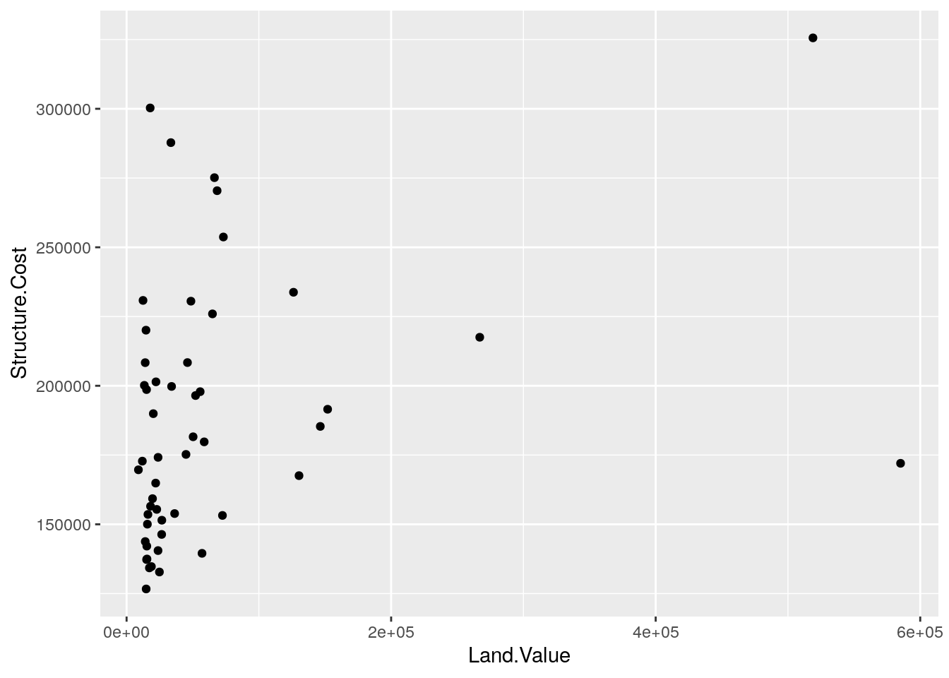
- Create a scatterplot of the value of each home in the first quarter of 2013 as a function of the value of the land.
# sample solution
ggplot(hp2013Q1, aes(y = Home.Value, x = Land.Value)) +
  geom_point()
Plot objects
The output of the ggplot() function is an object. Since we want to modify the plot that we created above, it’s helpful to store the plot as an object.
base_plot <- ggplot(hp2013Q1,
                    aes(y = Structure.Cost, x = Land.Value))
To actually show the plot, we just print it. Note that this plot doesn’t show anything because we haven’t added any geoms yet! Still, the aesthetic mapping are defined, and any subsequent geoms that we add will use those mappings.
base_plot +
geom_point()- Store the scatterplot that you created in the previous exercise as an object called
home_value_plot.
# sample solution
home_value_plot <- ggplot(hp2013Q1,
                          aes(y = Home.Value, x = Land.Value)) +
  geom_point()
Lines
A plot constructed with ggplot can have more than one geom. In that case, the mappings established in the ggplot() call are plot defaults that can be added to or overridden. For example, we could connect all of the points using geom_line(). Note that now we see both points and lines!
base_plot +
  geom_point() +
  geom_line()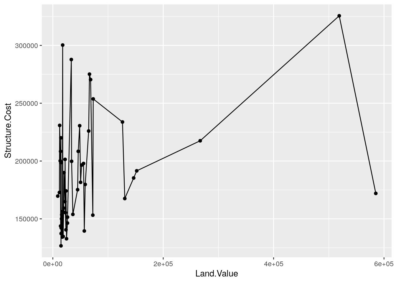
- Does it makes sense to connect the observations with
geom_line()in this case? Do the lines help us understand the connections between the observations better? What do the lines represent?
Smoothers
Not all geometric objects are simple shapes—geom_smooth() includes both a line and a ribbon.
base_plot +
  geom_point() +
  geom_smooth()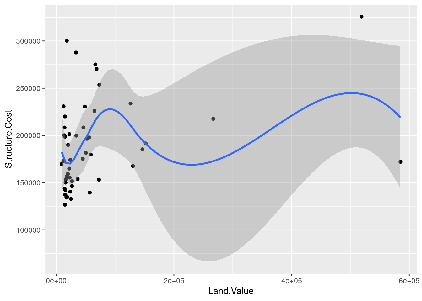
Text
Each geom accepts a particular set of aesthetics (i.e., mappings)—for example geom_text() accepts a labels mapping.
base_plot +
  geom_text(aes(label = State), size = 3)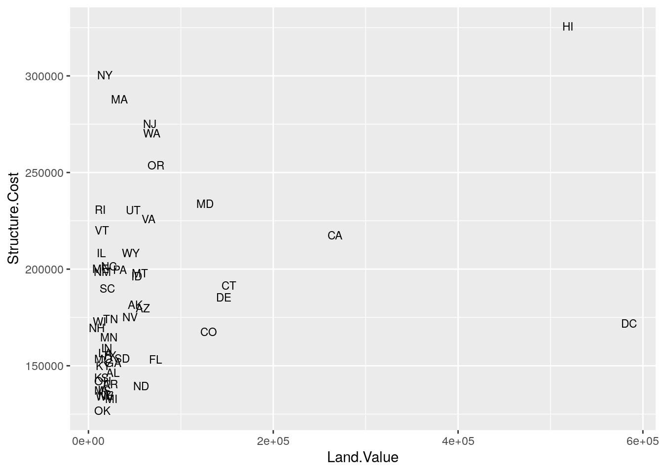
Aesthetic Mapping vs. Assignment
Note that variables are mapped to aesthetics with the aes() function, while fixed visual cues are set outside the aes() call. This sometimes leads to confusion, as in this example:
base_plot +
  geom_point(aes(size = 2),   # not what you want because 2 is not a variable
             color = "red")   # this is fine -- turns all points red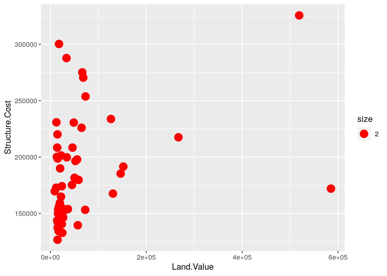
The aes() function can also be used outside of a call to a geom. Here, we update the base_plot to map color to home value.
base_plot <- base_plot +
aes(color = Home.Value)- In your
home_value_plot, map color to the cost of the structure and show your scatterplot.
# sample solution
home_value_plot +
  aes(color = Structure.Cost) +
  geom_point()
Mapping Variables to Other Aesthetics
Other aesthetics are mapped in the same way as x and y in the previous example.
base_plot +
  geom_point(aes(shape = region))
## Warning: Removed 1 rows containing missing values (geom_point).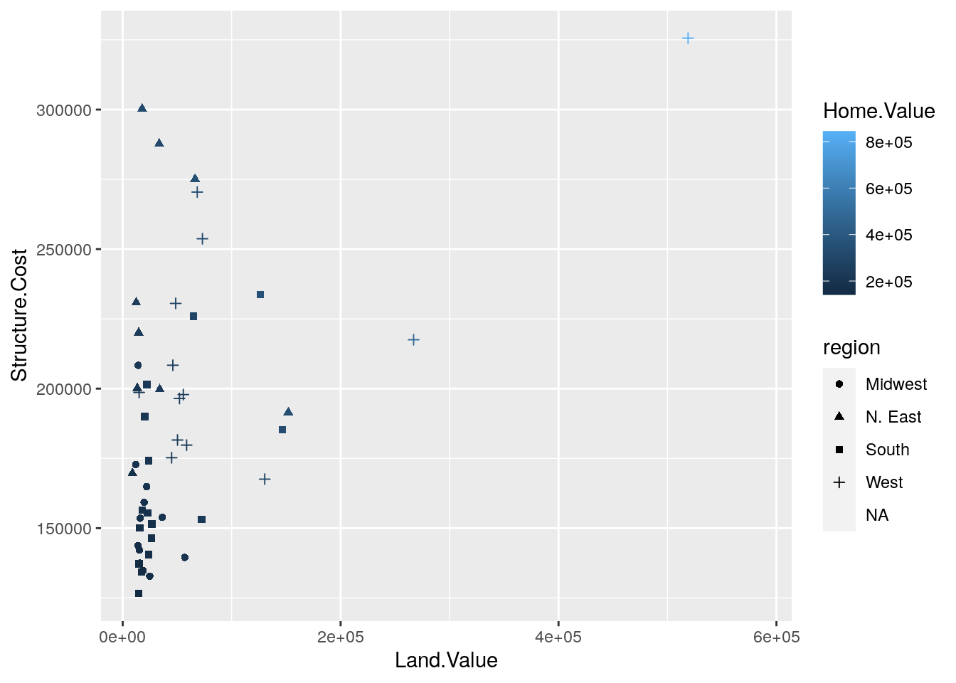
Scales: Controlling Aesthetic Mapping
Aesthetic mapping (i.e., with aes()) only says that a variable should be mapped to an aesthetic. It doesn’t say how that should happen. For example, when mapping a variable to shape with aes(shape = z) you don’t say what shapes should be used. Similarly, aes(color = z doesn’t say what colors should be used. Describing what colors/shapes/sizes etc. to use is done by modifying the corresponding scale. In ggplot2, scales include:
positioncolor,fill, andalphasizeshapelinetype
Scales are modified with a series of functions using a scale_<aesthetic>_<type> naming scheme. Try typing scale_<tab> to see a list of scale modification functions.
Common Scale Arguments
The following arguments are common to most scales in ggplot2:
name: the first argument specifies the axis or legend titlelimits: the minimum and maximum of thescalebreaks: the points along the scale where labels should appearlabels: the text that appear at each break
Specific scale functions may have additional arguments; for example, the scale_color_continuous() function has arguments low and high for setting the colors at the low and high end of the scale.
Scale Modification Examples
Start by constructing a dotplot showing the distribution of home values by Date and State.
home_plot <- ggplot(housing, aes(y = State, x = Home.Price.Index)) +
  geom_point(aes(color = Date),
             alpha = 0.3,
             size = 1.5,
             position = position_jitter(width = 0, height = 0.25))
First, we will change the label on the vertical axis.
home_plot <- home_plot +
  scale_y_discrete(name = "State Abbreviation")
Now let’s modify the breaks and labels for the x axis and color scales:
home_plot +
  scale_color_continuous(breaks = c(1975.25, 1994.25, 2013.25),
                         labels = c(1971, 1994, 2013))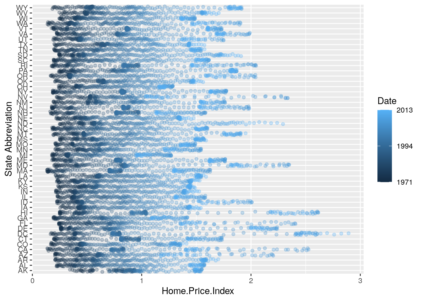
Next change the low and high values to blue and red:
home_plot <- home_plot +
  scale_color_continuous(breaks = c(1975.25, 1994.25, 2013.25),
                         labels = c(1971, 1994, 2013),
                         low = "blue", high = "red")
home_plot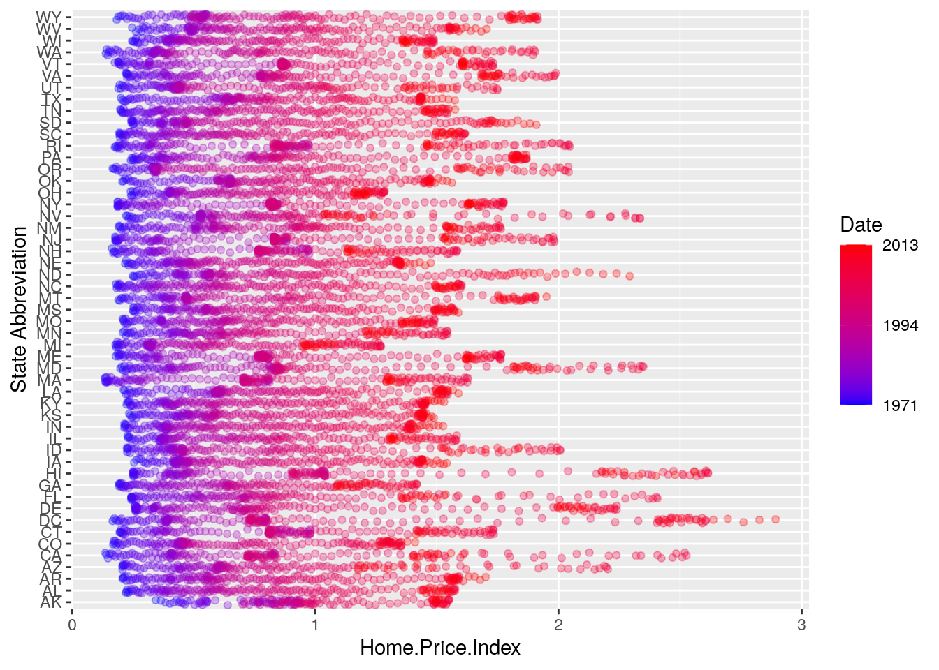
Using different color scales
ggplot2 has a wide variety of color scales; here is an example using scale_color_gradient2 to interpolate between three different colors:
home_plot +
  scale_color_gradient2(breaks = c(1975.25, 1994.25, 2013.25),
                        labels = c(1971, 1994, 2013),
                        low = "blue",
                        high = "red",
                        mid = "gray60",
                        midpoint = 1994.25)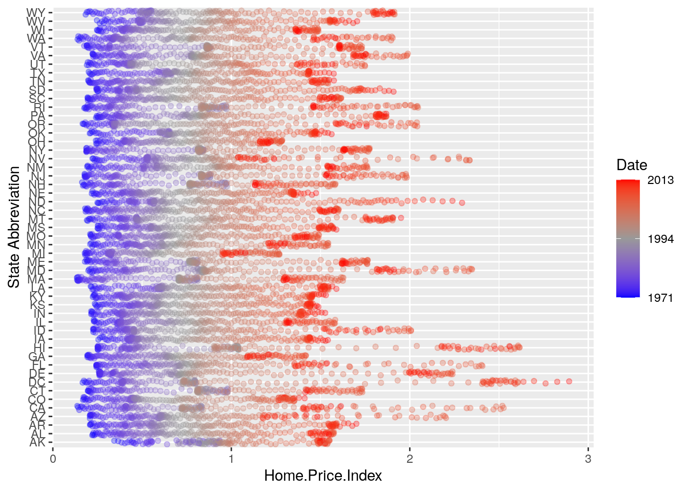
- Since a home price index of 1 is an important benchmark, it is worth highlighting as contextual reference in our plot. Use
geom_vline()to add a dotted, black, vertical line to the plot we created above.
# sample solution
home_plot +
  geom_vline(aes(xintercept = 1), linetype = 3, color = "black") +
  scale_color_gradient2(breaks = c(1975.25, 1994.25, 2013.25),
                        labels = c(1971, 1994, 2013),
                        low = "blue",
                        high = "red",
                        mid = "gray60",
midpoint = 1994.25)- Recall that layers in
ggplot2are added sequentially. How would you put the dotted vertical line you created in the previous exercise behind the data values?
Available Scales
Here’s a (partial) combination matrix of available scales:
| Scale | Types | Examples |
|---|---|---|
scale_color_ |
identity |
scale_fill_continuous |
scale_fill_ |
manual |
scale_color_discrete |
scale_size_ |
continuous |
scale_size_manual |
discrete |
scale_size_discrete |
|
scale_shape_ |
discrete |
scale_shape_discrete |
scale_linetype_ |
identity |
scale_shape_manual |
manual |
scale_linetype_discrete |
|
scale_x_ |
continuous |
scale_x_continuous |
scale_y_ |
discrete |
scale_y_discrete |
reverse |
scale_x_log |
|
log |
scale_y_reverse |
|
date |
scale_x_date |
|
datetime |
scale_y_datetime |
Note: in RStudio, you can type scale_ followed by TAB to get the whole list of available scales.
Faceting
- Faceting is
ggplot2parlance for small multiples - The idea is to create separate graphs for subsets of data
ggplot2offers two functions for creating small multiples:facet_wrap(): define subsets as the levels of a single grouping variablefacet_grid(): define subsets as the crossing of two grouping variables
- Facilitates comparison among plots, not just of
geomswithin a plot
Example: what is the trend in housing prices in each state?
Let’s start by using a technique we already know: map State to color:
state_plot <- ggplot(housing, aes(x = Date, y = Home.Value))

state_plot +
geom_line(aes(color = State)) 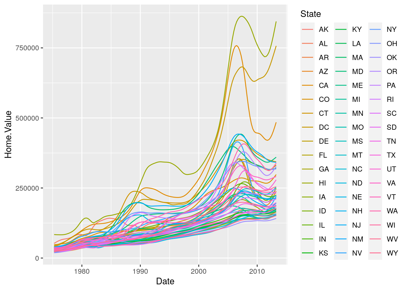
There are two problems here: there are too many states to distinguish each one by color, and the lines obscure one another.
Faceting to the rescue!
We can fix the previous plot by faceting by State rather than mapping State to color:
state_plot +
  geom_line() +
  facet_wrap(~State, ncol = 10)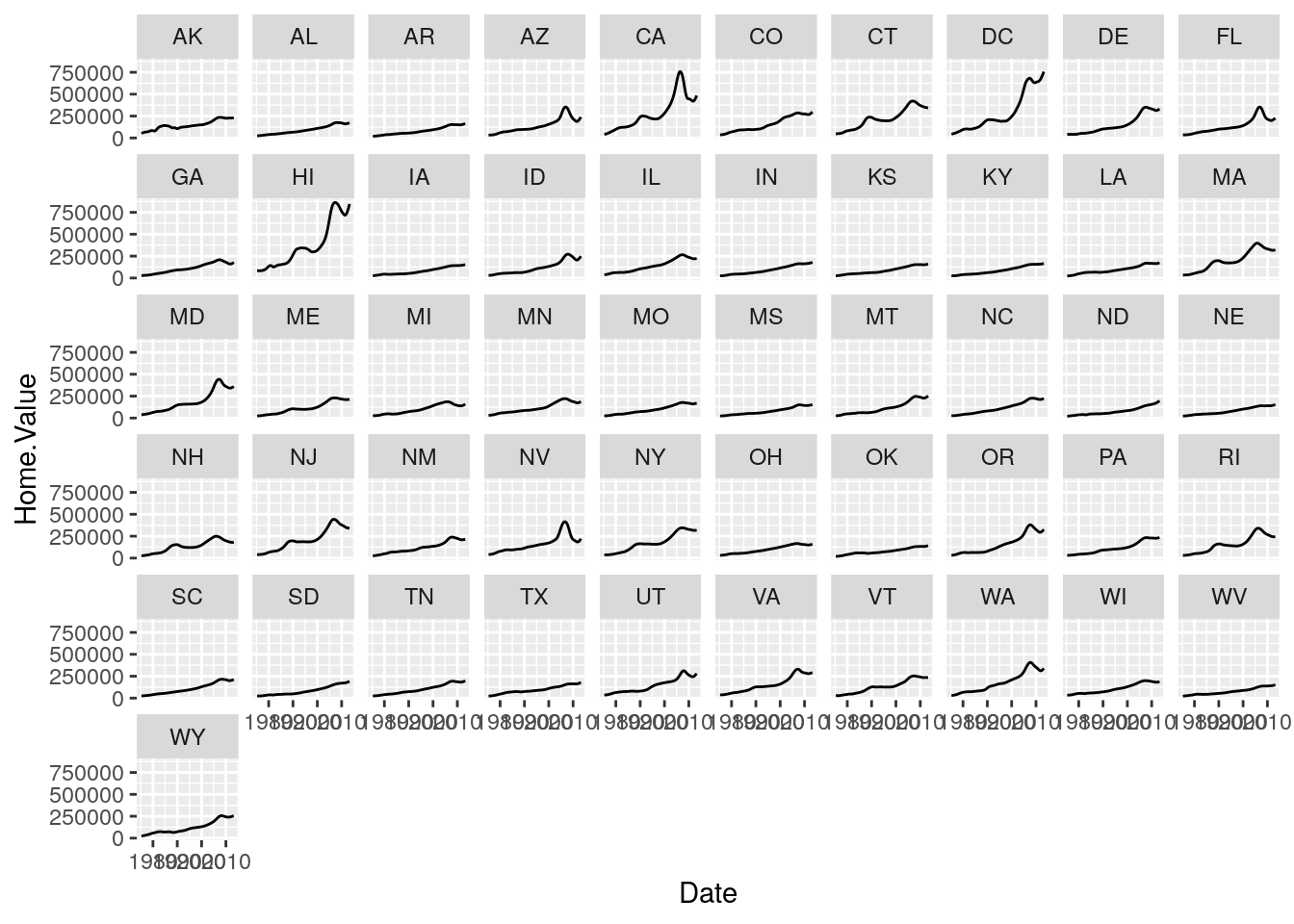
There is also a facet_grid() function for faceting in two dimensions.
- Use a
facet_wrapto create a data graphic of your choice that illustrates something interesting about home prices.
# sample solution
ggplot(housing, aes(x = Date, y = Home.Price.Index, color = State)) +
  geom_hline(aes(yintercept = 1), linetype = 3, color = "black") +
  geom_point(alpha = 0.1) +
  geom_line() +
  facet_wrap(~region)
Your learning
Please response to the following prompt on Slack in the #mod-viz channel.
Prompt: Post an image of the data graphic you created in Exercise 7
This lab is based on the “Introduction to R Graphics with ggplot2” workshop, which is a product of the Data Science Services team Harvard University. The original source is released under a Creative Commons Attribution-ShareAlike 4.0 Unported. This lab was adapted for SDS192: and Introduction to Data Science in Spring 2017 by R. Jordan Crouser at Smith College.