Programming with data
Learning Goals
- To further sharpen data wrangling, data visualization, and workflow skills
- To demonstrate that you can iterate an analysis at scale
Technical Skills
dplyrtidyrggplot2purrr- GitHub
Readings
- Modern Data Science with R, Ch. 2–8
Mini-Project
Big picture
In this assignment, you’ll combine your data-wrangling and visualization skills to try to reverse-engineer a professional data visualization. This is known as a Copy the Master assignment and is a well-known task for learning data visualization (Nolan and Perrett 2016).
About the data source
You will be working with the babynames data set, which is available through the babynames package for R.
Note: we know you’re probably getting sick of this data set; we promise there’s more interesting stuff coming up!
library(tidyverse)
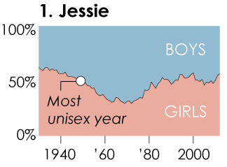
library(babynames)Consider this data graphic on gender-neutral names. You should read the accompanying FlowingData article, which provides some additional context.
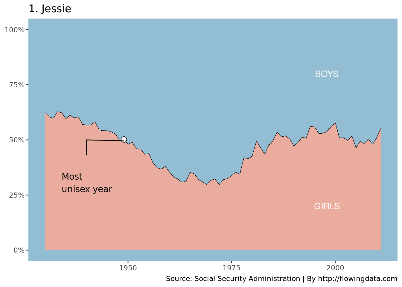
Step 1: Make the plot for “Jessie”
Make the data graphic shown below. Make it for the name Jessie. Try to re-create it as closely as you can using ggplot2. Everything is in play: color, scales, tick labels, fonts, etc. You may want to consult the ggplot2 documentation for details and examples. [I’m pretty sure that this plot was created in ggplot2 using the babynames data set, so you should be able to get very close.]
Step 1A: Gather the data for “Jessie”
The main feature of the plot is a time series that indicates the percentage of children assigned to male and female in each year from 1930 to 2011. There are \(n = 82\) such years. To draw this, you need a data frame with \(n\) rows and two variables: year and percent_female.
Hint: Think about how many pieces of information you need to draw each element of the data graphic.
Here is a potential solution. As always, others solutions are possible.
jessie <- babynames %>%
  filter(
    name == "Jessie",
    year >= 1930 & year < 2012
  ) %>%
  select(-prop) %>%
  pivot_wider(names_from = sex, values_from = n) %>%
  mutate(pct_girls = F / (F + M))
jessie
## # A tibble: 82 x 5
## year name F M pct_girls
## <dbl> <chr> <int> <int> <dbl>
## 1 1930 Jessie 2196 1330 0.623
## 2 1931 Jessie 1930 1267 0.604
## 3 1932 Jessie 1895 1282 0.596
## 4 1933 Jessie 1807 1077 0.627
## 5 1934 Jessie 1793 1091 0.622
## 6 1935 Jessie 1618 1103 0.595
## 7 1936 Jessie 1586 1013 0.610
## 8 1937 Jessie 1552 1040 0.599
## 9 1938 Jessie 1475 971 0.603
## 10 1939 Jessie 1396 1058 0.569
## # … with 72 more rowsStep 1B: Compute the “most unisex year”
In addition to the time series, there is a single point that represents the year in which the ratio of boys to girls was closest to 1:1. In order to draw this point, you need to compute both the percentage that was closest to 50%, and the year in which that percentage occurred.
jessie_unisex_year <- jessie %>%
  mutate(distance = abs(pct_girls - 0.5)) %>%
  arrange(distance) %>%
  head(1)
jessie_unisex_year
## # A tibble: 1 x 6
## year name F M pct_girls distance
## <dbl> <chr> <int> <int> <dbl> <dbl>
## 1 1949 Jessie 1031 1023 0.502 0.00195Step 1C: Add the annotations for “Jessie”
On the plot for “Jessie,” there are words and lines that provide context. Build data frames that contain the coordinates for those elements. Unfortunately this process if often manual and involves some trial-and-error.
jessie_context <- tribble(
  ~year_label, ~vpos, ~hjust, ~name, ~text,
  1934, 0.35, "left", "Jessie", "Most\nunisex year"
)

jessie_segments <- tribble(
  ~year, ~pct_girls, ~name,
  1940, 0.43, "Jessie",
  1940, 0.5, "Jessie",
  1949, 0.4956897, "Jessie"
)

jessie_labels <- tribble(
  ~year, ~name, ~pct_girls, ~label,
  1998, "Jessie", 0.8, "BOYS",
  1998, "Jessie", 0.2, "GIRLS"
)
Step 1D: Draw the plot for “Jessie”
Having computed the data that we’ll need, now we need to draw the plot. This step may involve extensive consultation with the ggplot2 documentation to learn about lesser-known features. This is a basic solution, but you might spent some more time polishing it.
Hint: Read the section in the book about customizing gplot2 graphics
ggplot(jessie, aes(x = year, y = pct_girls)) +
  geom_line() +
  geom_area(fill = "#eaac9e") +
  geom_point(data = jessie_unisex_year, fill = "white", pch = 21, size = 3) +
  geom_path(data = jessie_segments) +
  geom_text(
    data = jessie_labels,
    aes(label = label),
    color = "white"
  ) +
  geom_text(
    data = jessie_context, family = "Century Gothic",
    aes(x = year_label, y = vpos, label = text, hjust = hjust), vjust = "top"
  ) +
  scale_y_continuous(NULL,
    limits = c(0, 1),
    labels = scales::percent
  ) +
  scale_x_continuous(NULL) +
  scale_fill_manual(values = c("#eaac9e", "black")) +
  theme(
    panel.background = element_rect(fill = "#92bdd3"),
    panel.grid.major = element_blank(),
    panel.grid.minor = element_blank(),
    text = element_text(family = "Century Gothic"),
    strip.background = element_blank(),
    strip.text = element_text(hjust = 0, face = "bold", size = 14)
  ) +
  guides(fill = FALSE) +
  labs(
    title = "1. Jessie",
    caption = "Source: Social Security Administration | By http://flowingdata.com"
  )
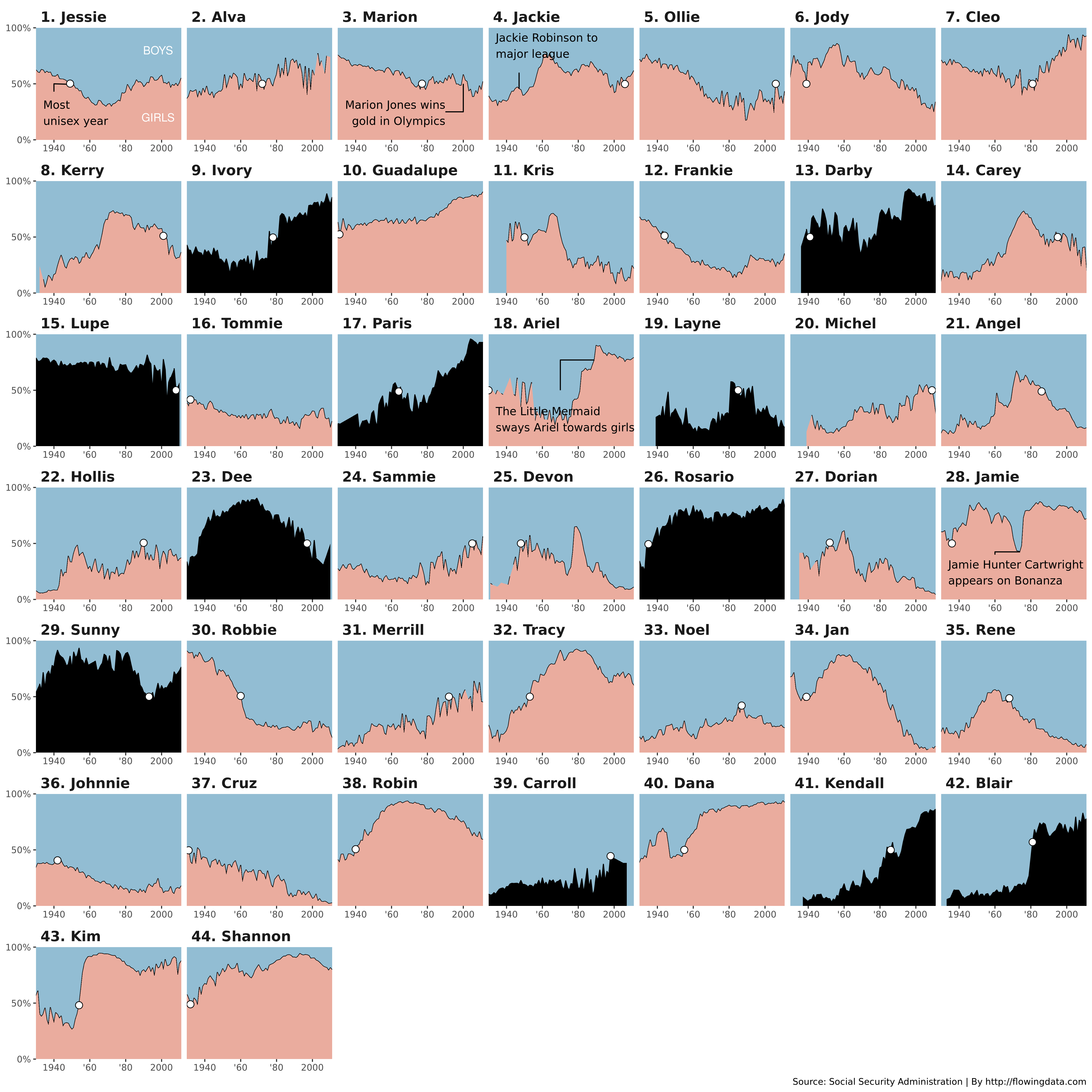
Step 2: Make the graphic for all 35 names
Make the full data graphic with the 35 most gender-neutral names.
Note: Please do NOT obsess about making this perfect. It probably can’t be done! Just give it your best shot!
This bit of code will create a data frame with the 35 names as ranked by FlowingData.com. You can use this to check your work, but note that to meet the standard for computing the names, you need to discover these names algorithmically.
fd_names <- c(
  "Jessie", "Marion", "Jackie", "Alva", "Ollie",
  "Jody", "Cleo", "Kerry", "Frankie", "Guadalupe",
  "Carey", "Tommie", "Angel", "Hollis", "Sammie",
  "Jamie", "Kris", "Robbie", "Tracy", "Merrill",
  "Noel", "Rene", "Johnnie", "Ariel", "Jan",
  "Devon", "Cruz", "Michel", "Gale", "Robin",
  "Dorian", "Casey", "Dana", "Kim", "Shannon"
) %>%
  enframe(name = "fd_rank", value = "name")
fd_names
## # A tibble: 35 x 2
## fd_rank name
## <int> <chr>
## 1 1 Jessie
## 2 2 Marion
## 3 3 Jackie
## 4 4 Alva
## 5 5 Ollie
## 6 6 Jody
## 7 7 Cleo
## 8 8 Kerry
## 9 9 Frankie
## 10 10 Guadalupe
## # … with 25 more rowsStep 2A: Compute the RMSE for Jessie
If you read the FlowingData article carefully, you will find that the author uses the RMSE (root mean squared error) as his metric for ranking the names.
Start by computing the RMSE for “Jessie.”
jessie %>%
  mutate(
    error = pct_girls - 0.5,
    squared_error = error^2
  ) %>%
  summarize(
    mse = mean(squared_error),
    rmse = sqrt(mse)
  )
## # A tibble: 1 x 2
## mse rmse
## <dbl> <dbl>
## 1 0.00998 0.0999Step 2B: Compute the RMSE for all names
Generalize the pattern you used in Step 2A above for “Jessie” to compute the RMSE for all names in the data set. There are nearly 90,000 names in the babynames data set.
Hint: Be careful with how you handle missing data!
Step 2C: Rank and filter the list of names
Not all of these 90,000 names are viable candidates to make the final plot. Many are names that are very uncommon. Make your life easier by restricting the set of candidates names from 90,000 to, say, the 1,000 most popular names. It’s not clear how the original author did this, so don’t obsess about making this perfect. The goal is just to reduce the set of names to something more manageable.
Then put them in order by RMSE and take the first 35 names.
Step 2D: Gather the data you need to draw the time series
Generalize the pattern you used in Step 1A to work for the set of 35 names you have computed. You can do this by either:
- Converting the code from Step 1A into a function that takes a
nameand returns a data frame withnrows, and then usingmap_dfr()to apply that function to your list of names; OR - Copying the pipeline from Step 1A and using a
join()function to return a data frame with all the data you need
Either way, you should end up with a data frame with \(35n\) rows.
Hint: Be careful of how you deal with missing data!
Step 2E: Gather the data you need to draw the points
Similarly, generalize the pattern you used in Step 1B to compute the most unisex year for each of the 35 names. Again, you can do this by either mapping a function or by joining.
Either way, you should end up with a data frame with 35 rows.
Step 2F: Polish the data
You may need to polish up the data for plotting. For example, one problem is that when data is unavailable for a certain name in a certain year, the plot will show weird artifacts.
Step 2G: Create the annotations
Generalize the contextual elements you created in Step 1C to create annotations across the facets. Build a tibble with all of the contextual annotations you will need.
Hint: Read the section in the book about customizing gplot2 graphics
Step 2H: Order the facets
We want the names in the plot to appear in order by their RMSE (not alphabetically). Use mutate() and dense_rank() to create a column called name_label that is a factor that includes not only the name, but the rank, and use fct_reorder() to order that factor by rank (not alphabetically).
Since we will be faceting by name_label, this variable must be present in all of the data sets that will appear on the plot. Use left_join() to add this new variable to all of the data that need it.
Step 2I: Draw the plot
Generalize the data graphic you drew in Step 1D and use a facet_wrap() to draw the big plot.
Disclaimer
I was not able to compute the names exactly using algorithmic methods. Here is my best attempt, which gets all 35 names—mostly in the right order—among the top 49 that I computed. The false positives are shown in black. I can’t explain why these names were omitted from the FlowingData post. [I think it has something to do with missing data, and possibly the way that the original author imputed missing values. Extra credit is available to anyone who can figure it out.]
Submission
- Include your data graphic with the 35 names, along with a short write-up (no more than 500 words) describing your approach.
- Push all commits to the appropriate repository in our private GitHub organization.
- Submit rendered
.htmlfile to Moodle
References
Nolan, Deborah, and Jamis Perrett. 2016. “Teaching and Learning Data Visualization: Ideas and Assignments.” The American Statistician 70 (3): 260–69. https://arxiv.org/pdf/1503.00781.