Data visualization
SDS 236
Mar 31, 2025
Good viz

Sorry, no rainbows
Read more about this!
Two more books
 ]
]

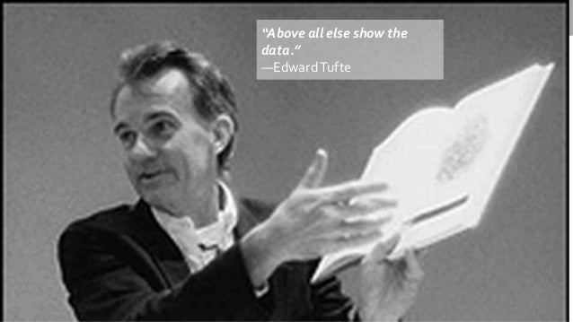
Tufte’s mantra
Three color schemes
Sequential
- Single hue
- Multi-hue
Diverging
Categorical

Big Idea
Color choices matter and there are better and worse choices
Sequential, single hue (discrete)
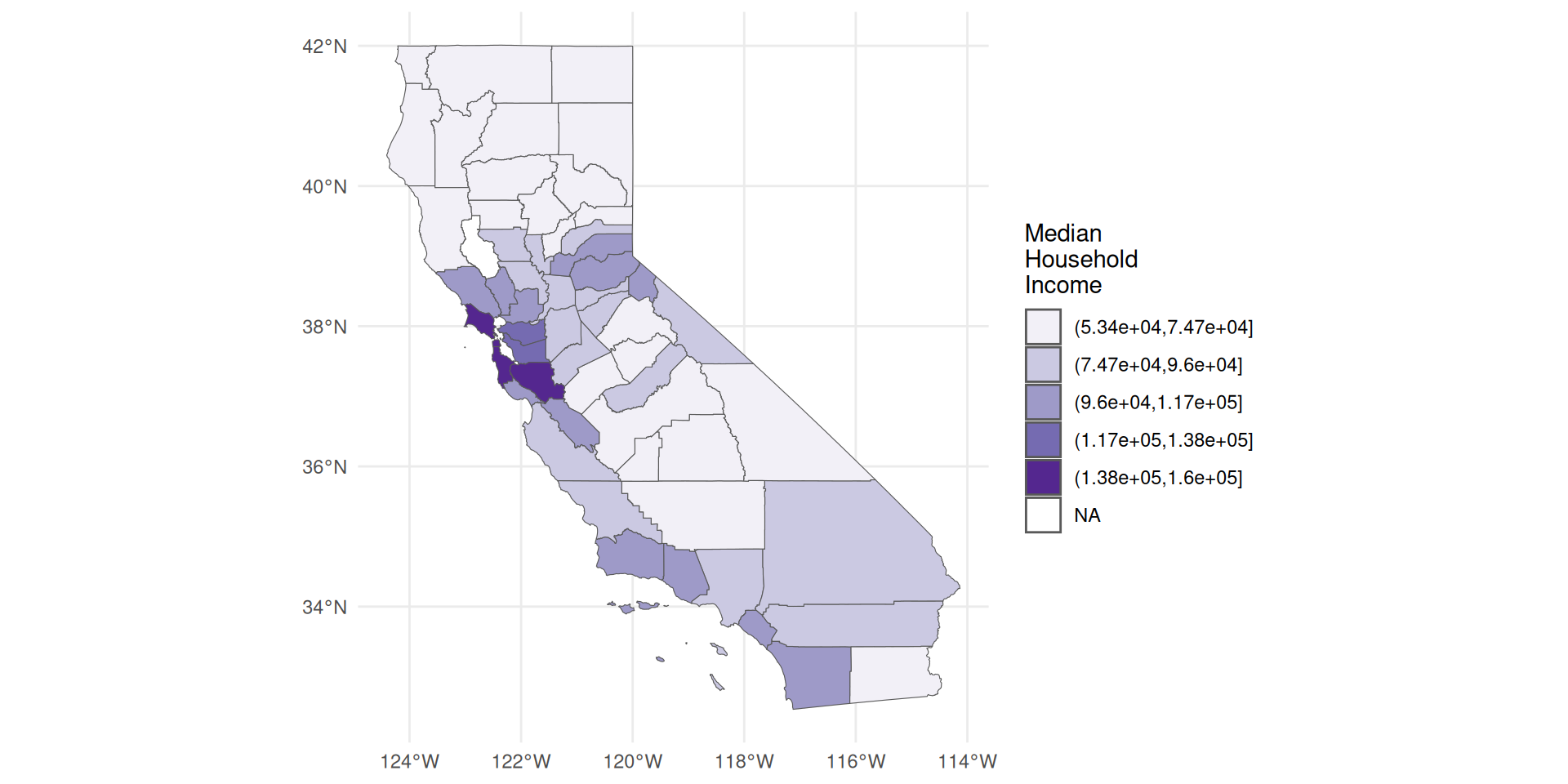
Map saturation to numeric variable
People interpret high saturation as more
No more than 5–6 levels
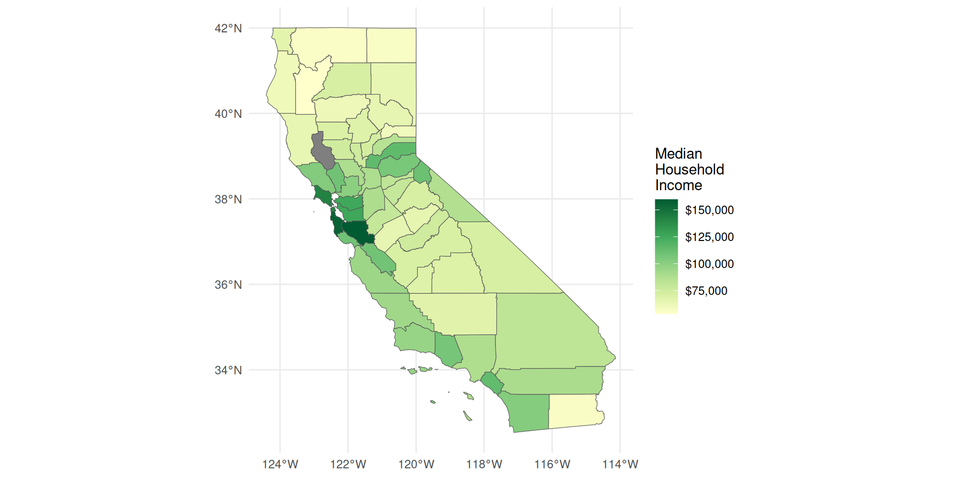
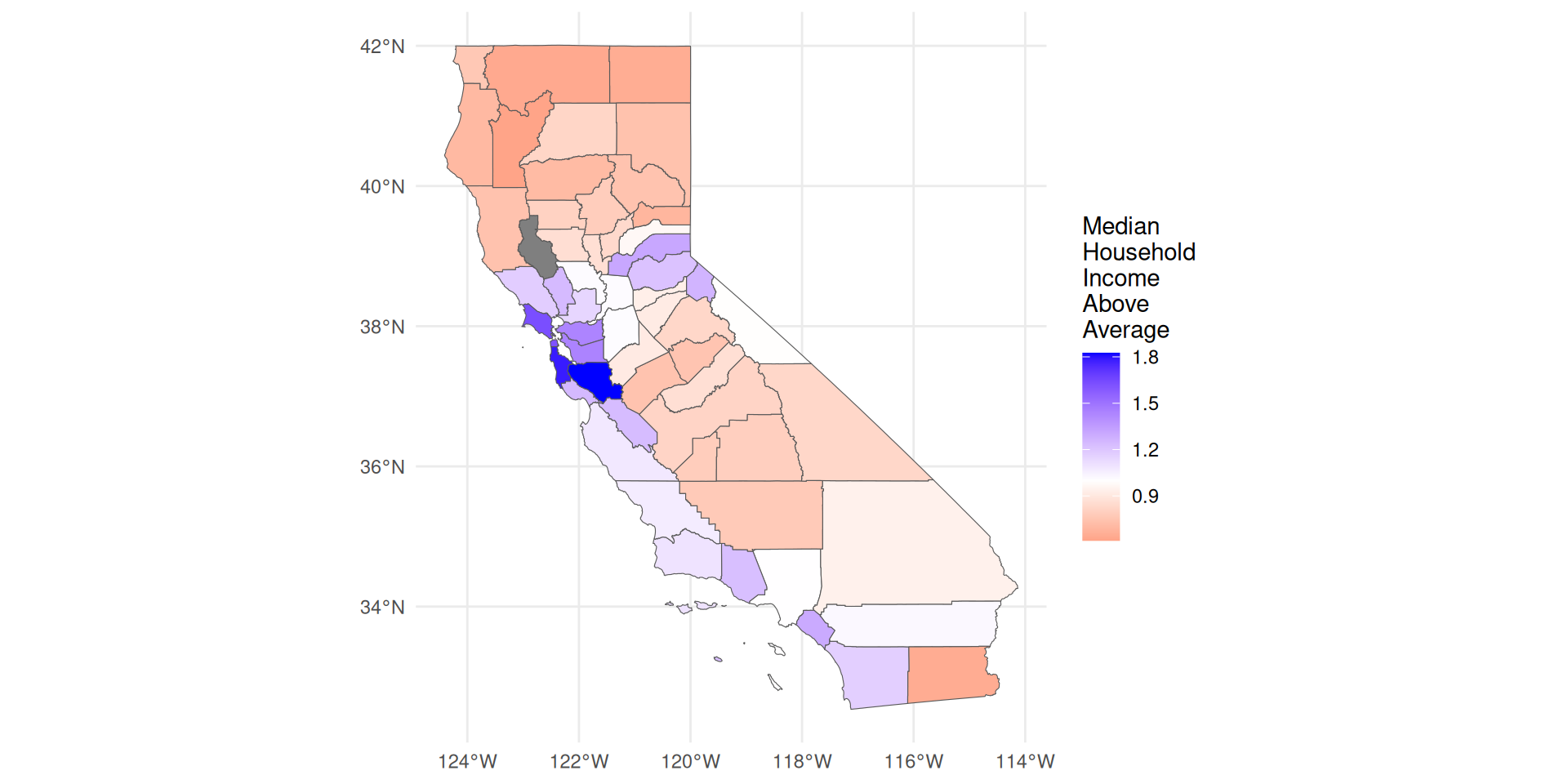
Sequential, double hue
Map hue to numeric variable
Generally, no more than 2 anchor colors
People interpret darker hue as more
Diverging
Two colors used to indicate extremes of a range
Neutral color in the middle
distinguish between zero and missing
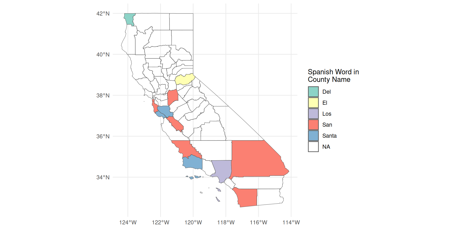
Categorical
Different color = different category
choose colors that are
- perceptually distant
- roughly the same saturation
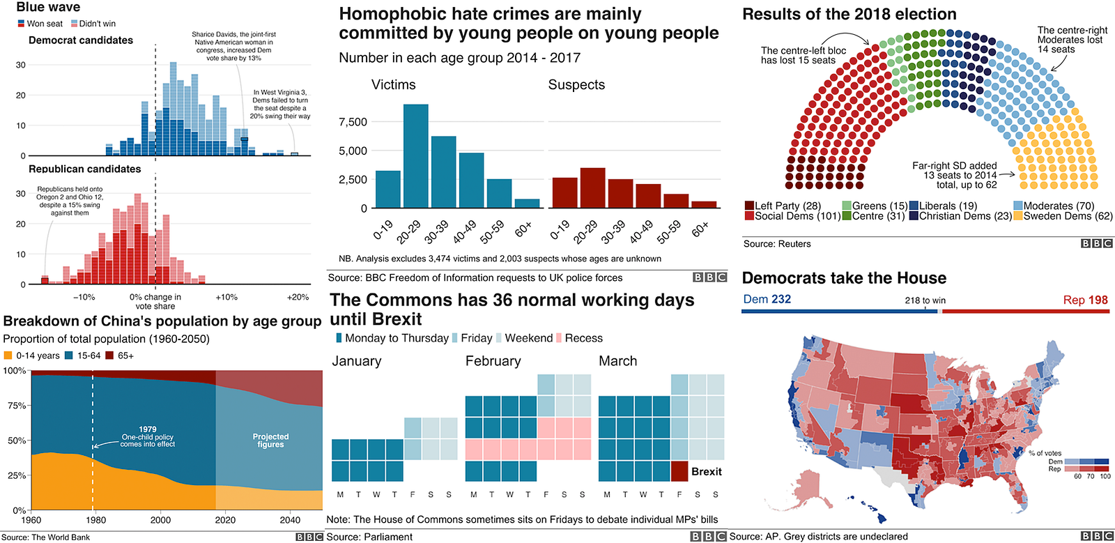
bbplot from the BBC
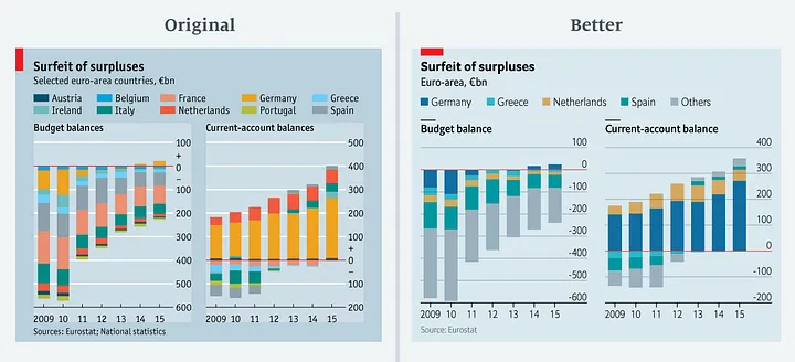
Improving Economist graphics (1)
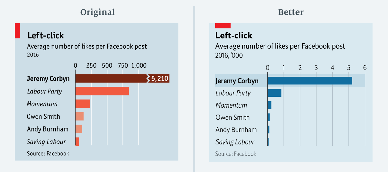
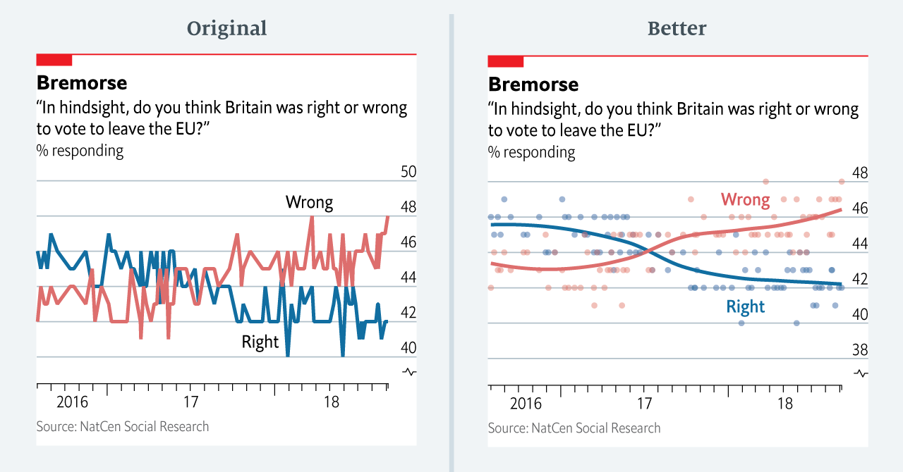
Improving Economist graphics (2)
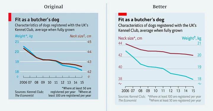
Improving Economist graphics (3)
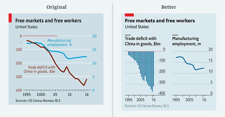
Improving Economist graphics (4)
Improving Economist graphics (5)