# A tibble: 6 × 2
  league height
  <chr>   <dbl>
1 nba      74.8
2 nba      79.5
3 nba      75.9
4 nba      78.4
5 nba      76.0
6 nba 74.005: Bivariate relationships
IMS, Ch. 7.1
Feb 6, 2026
You were right!

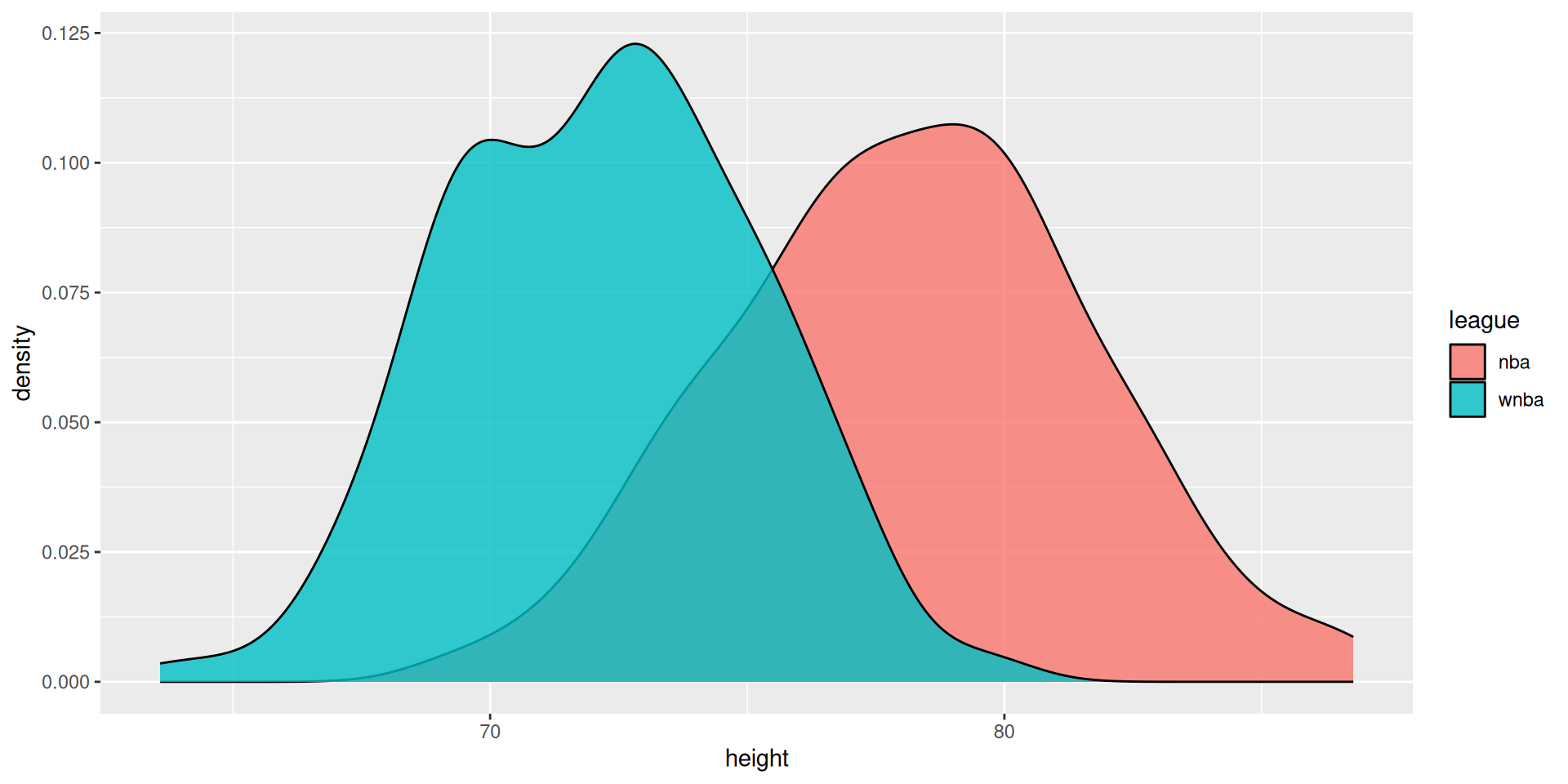
Visualize distribution (bivariate)
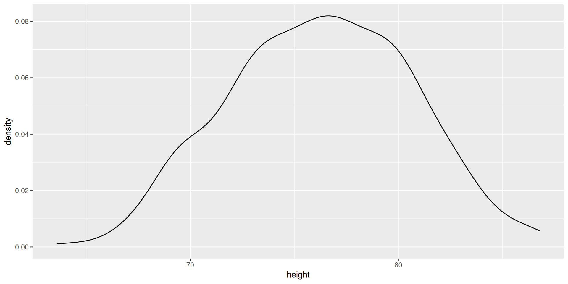
Visualize distribution (univariate)
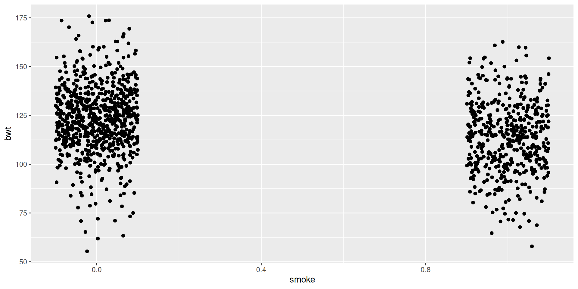
Example: birthweight of babies
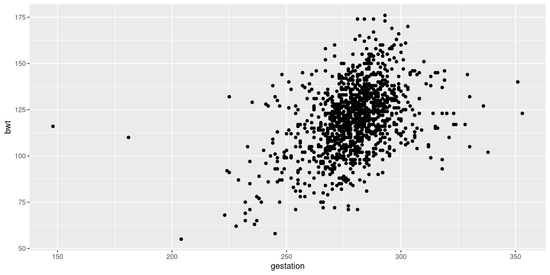
Example: birthweight of babies
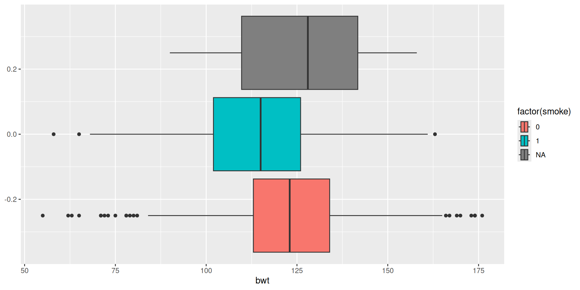
Example: birthweight of babies
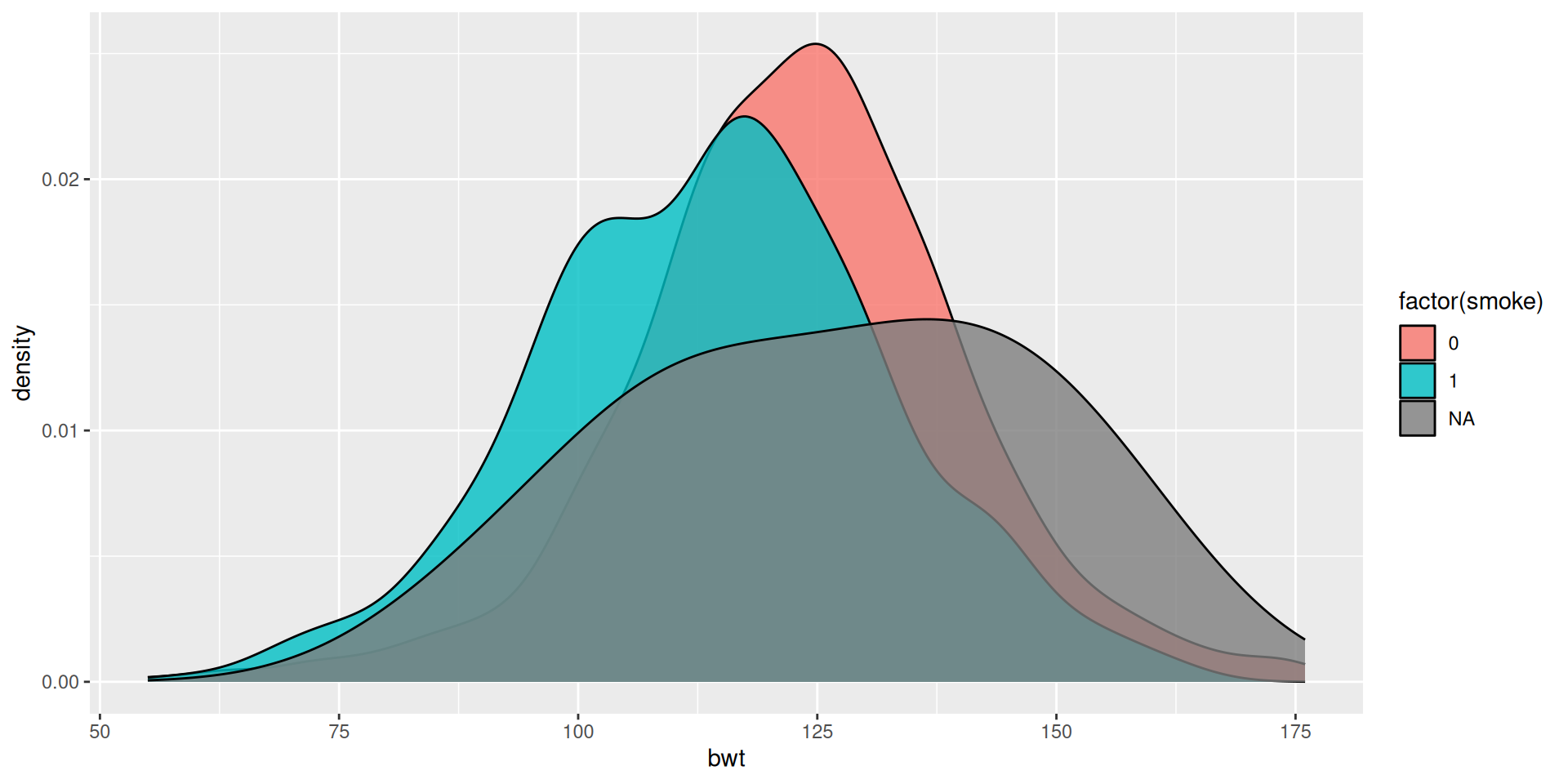
Example: birthweight of babies
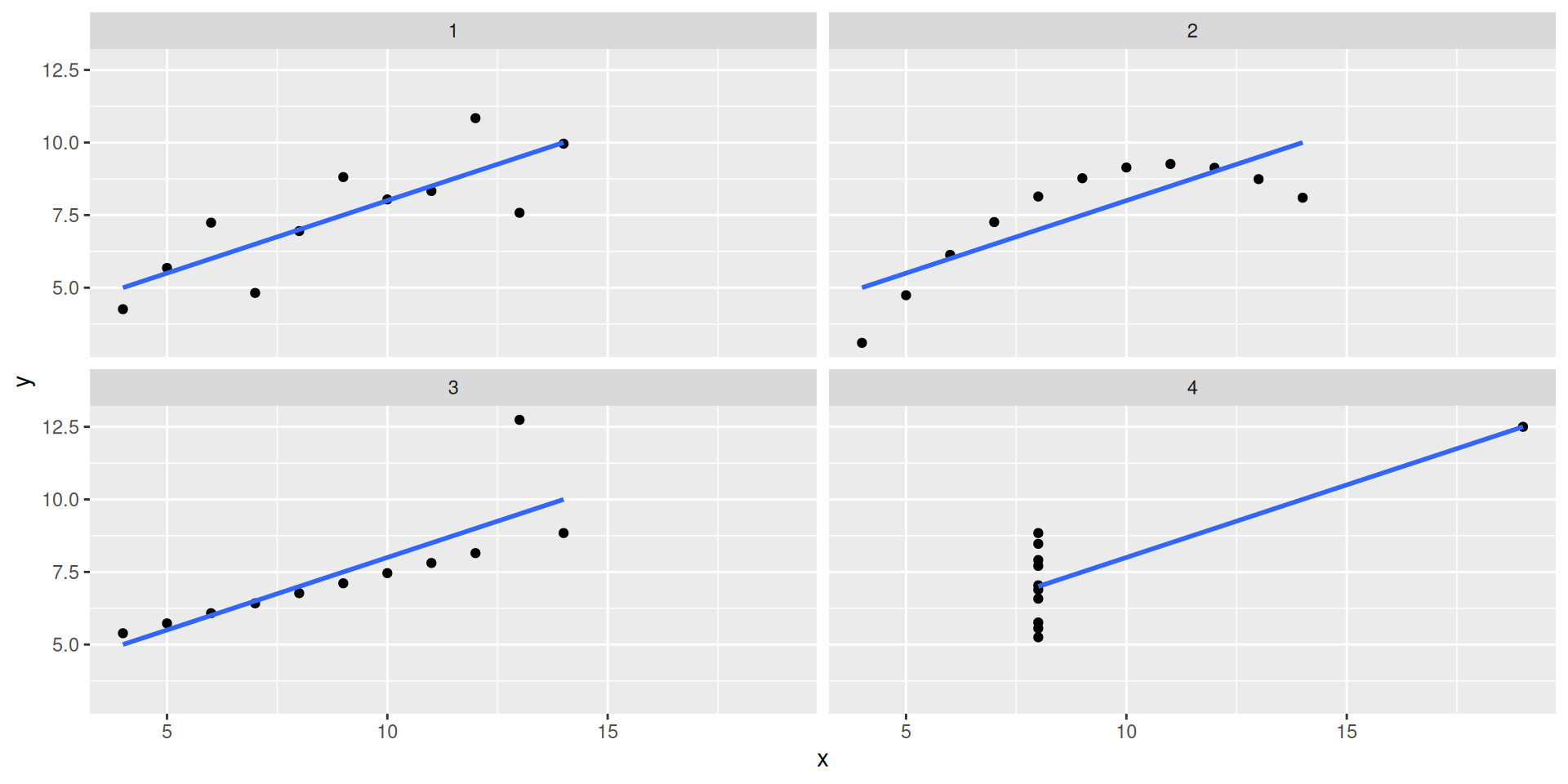
Anscombe plots
More examples
