
library(tidyverse)
library(abdwr3edata)
hof <- hof_batting3 Graphics
3.1 Introduction
To illustrate methods for creating graphs in R in the ggplot2 package (Wickham 2016), consider all the career batting statistics for the current members of the Hall of Fame. The data frame hof_batting in the abdwr3edata package contains the career batting statistics for this group. We copy these data into a data frame named hof.
If we remove the pitchers’ batting statistics from the dataset, one has statistics for 167 non-pitchers. The type of graph we use depends on the measurement scale of the variable. There are two fundamental data types—measurement and categorical—which are represented in R as numeric and character variables. We initially describe graphs for a single character variable and a single numeric variable, and then describe graphical displays helpful for understanding relationships between the variables. Using the ggplot2 system, it is easy to modify the attributes of a graph by adding labels and changing the style of plotting symbols and lines. After describing the graphical methods, we describe the process of creating graphs for two home run stories. In Section 3.7, we compare the home run career progress of four great sluggers in baseball history, while Section 3.8 we illustrate the famous home run race of Mark McGwire and Sammy Sosa during the 1998 season.
3.2 Character Variable
3.2.1 A bar graph
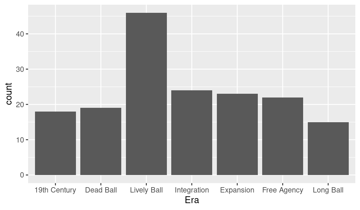
The Hall-of-Famers played during different eras of baseball; one common classification of eras is “19th Century” (up to the 1900 season), “Dead Ball” (1901 through 1919), “Lively Ball” (1920 though 1941), “Integration” (1942 through 1960), “Expansion” (1961 through 1976), “Free Agency” (1977 through 1993), and “Long Ball” (after 1993). We want to create a new character variable Era giving the era for each player. First, we define a player’s mid career (variable MidCareer) as the average of his first and last seasons in baseball. We then use the mutate() and cut() functions to create the new factor variable Era—the arguments to the function are the numeric variable to be discretized, the vector of cut points, and the vector of labels for the categories of the factor variable.
A frequency table of the variable Era can be constructed using the summarize() function with the n() function. Below, we store that output in the data frame hof_eras.
NA # A tibble: 7 × 2
NA   Era              N
NA   <fct>        <int>
NA 1 19th Century    18
NA 2 Dead Ball       19
NA 3 Lively Ball     46
NA 4 Integration     24
NA 5 Expansion       23
NA 6 Free Agency     22
NA 7 Long Ball       15
We construct a bar graph from those data using the geom_bar() function in ggplot2.
The aes() function defines aesthetics. There are mappings between visual elements on the plot and variables in the data frame. Here we map the character vector Era to the x aesthetic, which defines horizontal positioning. Figure 3.1 shows the resulting graph. We see that a large number of these Hall of Fame players played during the Lively Ball era.
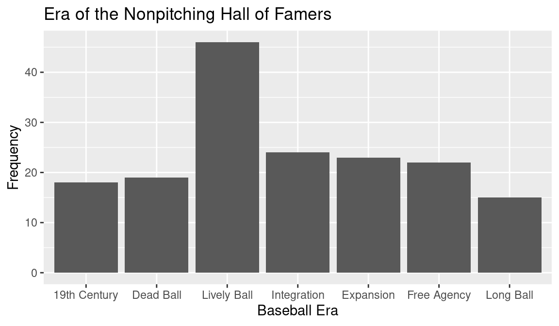
3.2.2 Add axes labels and a title
As good practice, graphs should have descriptive axes labels and a title for describing the main message of the display. In the ggplot2 package, the functions xlab() and ylab() add horizontal and vertical axis labels and the ggtitle() function adds a title. In the following code to construct a bar graph, we add the labels “Baseball Era” and “Frequency” and add the title “Era of the Nonpitching Hall of Famers”. The enhanced plot is shown in Figure 3.2.
3.2.3 Other graphs of a character variable
There are alternative graphical displays for a table of frequencies of a character variable. For the data frame of era frequencies, we use the function geom_point() to construct a Cleveland-style (Cleveland 1985) dot plot shown in Figure 3.3. A dot plot is helpful when there are a large number of categories of the character vector. The dots are colored red by the color = "red" argument in geom_plot().
ggplot(hof_eras, aes(Era, N)) +
  geom_point(color = "red") +
  xlab("Baseball Era") +
  ylab("Frequency") +
  ggtitle("Era of the Nonpitching Hall of Famers") +
  coord_flip()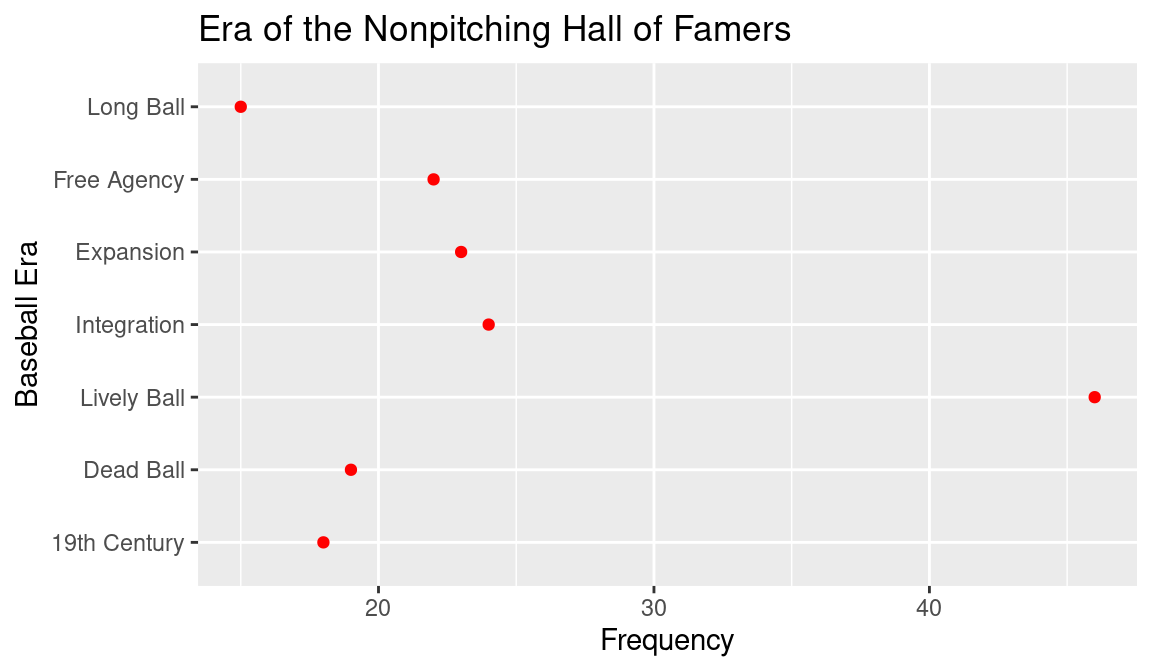
3.3 Saving Graphs
After a graph is produced in R, it is straightforward to export it to one of the usual graphics formats so that it can be used in a document, blog, or website. We outline the steps for saving graphs in the RStudio interface.
If a graph appears in the Plots window of RStudio, then the Export menu allows one to “Save Plot as Image”, “Save Plot as PDF”, or “Copy Plot to the Clipboard”. If one chooses the “Save Plot as Image” option, then by choosing an option from a drop-down menu, one can save the graph in PNG, JPEG, TIFF, BMP, metafile, clipboard, SVG, or EPS formats. The PNG format is convenient for uploading to a web page, and the EPS and PDF formats are well-suited for use in a LaTeX document. The metafile and clipboard options are useful for insertion of the graph into a Microsoft Word document.
Alternately, plots can be saved by use of R functions typed in the Console window. For example, suppose we wish to save the bar graph shown in Figure 3.2 in a graphics file of PNG format. We first type the R commands to produce the graph. Then we use the special ggsave() function where the argument is the name of the saved graphics file. Since the extension of the filename is png, the graph will be saved in PNG format.
If we look at the current directory, we will see a new file bargraph.png containing the image in PNG format. The graph can be saved in alternative graphics formats by use of different extensions. For example the argument to ggsave() would be pdf if we wished to save the graph in PDF format or jpeg if we wanted save in the JPEG format.
Other methods of saving graphs are useful if one wishes to save a number of graphs in a single file. For example, one can use the patchwork library to combine more than one ggplot into a single ggplot object. This composite plot can then be saved using the aforementioned ggsave() command. For example, if one types:
then the bar graph and the dot plot graph will be saved together in the PDF file graphs.pdf.
3.4 Numeric Variable: One-Dimensional Scatterplot and Histogram
When one collects a numeric variable such as a batting average, an on-base percentage, or an OPS from a group of players, one typically wants to learn about its distribution. For example, if we examine OPS values for the nonpitcher Hall of Fame inductees, we are interested in learning about the general shape of the OPS values. For example, is the distribution of OPS values symmetric, or is it right or left skewed? Also we are interested in learning about the typical or representative Hall of Fame OPS value, and how the OPS values are spread out. Graphical displays provide a quick visual way of studying distributions of baseball statistics.
For a single numeric variable, two useful displays for visualizing a distribution are the one-dimensional scatterplot and the histogram. A one-dimensional scatterplot is basically a number line graph, where the values of the statistics are plotted over a number line ranging over all possible values of the variable. We construct a graph of the OPS values for the Hall of Fame inductees in ggplot2 by the geom_jitter() function. In the data frame hof, the OPS is mapped to the x aesthetic and the dummy variable y is set to a constant value. The theme elements are chosen to remove the tick marks, text, and title from the y-axis.
ggplot(hof, aes(x = OPS, y = 1)) +
  geom_jitter(height = 0.2) +
  ylim(0, 2) +
  theme(
    axis.title.y = element_blank(),
    axis.text.y = element_blank(),
    axis.ticks.y = element_blank()
  ) +
  coord_fixed(ratio = 0.03)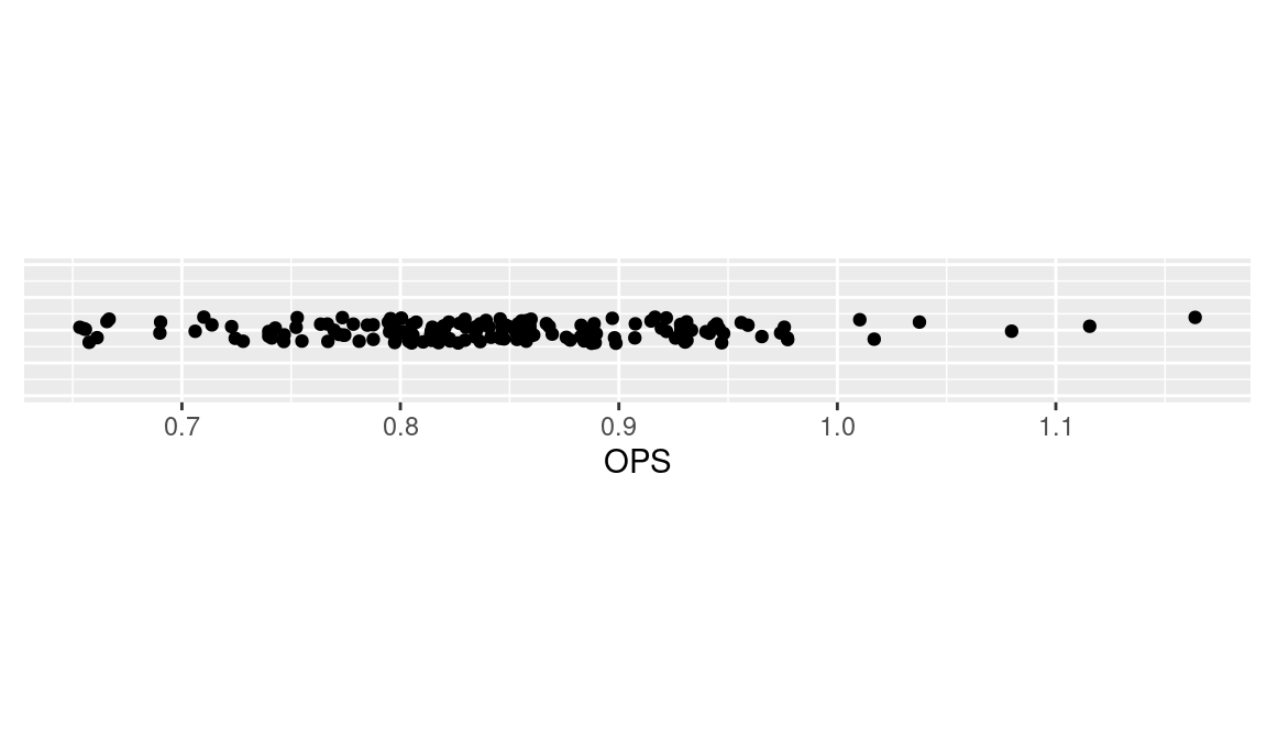
The resulting graph is shown in Figure 3.4. One sees that most of the OPS values fall between 0.700 and 1.000, but there are a few unusually high values that could merit further exploration.
A second graphical display for a numeric variable is a histogram where the values are grouped into bins of equal width and the bin frequencies are displayed as non-overlapping bars over the bins. A histogram of the OPS values is constructed in the ggplot2 system by use of the function geom_histogram(). The only aesthetic mapping is to the variable OPS (see Figure 3.5).
ggplot(hof, aes(x = OPS)) +
   geom_histogram()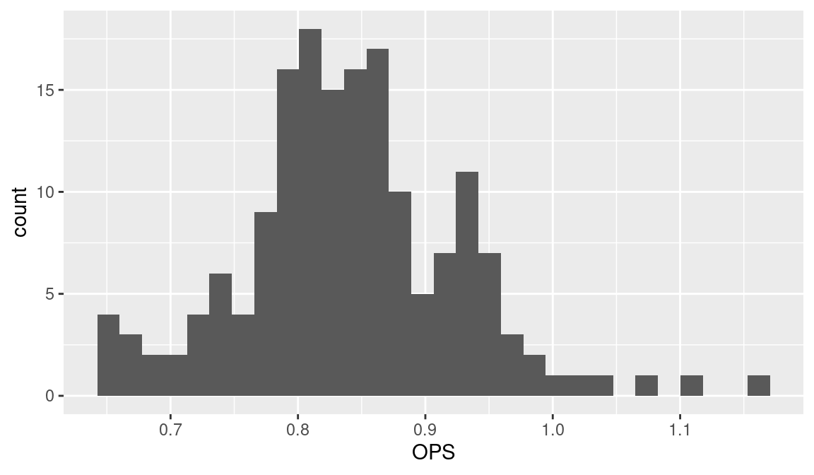
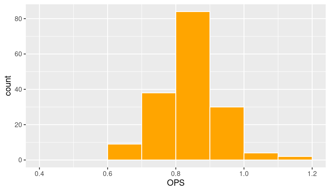
One issue in constructing a histogram is the choice of bins, and the function geom_histogram() will typically make reasonable choices for the bins to produce a good display of the data distribution. One can select one’s own bins in geom_histogram() by use of the argument breaks. For example, if one wanted to choose the alternative bin endpoints \(0.4, 0.5, \ldots, 1.2\), then one could construct the histogram by the following code (see Figure 3.6). By use of the color and fill arguments, the lines of the bars are colored white and the bars are filled in orange.
ggplot(hof, aes(x = OPS)) +
  geom_histogram(
    breaks = seq(0.4, 1.2, by = 0.1),
    color = "white", fill = "orange"
  )
3.5 Two Numeric Variables
3.5.1 Scatterplot
When one collects two numeric variables for many players, one is interested in exploring their relationship. A scatterplot is a standard method for graphing two numeric variables, and one can produce a scatterplot in the ggplot2 system by using the \(x\) and \(y\) aesthetics and the geom_point() function.
In the previous section we explored the distribution of the OPS statistic. Is there any relationship between a player’s OPS and the baseball era? Were there particular seasons where the Hall of Fame OPS values were unusually high or low?
We can answer these questions by constructing a scatterplot using geom_point() where the variables MidCareer and OPS are respectively mapped to the \(x\) and \(y\) aesthetics. As it can be difficult to visually detect scatterplot patterns, it is helpful to add a smoothing curve by use of the geom_smooth() function to show the general association. This function by default implements the popular LOESS smoothing method (Cleveland 1979).
ggplot(hof, aes(MidCareer, OPS)) +
  geom_point() +
  geom_smooth()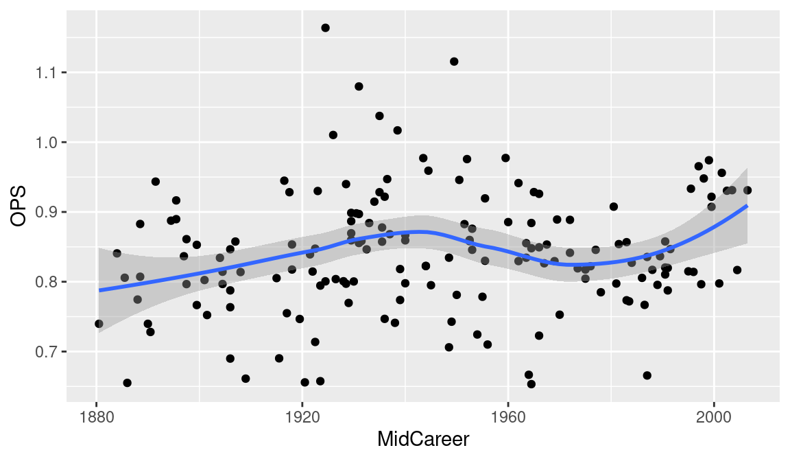
In viewing the scatterplot in Figure 3.7, we notice three unusually large career OPS values, and we’d like to identify the players with these extreme values. Figure 3.8 shows the scatterplot with points identified. We achieve this by adding text labels to the plot using the geom_text_repel() function form the ggrepel package. Note that we use filter() to only send a small subset of the data to this function. Also the labels are colored red by use of the color = "red" argument to geom_text_repel().
library(ggrepel)
ggplot(hof, aes(MidCareer, OPS)) +
  geom_point() +
  geom_smooth() +
  geom_text_repel(
    data = filter(hof, OPS > 1.05 | OPS < .5),
    aes(MidCareer, OPS, label = Player), color = "red"
  )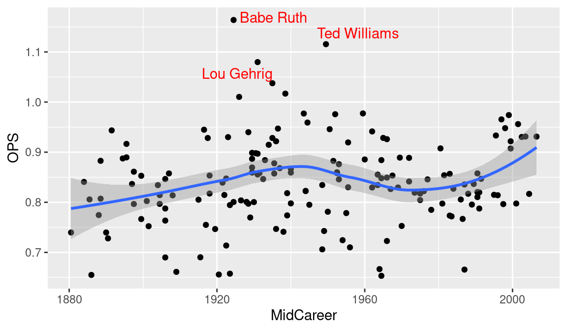
What do we learn from Figures 3.7 and 3.8? The typical OPS of a Hall of Famer has stayed pretty constant through the years. But there was an increase in the OPS during the 1930s when Babe Ruth and Lou Gehrig were in their primes. It is interesting to note that the variability of the OPS values among these players seems smaller in recent seasons.
3.5.2 Building a graph, step-by-step
Generally, constructing a graph is an iterative process. One begins by choosing variables of interest and a particular graphical method (such as a scatterplot. By inspecting the resulting display, one will typically find ways for the graph to be improved. By using several of the optional arguments, one can make changes to the graph that result in a clearer and more informative display. We illustrate this graph construction process in the situation where one is exploring the relationship between two variables.
There are two dimensions of hitting, the ability to get on base, measured by on-base percentage (OBP), and the ability to advance runners already on base, measured by slugging percentage (SLG). One can better understand the hitting performances of players by constructing a scatterplot of these two measures. We use the geom_plot() function to construct a scatterplot of OBP and SLG (see Figure 3.9).
(p <- ggplot(hof, aes(OBP, SLG)) + geom_point())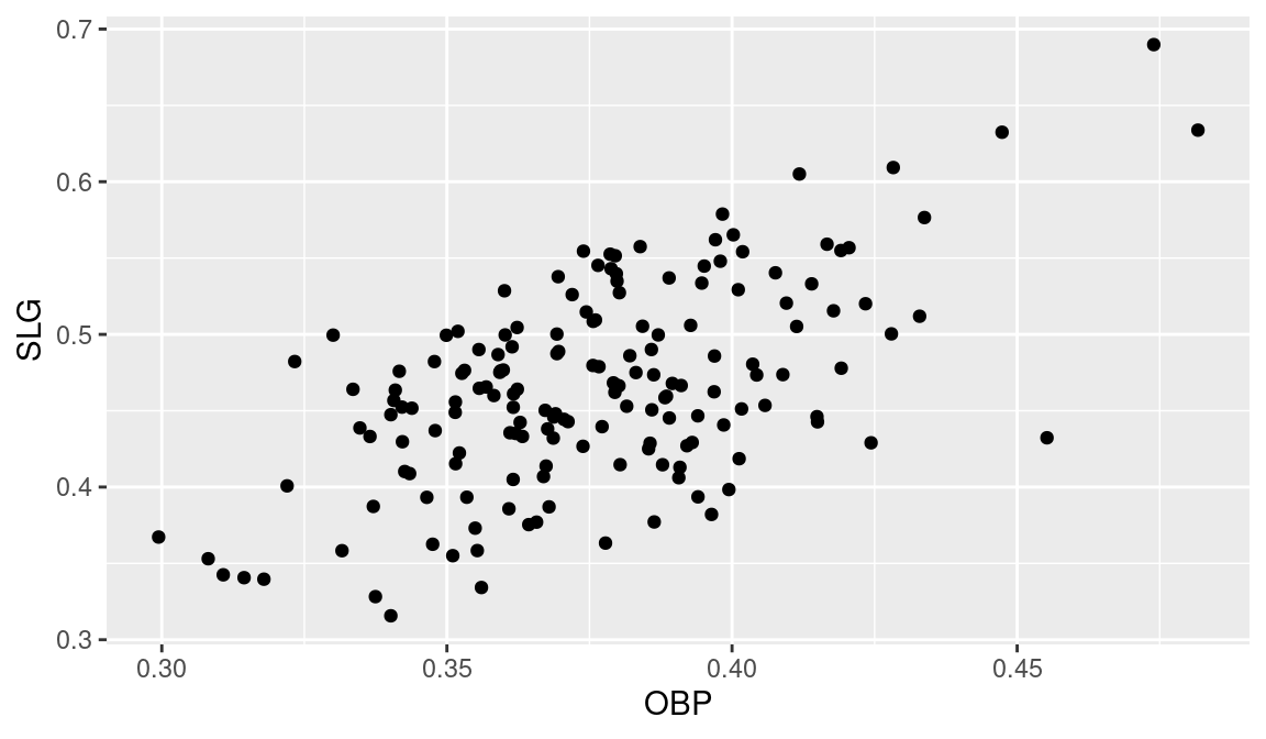
Looking at Figure 3.9, we see several problems with this display. Notably, the graph would be easier to read if more descriptive labels were used for the two axes. We plot a new figure to incorporate these new ideas. We use the xlab() and ylab() functions to replace OBP and SLG respectively with “On-Base Percentage” and “Slugging Percentage”. The updated display is shown in Figure 3.10.
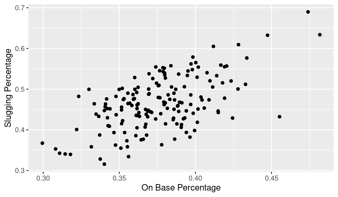
Equivalently, we could change the limits and the labels by appealing directly to the scale_x_continuous() and scale_y_continuous() functions.
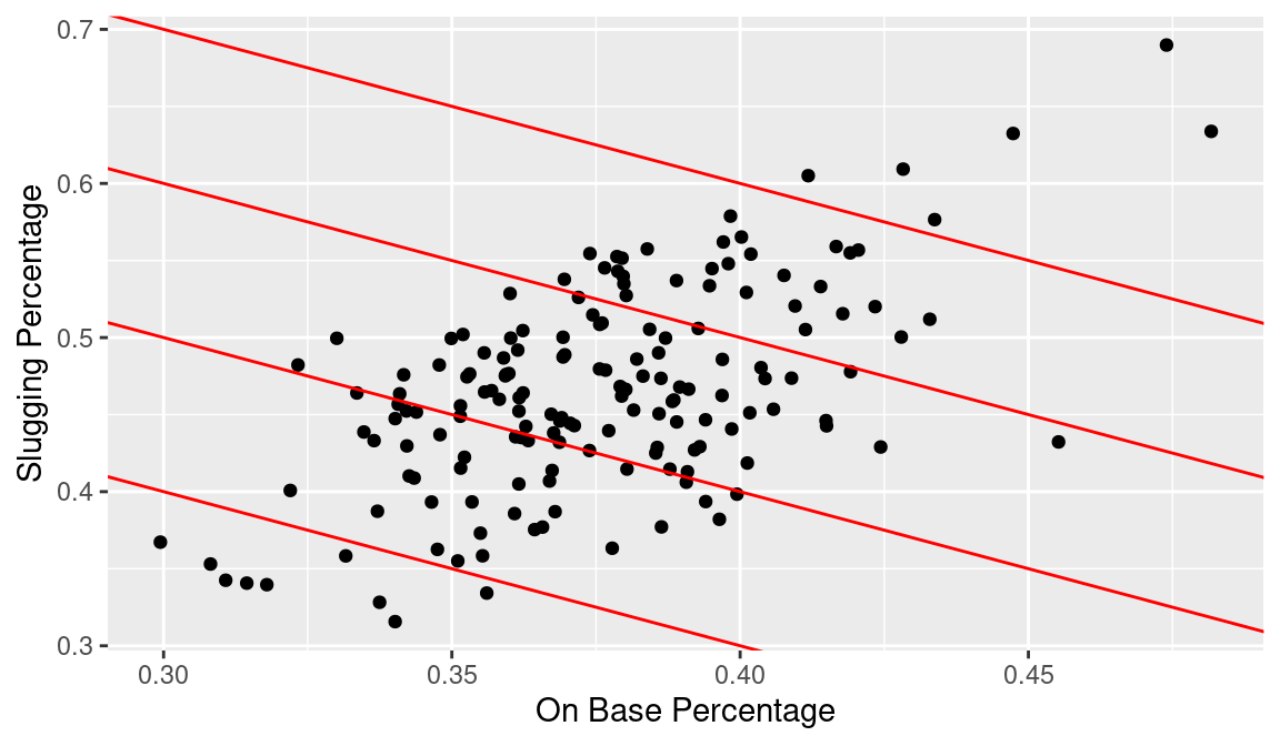
A good measure of batting performance is the OPS statistic defined by \(OPS = OBP + SLG\). To evaluate hitters in our graph on the basis of OPS, it would be helpful to draw constant values of OPS on the graph. If we represent OBP and SLG by \(x\) and \(y\), suppose we wish to draw a line where \(OPS = 0.7\) or where \(x + y = 0.7\). Equivalently, we want to draw the function \(y = 0.7 - x\) on the graph; this is accomplished in the ggplot2 system by the geom_abline() function where the arguments to the function are given by slope = \(-1\) and intercept = 0.7. Similarly, we apply the geom_abline() function three more times to draw lines on the graph where OPS takes on the values 0.8, 0.9, and 1.0. The resulting display is shown in Figure 3.11.
(p <- p +
   geom_abline(
     slope = -1,
     intercept = seq(0.7, 1, by = 0.1),
     color = "red"
   )
)
In our final iteration, we add labels to the lines showing the constant values of OPS, and we label the points corresponding to players having a lifetime OPS exceeding one. Each of the line labels is accomplished using the annotate() function—the three arguments are the x location and y location where the text is to be drawn, and label is the vector of strings of text to be displayed (see Figure 3.12).
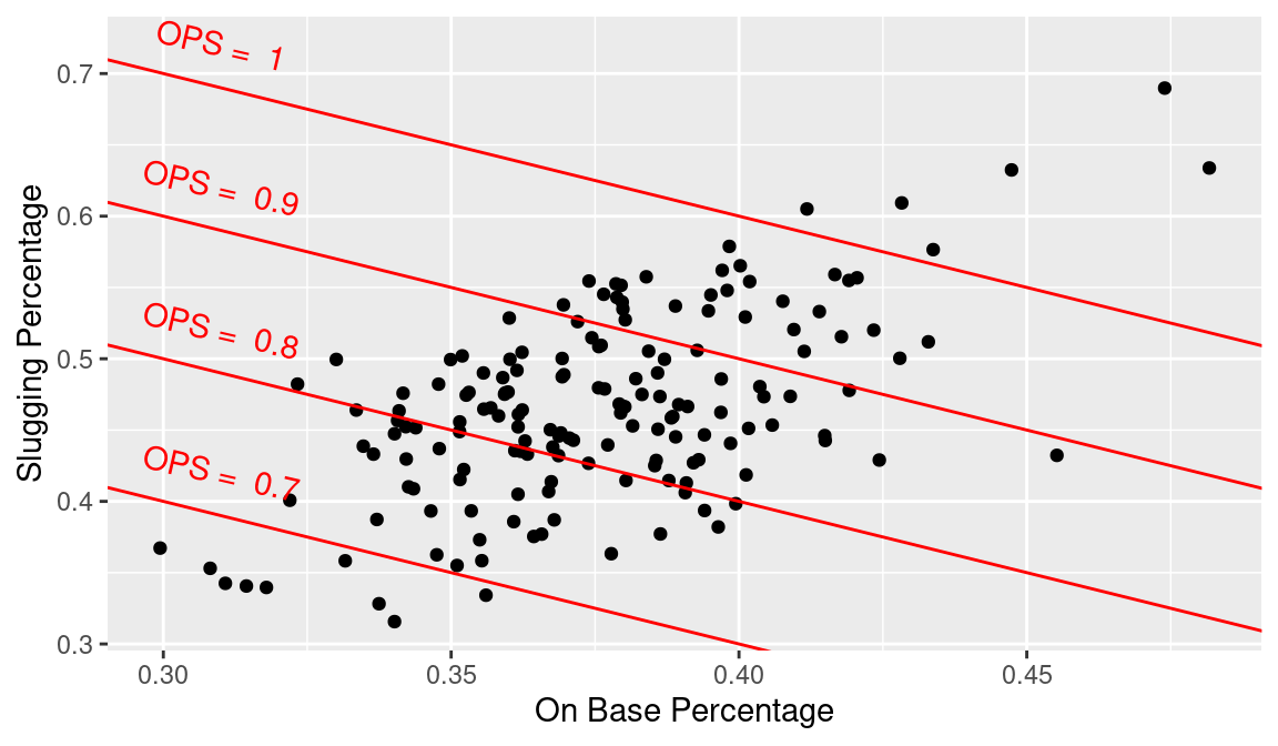
Rather than input these labels manually, we could create a data frame with the coordinates and labels, and then use the geom_text() function to add the labels to the plot.
This final graph is very informative about the batting performance of these Hall of Famers. We see that a large group of these batters have career OPS values between 0.8 and 0.9, and only six players (Hank Greenberg, Rogers Hornsby, Jimmie Foxx, Ted Williams, Lou Gehrig, and Babe Ruth) had career OPS values exceeding 1.0. Points to the right of the major point cloud correspond to players with strong skills in getting on-base, but relatively weak in advancing runners home. In contrast the points to the left of the major point cloud correspond to hitters who are better in slugging than in reaching base.
3.6 A Numeric Variable and a Factor Variable
When one collects a numeric variable such as OPS and a factor such as era, one is typically interested in comparing the distributions of the numeric variable across different values of the factor. In the ggplot2 system, the geom_jitter() function can be used to construct parallel stripcharts or number line graphs for values of the factor, and the geom_boxplot() function constructs parallel boxplots (graphs of summaries of the numeric variable) across the factor.
Home run hitting has gone through dramatic changes in the history of baseball, and suppose we are interested in exploring these changes over baseball eras. Suppose one focuses on the home run rate defined by \(HR / AB\) for our Hall of Fame players. We add a new variable hr_rate to the data frame hof:
hof <- hof |>
  mutate(hr_rate = HR / AB)
3.6.1 Parallel stripcharts
One constructs parallel stripcharts of hr_rate by Era by using the geom_jitter() function; the x and y aesthetics are mapped to hr_rate and Era, respectively. We use the height = 0.1 argument to reduce the amount of the vertical jitter of the points.
ggplot(hof, aes(hr_rate, Era)) +
  geom_jitter(height = 0.1)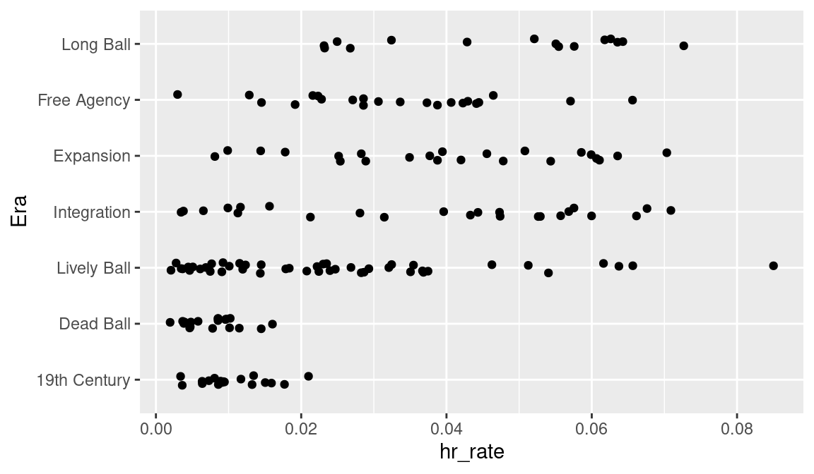
Figure 3.13 shows how the rate of hitting home runs has changed over eras. Home runs were rare in the 19th Century and Dead Ball eras. In the Lively Ball era, home run hitting was still relatively low, but there were some unusually good home run hitters such as Babe Ruth. The home run rates in the Integration, Expansion, and Free Agency eras were pretty similar.
3.6.2 Parallel boxplots
An alternative display for comparing distributions uses the geom_boxplot() function. Here the x and y aesthetics are mapped to Era and hr_rate, respectively. The function coord_flip() will flip the axes and display the boxplots horizontally. By use of the color and fill arguments, we display orange boxplots with brown edges.
ggplot(hof, aes(Era, hr_rate)) +
  geom_boxplot(color = "brown", fill = "orange") +
  coord_flip()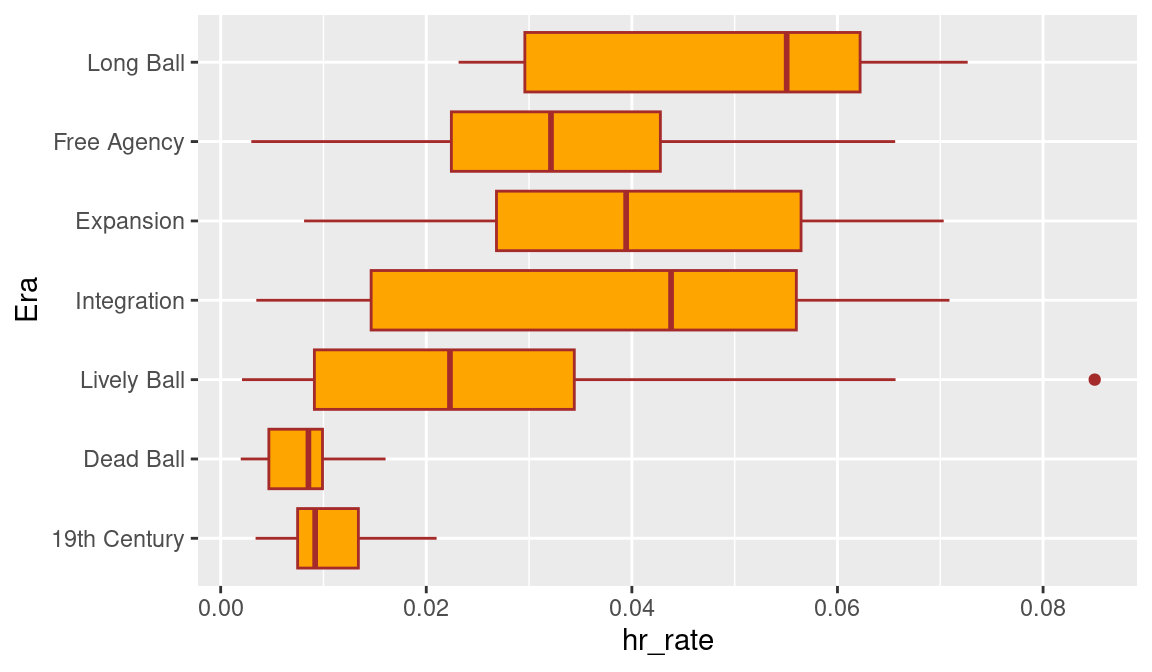
The parallel boxplot display is shown in Figure 3.14. Each rectangle in the display shows the location of the lower quartile, the median, and the upper quartile, and lines are drawn to the extreme values. Unusual points (outliers) that fall far from the rest of the distribution are indicated by points outside the boxes. This graph confirms the observations we made when we viewed the stripchart display. Home run hitting was low in the first two eras and started to increase in the Lively Ball era. It is interesting that the only outlier among these Hall of Famers was Babe Ruth’s career home run rate of 0.085.
3.7 Comparing Ruth, Aaron, Bonds, and A-Rod
In Chapter 1, we constructed a graph comparing the career home run trajectories of four great sluggers in baseball history. In this section, we describe how we used R to create this graph. First, we need to load in the relevant data into R. Next, we need to construct data frames containing the home run and age data for the sluggers. Last, we use R functions to construct the graph.
3.7.1 Getting the data
To obtain the graph, we need to collect the number of home runs, at-bats, and the age for each season of each slugger’s career. From the Lahman package, the relevant data frames are People and Batting. From the data frame People, we obtain the player ids and birth years for the four players. The Batting data frame is used to extract the home run and at-bats information.
We begin by reading in the Lahman package.
From the People data frame, we wish to extract the player id and the birth year for a particular player.
- The
filter()function is used to extract the rows in thePeopledata frame matching each player’s id. - In Major League Baseball, a player’s age for a season is defined to be his age on June 30. So we make a slight adjustment to a player’s birth year depending if his birthday falls in the first six months or not. The adjusted birth year is stored in the variable
mlb_birthyear. (Theif_else()function is useful for assignments based on a condition; ifbirthMonth >= 7isTRUE, thenbirthyear <- birthYear + 1, otherwisebirthyear <- birthyear.)
The PlayerInfo data frame contains information for the sluggers Babe Ruth, Hank Aaron, Barry Bonds, and Alex Rodriguez.
3.7.2 Creating the player data frames
Now that we have the player id codes and birth years, we use this information together with the Lahman batting data frame Batting to create data frames for each of these four players. One of the variables in the batting data frame is playerID. To get the batting and age data for Babe Ruth, we use the inner_join() function to match the rows of the batting data to those corresponding in the PlayerInfo data frame where playerID is equal. We create a new variable Age defined to be the season year minus the player’s birth year. (Recall that we made a slight modification to the birthyear variable so that one obtains a player’s correct age for a season.) Last, for each player, we use the cumsum() function on the grouped data to create a new variable cHR containing the cumulative count of home runs for each player each season.
3.7.3 Constructing the graph
We want to plot the cumulative home run counts for each of the four players against age. In the data frame HR_data the relevant variables are cHR, Age, and Player.
We use the geom_line() function to graph the cumulative home run counts against age. By mapping the color aesthetic to the Player variable, distinct cumulative home run lines are drawn for each player. Note that different colors are used for the four players and a legend is automatically constructed that matches up the line type with the player’s name. The scale_color_manual function allows us to specify the set of colors to use in the plot. In this case, the vector crc_fc contains an ordered set of pre-defined colors.
ggplot(HR_data, aes(x = Age, y = cHR, color = Player)) +
  geom_line() +
  scale_color_manual(values = crc_fc)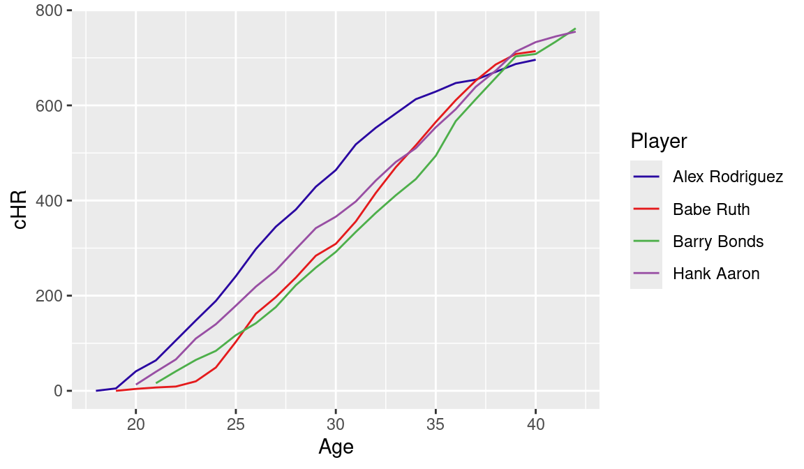
Figure 3.15 displays the completed graph.
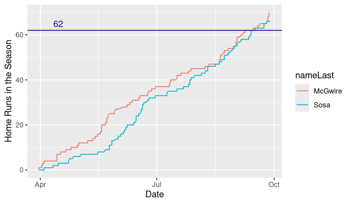
3.8 The 1998 Home Run Race
The Retrosheet play-by-play files are helpful for learning about patterns of player performance during a particular baseball season. We illustrate the use of R to read in the files for the 1998 season and graphically view the famous home run duel between Mark McGwire and Sammy Sosa.
3.8.1 Getting the data
We begin by reading in the 1998 play-by-play data and storing it in the data frame retro1998. See Section A.1.3 for information about how to create this file.
In the play-by-play data, the variable bat_id gives the identification code for the player who is batting. To extract the batting data for McGwire and Sosa, we need to find the codes for these two players available in the Lahman People data frame. By use of the filter() function, we find the id code where nameFirst = "Sammy" and nameLast = "Sosa". Likewise, we find the id code corresponding to Mark McGwire; these codes are stored in the variables sosa_id and mac_id.
Now that we have the player id codes, we extract McGwire’s and Sosa’s plate appearance data from the play-by-play data frame retro1998. These data are stored in the data frame hr_race.
3.8.2 Extracting the variables
For each player, we are interested in collecting the current number of home runs hit for each plate appearance and graphing the date against the home run count. For each player, the two important variables are the date and the home run count. We write a new function cum_hr() that will extract these two variables given a player’s play-by-play batting data.
In the play-by-play data frame, the variable game_id identifies the game location and date. For example, the value game_id of ARI199805110 indicates that this particular play occurred at the game played in Arizona on May 11, 1998. (The variable is displayed in the “location, year, month, day” format.) Using the str_sub() function, we select the 4th through 11th characters of this string variable and assign this date to the variable Date. (The ymd() function converts the date to the more readable “year-month-day” format, and forces R to recognize it as a Date.) Using the arrange() function, we sort the play-by-play data from the beginning to the end of the season. The variable event_cd contains the outcome of the batting play; a value event_cd of 23 indicates that a home run has been hit. We define a new variable HR to be either 1 or 0 depending if a home run occurred, and the new variable cumHR records the cumulative number of home runs hit in the season using the cumsum() function. The output of the function is a new data frame containing each date and the cumulative number of home runs to date for all plate appearances during the season.
After grouping the hr_race data frame by player, and collecting the corresponding player ids, we use the group_split() and map() functions to iterate cum_hr() twice, once on Sosa’s batting data and once on McGwire’s batting data, obtaining the new data frame hr_ytd.
hr_grouped <- hr_race |>
  group_by(bat_id)

keys <- hr_grouped |>
  group_keys() |>
  pull(bat_id)

hr_ytd <- hr_grouped |>
  group_split() |>
  map(cum_hr) |>
  set_names(keys) |>
  bind_rows(.id = "bat_id") |>
  inner_join(People, by = c("bat_id" = "retroID"))
3.8.3 Constructing the graph
Once this new data frame is created, it is straightforward to produce the graph of interest. The geom_line() function constructs a graph of the cumulative home run count against the date. By mapping nameLast to the color aesthetic, the lines corresponding to the two players are drawn using different colors. We use the geom_hline() function to add a horizontal line at the home run value of 62 and the annotate() function is applied to place the text string “62” above this plotted line (see Figure 3.16).
3.9 Further Reading
A good reference to the traditional graphics system in R is Murrell (2006). Kabacoff (2010) together with the Quick-R website at https://www.statmethods.net provide a useful reference for specific graphics functions. Chapter 4 of Albert and Rizzo (2012) provides a number of examples of modifying traditional graphics in R such as changing the plot type and symbol, using color, and overlying curves and mathematical expressions. Wickham, Çetinkaya-Rundel, and Grolemund (2023), Baumer, Kaplan, and Horton (2021) and Ismay and Kim (2019) all discuss the use of ggplot2 for creating data graphics.
3.10 Exercises
1. Hall of Fame Pitching Dataset
The hof_pitching data frame in the abdwr3edata package contains the career pitching statistics for all of the pitchers inducted in the Hall of Fame. The variable BF is the number of batters faced by a pitcher in his career. Suppose we group the pitchers by this variable using the intervals (0, 10,000), (10,000, 15,000), (15,000, 20,000), (20,000, 30,000). One can reexpress the variable BF to the grouped variable BF_group by use of the cut() function.
- Construct a frequency table of
BF.groupusing thesummarize()function. - Construct a bar graph of the output from
summarize(). How many HOF pitchers faced more than 20,000 pitchers in their career? - Construct an alternative graph of the
BF.groupvariable. Compare the effectiveness of the bar graph and the new graph in comparing the frequencies in the four intervals.
2. Hall of Fame Pitching Dataset (Continued)
The variable WAR is the total wins above replacement of the pitcher during his career.
Using the
geom_histogram()function, construct a histogram ofWARfor the pitchers in the Hall of Fame dataset.There are two pitchers who stand out among all of the Hall of Famers on the total
WARvariable. Identify these two pitchers.
3. Hall of Fame Pitching Dataset (Continued)
To understand a pitcher’s season contribution, suppose we define the new variable WAR_Season defined by
hofpitching <- hofpitching |>
mutate(WAR_Season = WAR / Yrs)- Use the
geom_point()function to construct parallel one-dimensional scatterplots ofWAR.Seasonfor the different levels ofBP.group. - Use the
geom_boxplot()function to construct parallel boxplots ofWAR.SeasonacrossBP.group. - Based on your graphs, how does the wins above replacement per season depend on the number of batters faced?
4. Hall of Fame Pitching Dataset (Continued)
Suppose we limit our exploration to pitchers whose mid-career was 1960 or later. We first define the MidYear variable and then use the filter() function to construct a data frame consisting of only these 1960+ pitchers.
- By use of the
arrange()function, order the rows of the data frame by the value ofWAR_Season. - Construct a dot plot of the values of
WAR_Seasonwhere the labels are the pitcher names. - Which two 1960+ pitchers stand out with respect to wins above replacement per season?
5. Hall of Fame Pitching Dataset (Continued)
The variables MidYear and WAR_Season are defined in the previous exercises.
- Construct a scatterplot of
MidYear(horizontal) againstWAR_Season(vertical). - Is there a general pattern in this scatterplot? Explain.
- There are two pitchers whose mid careers were in the 1800s who had relatively low
WAR_Seasonvalues. By use of thefilter()andgeom_text()functions, add the names of these two pitchers to the scatterplot.
6. Working with the Lahman Batting Dataset
- Read the Lahman
PeopleandBattingdata frames into R. - Collect in a single data frame the season batting statistics for the great hitters Ty Cobb, Ted Williams, and Pete Rose.
- Add the variable
Ageto each data frame corresponding to the ages of the three players. - Using the
geom_line()function, construct a line graph of the cumulative hit totals against age for Pete Rose. - Using the
geom_line()function, overlay the cumulative hit totals for Cobb and Williams. - Write a short paragraph summarizing what you have learned about the hitting pattern of these three players.
7. Working with the Lahman Teams Dataset
The Lahman Teams dataset contains yearly statistics and standing information for all teams in MLB history.
- Read the
Teamsdata frame into R. - Create a new variable
win_pctdefined to be the team winning percentageW / (W + L). - For the teams in the 2022 season, construct a scatterplot of the team ERA and its winning percentage.
- Use the
geom_mlb_scoreboard_logos()function from the mlbplotR package to put the team logos on the scatterplot as plotting marks.
Use this function to redo the graph in part (c), plotting using the team logos.
8. Working with the Retrosheet Play-by-Play Dataset
In Section 3.8, we used the Retrosheet play-by-play data to explore the home run race between Mark McGwire and Sammy Sosa in the 1998 season. Another way to compare the patterns of home run hitting of the two players is to compute the spacings, the number of plate appearances between home runs.
Following the work in Section 3.8, create the two data frames
mac_dataandsosa_datacontaining the batting data for the two players.Use the following R commands to restrict the two data frames to the plays where a batting event occurred. (The relevant variable
bat_event_flis eitherTRUEorFALSE.)
- For each data frame, create a new variable
PAthat numbers the plate appearances 1, 2, … (The functionnrow()gives the number of rows of a data frame.)
- The following commands will return the numbers of the plate appearances when the players hit home runs.
- Using the R function
diff(), the following commands compute the spacings between the occurrences of home runs.
Create a new data frame HR_Spacing with two variables, Player, the player name, and Spacing, the value of the spacing. f. By use of the summarize() and geom_histogram() functions on the data frame HR_Spacing, compare the home run spacings of the two players.