In this chapter we explore the effect of the ball/strike count on the behavior of players and umpires and on the final outcome of a plate appearance. We use Retrosheet data from the 2016 season to estimate how the ball/strike count affects the run expectancy. We also use Statcast data to explore how one pitcher modifies his pitch selection, how one batter alters his swing zone, and how umpires judge pitches based on the count. Along the way, we introduce functions for string manipulation that are useful for managing the pitch sequences from the Retrosheet play-by-play files. Level plots and contour plots, created with the use of the ggplot2 package, will be used for the explorations of batters’ swing tendencies and umpires’ strike zones.
6.2 Hitter’s Counts and Pitcher’s Counts
When watching a broadcast of a baseball game, one often hears an announcer’s concern for a pitcher who is repeatedly “falling behind” in the count, or his/her anticipation for a particular pitch because it’s a “hitter’s count” and the batter has a chance to do some damage. We will see if there is actual evidence that the so-called hitter’s count really leads to more favorable outcomes for batters, while “getting ahead” in the count (a pitcher’s count) is beneficial for pitchers.
6.2.1 An example for a single pitcher
The Baseball-Reference1 website provides various splits for every player—in particular, it gives splits by ball/strike counts for all seasons since 1988. We find Mike Mussina’s split statistics by entering the player’s profile page (typing “Mussina” on the search box brings one there), clicking on the “Splits” tab in the “Standard Pitching” table, and clicking on “Career” (or whatever season we are interested in) on the pop-up menu that appears. One finds the “Count Balls/Strikes” table scrolling down on the splits page. Alternatively, the table can be reached by a direct link: in this case the career splits by count for Mike Mussina are currently available at http://www.baseball-reference.com/players/split.fcgi?id=mussimi01&year=Career&t=p#count.
The first series of lines (from “First Pitch” to “Full Count”) shows the statistics for events happening in that particular count. Thus, for example, a batting average (BA) of .338 on 1-0 counts indicates batters hit safely 34% of the time when putting the ball in play on a 1-0 count against Mussina. We are more interested in the second group of rows, those beginning with the word “After”. In fact, in these cases the statistics are relative to every plate appearance that goes through that count. Thus a .337 on-base percentage (OBP) after 1-0 means that, whenever Mike Mussina started a batter with a ball, the batter successfully got on base 34% of the time, no matter how many pitches it took to end the plate appearance.
The last column on every table in the splits page is tOPS+. It’s an index for comparing the player’s OPS in that particular situation (the sum of on-base percentage and slugging percentage2) to his overall rself_index(“OPS”)`. A value over 100 is interpreted as a higher OPS in the situation compared to his OPS on all counts; conversely, values below 100 indicate a OPS value that is lower than his overall OPS.
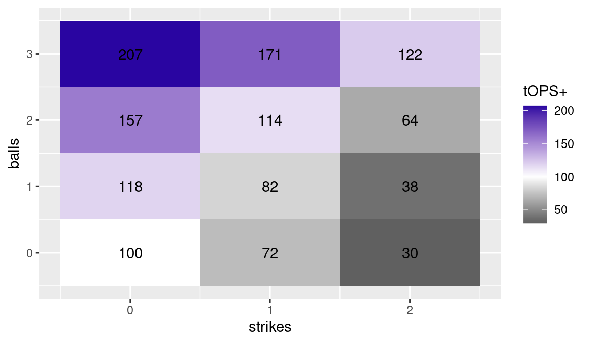
Figure 6.1 uses a heat map to display Mussina’s tOPS+ through the various counts. If one focuses on a particular number of strikes (moving up vertically), a higher number of balls in the count makes the outcome more likely to be favorable to the hitter (darker shades). Conversely, if one fixes the number of balls (moving right horizontally), the balance moves towards the pitcher (lighter shades) as one increases the number of strikes.
Figure 6.1 emphasizes the importance from a pitcher’s perspective of beginning the duel with a strike. When Mussina fell behind 1-0 in his career, batters performed 18% better than usual in the plate appearance; conversely, after a first pitch strike, they were limited to 72% of their potential performance.
How is the heat map display of Figure 6.1 created in R? First we prepare a data frame mussina with all the possible balls/strikes counts, using the expand_grid() function as previously illustrated in Section 4.5. We then add a new variable value with the tOPS+ values taken from the Baseball-Reference website.
NA # A tibble: 12 × 3
NA    balls strikes value
NA    <int>   <int> <dbl>
NA  1     0       0   100
NA  2     0       1    72
NA  3     0       2    30
NA  4     1       0   118
NA  5     1       1    82
NA  6     1       2    38
NA  7     2       0   157
NA  8     2       1   114
NA  9     2       2    64
NA 10     3       0   207
NA 11     3       1   171
NA 12     3       2   122
We create a ggplot2 called count_plot by mapping strikes to the x aesthetic, balls to the y aesthetic, and fill color to the value. The tiles that we draw are colored based on this value. We use the scale_fill_gradient2() function to set a diverging color palette for the value of tOPS+. Since 100 is a neutral value, we set that to the midpoint and assign that value to the color white. For reasons that will become clear later on, we round the labels displayed in each tile (even though they are integers!).
count_plot<-mussina|>ggplot(aes(x =strikes, y =balls, fill =value))+geom_tile()+geom_text(aes(label =round(value, 3)))+scale_fill_gradient2("tOPS+", low ="grey10", high =crcblue, mid ="white", midpoint =100)count_plot
Figure 6.1: Heat map of tOPS+ for Mike Mussina through each ball/strike count. Data from Baseball-Reference website.
6.2.2 Pitch sequences from Retrosheet
From viewing Figure 6.1, we obtain an initial view of hitter’s counts (darker shades) and pitcher’s counts (lighter shades) on the basis of offensive production. However this figure is based on data for a single pitcher—does a similar pattern emerge when using league-wide data?
Retrosheet provides pitch sequences beginning with the 1988 season. Sequences are stored in strings such as FBSX. Each character encodes the description of a pitch. In this example, the pitch sequence is a foul ball (F), followed by a ball (B), a swinging strike (S), and the ball put into play (X). Table 6.1 provides the description for every code used in Retrosheet pitch sequences.3
Table 6.1: Pitch codes used by Retrosheet.
Symbol
Description
+
following pickoff throw by the catcher
*
indicates the following pitch was blocked by the catcher
.
marker for play not involving the batter
1
pickoff throw to first
2
pickoff throw to second
3
pickoff throw to third
>
indicates a runner going on the pitch
B
ball
C
called strike
F
foul
H
hit batter
I
intentional ball
K
strike (unknown type)
L
foul bunt
M
missed bunt attempt
N
no pitch (on balks and interference calls)
O
foul tip on bunt
P
pitchout
Q
swinging on pitchout
R
foul ball on pitchout
S
swinging strike
T
foul tip
U
unknown or missed pitch
V
called ball because pitcher went to his mouth
X
ball put into play by batter
Y
ball put into play on pitchout
6.2.2.1 Functions for string manipulation
Sequence strings from Retrosheet often require some initial processing before they can be suitably analyzed. In this section we provide a quick tutorial on some R functions for the manipulation of strings. Readers not interested in string manipulation functions may skip to Section 6.2.3.
The function str_length() returns the number of characters in a string. This function is helpful for obtaining the number of pitches delivered in a Retrosheet pitch sequence. For example, the number of pitches in the sequence BBSBFFFX is given by
str_length("BBSBFFFX")
NA [1] 8
However, as indicated in Table 6.1, there are some characters in the Retrosheet strings denoting actions that are not pitches, such as pickoff attempts.
The functions str_which() and str_detect() are used to find patterns within elements of character vectors. The function str_which() returns the indices of the elements for which a match is found, and the function str_detect() returns a logical vector, indicating for each element of the vector whether a match is found. For both functions, the first argument is the the vector of strings where matches are sought and the second argument is the string pattern to search for. For example, we apply the two functions to the vector of pitch sequences sequences to search for pickoff attempts to first base denoted by the code 1.
The function str_which() tells us that “1” is contained in the second (2) and third (3) components of the character vector sequences, and str_detect() outputs this same information by means of a logical vector.
The pattern to search for does not have to be a single character. In fact, it can be any regular expression. For example we may want to look for consecutive pickoff attempts to first, which is the pattern “11”. The output below shows that “11” is contained in the second component of sequences.
str_detect(sequences, "11")
NA [1] FALSE TRUE FALSE
The function str_replace_all() allows for the substitution of the pattern found with a replacement. The replacement can be an empty string, in which case the pattern is simply removed[^str_remove]. In the code below, we use the function str_remove_all() to removes the pickoff attempts to first from the pitch sequences.
str_remove_all(sequences, "1")
NA [1] "BBX" "CBBCS" "X"
6.2.2.2 Finding plate appearances going through a given count
Since we are interested only in pitch counts, we should remove the characters not corresponding to actual pitches from the pitch sequences. Regular expressions are the computing tool needed for this particular task. While it’s beyond the scope of this book to fully explain how regular expressions work, we will instead show a few examples on how to use them.4
We begin by loading the retro2016.rds file containing Retrosheet’s play-by-play for the 2016 season using the read_rds() function. Please see Section A.1.3 for instructions on how to create the file retro2016.rds.
We use the str_remove_all() function to create the variable pseq of pitch sequences after removing the symbols from the Retrosheet pitch sequence variable pitch_seq_tx that don’t correspond to actual pitches.
In a regular expression, the square brackets indicate the collection of characters to search. The above code removes pickoff attempts at any base (1, 2, 3) either by the pitcher or the catcher (+), balks and interference calls (N), plays not involving the batter (.), indicators of runners going on the pitch (>), and of catchers blocking the pitch (*).5
We need another special character to identify the plate appearances that go through a 1-0 count. In a regular expression, the ^ character means the pattern has to be matched at the beginning of the string. Looking at Table 6.1 there are four different ways a ball can be coded (B, I, P, V). A plate appearance that goes though a 1-0 count must therefore begin with one of these characters. The following code creates the desired variable c10.
NA # A tibble: 10 × 3
NA    pitch_seq_tx c10   c01
NA    <chr>        <lgl> <lgl>
NA  1 BX           TRUE  FALSE
NA  2 X            FALSE FALSE
NA  3 SFS          FALSE TRUE
NA  4 BCX          TRUE  FALSE
NA  5 BSS*B1S      TRUE  FALSE
NA  6 BBX          TRUE  FALSE
NA  7 BCX          TRUE  FALSE
NA  8 CX           FALSE TRUE
NA  9 BCCS         TRUE  FALSE
NA 10 SBFX         FALSE TRUE
Writing regular expressions for every pitch count is a tedious task and we will refer the reader to Section A.3 for the full code.
6.2.3 Expected run value by count
In order to compute the expected runs values by count, we need to augment pbp2016 via three steps:
We need to compute the base-out state, based on the configuration of the baserunners and the number of outs, both for the beginning and end of the play. This process is identical to the one explicated in Section 5.3. To avoid duplication of code, in this chapter we use the function retrosheet_add_states(), which we put in the abdwr3edata package for this purpose.
Using the state computed above, we need to join the expected run matrix that we created in Section 5.3 for the 2016 season. This provides us with the expected run values for both the beginning and end states of each play.
We need to compute variables analogous to c01 and c10 as described above, but for each of the 12 possible counts. We have placed that code in the retrosheet_add_counts() function in the abdwr3edata package. See Section A.3 for more details on how to compute these new variables.
NA # A tibble: 5 × 15
NA   game_id event_id run_value c00   c10   c20   c11   c01   c30
NA   <chr>      <int>     <dbl> <lgl> <lgl> <lgl> <lgl> <lgl> <lgl>
NA 1 ANA201…        1     0.635 TRUE  TRUE  FALSE FALSE FALSE FALSE
NA 2 ANA201…        2    -0.196 TRUE  FALSE FALSE FALSE FALSE FALSE
NA 3 ANA201…        3    -0.565 TRUE  FALSE FALSE FALSE TRUE  FALSE
NA 4 ANA201…        4     0.848 TRUE  TRUE  FALSE TRUE  FALSE FALSE
NA 5 ANA201…        5    -0.220 TRUE  TRUE  FALSE TRUE  FALSE FALSE
NA # ℹ 6 more variables: c21 <lgl>, c31 <lgl>, c02 <lgl>,
NA #   c12 <lgl>, c22 <lgl>, c32 <lgl>
For example, the at-bat in the fourth line of the data frame (a two-out RBI single) started with a 1-0 count (value TRUE in column c10), then moved to the count 1-1, and finally generated a change in expected runs of 0.848. The pbp2016 data frame has all the necessary information to calculate the run values of the various balls/strikes counts, in the same way the value of a home run and of a single were calculated in Section 5.8.
As an illustration, we can measure the importance of getting ahead on the first pitch. We calculate the mean change in expected run value for at-bats starting with a ball and for the at-bats starting with a strike.
NA # A tibble: 2 × 4
NA # Groups:   c10 [2]
NA   c10   c01   num_ab mean_run_value
NA   <lgl> <lgl>  <int>          <dbl>
NA 1 FALSE TRUE   94106        -0.0394
NA 2 TRUE  FALSE  76165         0.0371
The conclusion is that the difference between a first pitch strike and a first pitch ball, as estimated with data from the 2016 season, is over 0.07 expected runs.
We can calculate the run value for each possible ball/strike count. First, we use the select() function and the starts_with() operator to grab only those columns that start with the letter c. In this case, this matches the columns c00, c01, etc. that we defined previously. Additionally, we grab the run_value column.
Now, we want to apply the group_by()-summarize() idiom that we used previously to calculate the mean run value across all of the 12 possible counts. One way to do this would be to write a function that will perform that operation for a given variable name, and then iterate over the 12 variable names, and indeed, that is the approach taken in the first edition of this book. Here, we employ an alternative strategy that is more in keeping with the tidyverse philosophy and involves much less code. However, it may be conceptually less intuitive.
pbp_counts has \(n =\) 190713 rows and \(p =\) 13 columns. The variable named run_value contains a measurement of runs, and the other 12 columns contain logical indicators as to whether the plate appearance passed through a particular count. Thus, we really have three different kinds of information in this data frame: a count, whether the plate appearance passed through that count, and the run value. To tidy these data (Wickham 2014), we need to create a long data frame with \(12n\) rows and those three columns. We do this using the pivot_longer() function. We provide a name to the names_to argument, which becomes the name of the new variable that records the count. Similarly, the values_to argument takes a name for the new variable that records the data that was in the column that was gathered. We don’t want to gather the run_value column, since that records a different kind of information.
NA # A tibble: 6 × 3
NA   run_value count passed_thru
NA       <dbl> <chr> <lgl>
NA 1    -0.346 c21   FALSE
NA 2     0.590 c10   TRUE
NA 3    -0.312 c22   FALSE
NA 4    -0.162 c22   FALSE
NA 5    -0.162 c30   FALSE
NA 6    -0.230 c32   FALSE
Note that every plate appearance appears \(p=12\) times in pbp_counts_tidy: one row for each count. To compute the average change in expected runs (i.e., the mean run value), we have to filter() for only those plate appearances that actually passed through that count. Then we simply apply our group_by()-summarize() operation as before. Thus, in the mean() operation, the data is limited to only those plate appearances that have gone through each particular ball-strike count.
run_value_by_count<-pbp_counts_tidy|>filter(passed_thru)|>group_by(count)|>summarize( num_ab =n(), value =mean(run_value))
Finally, we can then update our count_plot to use these new data instead of the old mussina data. To do this, we have to re-compute the balls and strikes based on the count variable. We can do this by picking out the values of balls and strikes using the str_sub() function. We use the scale_fill_gradient2() function again to reset our diverging palette to colors more appropriate for these data (i.e., a midpoint at 0).
NA Warning: <ggplot> %+% x was deprecated in ggplot2 4.0.0.
NA ℹ Please use <ggplot> + x instead.
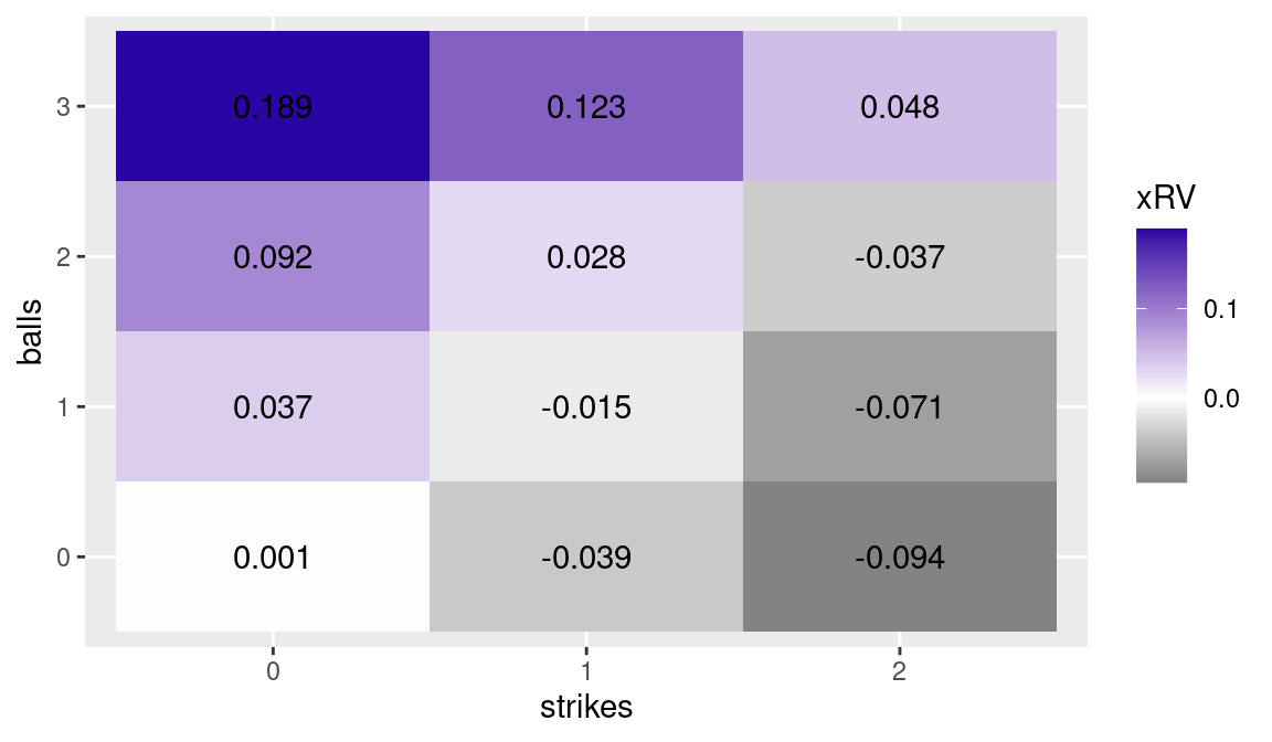
Figure 6.2: Average change in expected runs for plate appearances passing through each ball/strike count. Values estimated on data from the 2016 season.
By glancing at the values and color shades in Figure 6.2, one can construct reasonable definitions for the terms “hitter’s count” and “pitcher’s count”. Note that since all plate appearances pass through the 0-0 count, the average change in expected run value for this count is approximately 0. Ball/strike counts can be roughly divided in the following four categories6:
Pitcher’s counts: 0-2, 1-2, 2-2, 0-1;
Neutral counts: 0-0, 1-1;
Modest hitter’s counts: 3-2, 2-1, 1-0;
Hitter’s counts: 3-0, 3-1, 2-0.
6.2.4 The importance of the previous count
In the previous section we calculated run values for any ball/strike count. In performing this calculation we simply looked at whether a plate appearance went through a particular count, without considering how it got there. In other words, we considered, for example, all the at-bats going through a 2-2 count as having the same run expectancy, no matter if the pitcher started ahead 0-2 or fell behind 2-0. The implicit assumption in these calculations is that the previous counts have no influence on the outcome on a particular count7. However, a pitcher who got ahead 0-2 is likely to “waste some pitches”. That is, he would likely throw a few balls out of the strike zone with the sole intent of inducing the batter (who cannot afford another strike) to swing at them and possibly miss or make poor contact. On the other hand, with a plate appearance starting with two balls, the batter has the luxury of not swinging at strikes in undesirable locations and waiting for the pitcher to deliver a pitch of his liking.
Given the above discussion, it would seem that the run expectancy on a 2-2 count would be higher if the plate appearance started with two balls than if the pitcher started with a 0-2 count. Let’s investigate if there is numerical evidence to actually support this conjecture.
We begin by taking the subset of plays from the 2016 season that went through a 2-2 count and calculating their mean change in expected run value.
NA # A tibble: 1 × 2
NA   num_ab mean_run_value
NA    <int>          <dbl>
NA 1  44254        -0.0368
Using the case_when() function, we create a new variable after2 denoting the ball/strike count after two pitches and calculate the mean run value for each of the three possible levels of after2.
NA # A tibble: 3 × 3
NA   after2 num_ab mean_run_value
NA   <chr>   <int>          <dbl>
NA 1 0-2      9837        -0.0311
NA 2 1-1     28438        -0.0376
NA 3 2-0      5979        -0.0422
The above results appear to imply that plate appearances going through a 2-2 count after having started with two strikes are more favorable to the batter than those beginning with two balls.
This result should be considered in light of multiple types of potential selection bias. Many plate appearances starting with two strikes end without ever reaching the 2-2 count, in most cases with an unfavorable outcome for the batter.8 The plate appearances that survive a 0-2 count reaching 2-2 are hardly a random sample of all the plate appearances. Hard-to-strike-out batters are likely over-represented in such a sample, as well as pitchers with good fastball command (to get ahead 0-2), but weak secondary pitches (to finish off batters).
Similarly, comparing the paths leading to 1-1 counts yields results in line with common sense.
NA # A tibble: 2 × 3
NA   after2 num_ab mean_run_value
NA   <chr>   <int>          <dbl>
NA 1 0-1     38759        -0.0122
NA 2 1-0     36467        -0.0176
The numbers above suggest that after reaching a 1-1 count, the batter is expected to perform slightly worse if the first pitch was a ball than if it was a strike.
6.3 Behaviors by Count
In this section we explore how the roles of three individuals in the pitcher-batter duel are affected by the ball/strike count. How does a batter alter his swing when ahead or behind in the count? How does a pitcher vary his mix of pitches according to the count? Does an umpire (consciously or unconsciously), shrink or expand his strike zone depending on the pitch count?
We provide an R data file (a file with extension .Rdata) containing all the datasets used in this section. Once the file is loaded into R, the data frames cabrera, sanchez, umpires, and verlander are visible by use of the ls() function.9
These datasets contain pitch-by-pitch data, including the location of pitches as recorded by Sportvision’s PITCHf/x system. The cabrera data frame contains four years of batting data for 2012 American League Triple Crown winner Miguel Cabrera. The data frame umpires has information about every pitch thrown in 2012 where the home plate umpire had to judge whether it crossed the strike zone. The verlander data frame has four years of pitching data for 2016 Cy Young Award and MVP recipient Justin Verlander.
6.3.1 Swinging tendencies by count
We saw in Section 6.2 that batters perform worse when falling behind in the count. For example, when there are two strikes in the count, the batter may be forced to swing at pitches he would normally let pass by to avoid being called out on strikes. Using PITCHf/x data, we explore how a very good batter like Miguel Cabrera alters his swinging tendencies according to the ball/strike count.
6.3.1.1 Propensity to swing by location
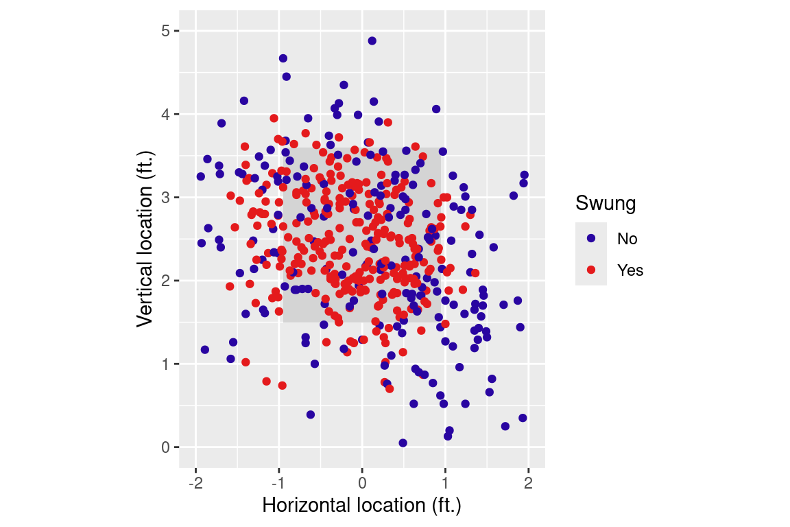
In this section we focus on the relationships between the variables balls and strikes indicating the count on the batter, the variables px and pz identifying the pitch location as it crosses the front of the plate, and the swung binary variable, denoting whether or not the batter attempted a swing on the pitch.
Figure 6.3: Scatterplot of Miguel Cabrera’s swinging tendency by location. Sample of 500 pitches. View from the catcher’s perspective.
Rather than plot all 6265 pitches, we use the sample_n() function to simplify matters by taking a random sample of 500 pitches. This reduces overlapping in the scatterplot without introducing bias. From Figure 6.3, one can see that Cabrera is less likely to swing at pitches delivered farther away from the strike zone (the black box). However, it is difficult to determine Cabrera’s preferred pitch location from this figure.
A contour plot is an effective alternative method to visualize batters’ swinging preferences. This type of plot is used to visualize three-dimensional data in two dimensions. Widely used in cartography and meteorology, the contour plot usually features spatial coordinates as the first two variables, while the third variable (which can be, for example, elevation in cartography or barometric pressure in meteorology) is plotted as a contour line, also called an isopleth. The contour line is a curve joining points sharing equal values of the third variable.
As a first step in producing a contour plot, we fit a smooth polynomial surface to the response variable swung as a function of the horizontal and vertical locations px and pz using the loess() function. The output of this fit is stored in the object miggy_loess.
miggy_loess<-loess(swung~px+pz, data =cabrera, control =loess.control(surface ="direct"))
After the surface has been fit, we are interested in predicting the likelihood of a swing by Cabrera at various pitch locations. Using the expand_grid() function, we build a data frame consisting of combinations of horizontal locations from \(-2\) (two feet to the left of the middle of home plate) to +2 (two feet to the right of the middle of the plate) and vertical locations from the ground (value of zero) to six feet of height, using subintervals of 0.1 feet. Using the predict() function, we obtain the likelihood of Miguel’s swinging at every location in the data frame. Note that because predict() returns a matrix, we use the as.numeric() function to convert the fitted values into a numeric vector.
pred_area<-expand_grid( px =seq(-2, 2, by =0.1), pz =seq(0, 6, by =0.1))pred_fits<-miggy_loess|>predict(newdata =pred_area)|>as.numeric()pred_area_fit<-pred_area|>mutate(fit =pred_fits)
To spot check, we examine in the data frame pred_area_fit the likelihood that Cabrera will swing for three different hand-picked locations—a pitch down the middle and two and a half feet from the ground (“down Broadway”, a ball that hits the ground in the middle of the plate (“ball in the dirt”), and another one delivered at mid-height (2.5 feet from the ground) but way outside (two feet from the middle of the plate). In each case, we use the filter() function to take a subset of the prediction data frame pred_area_fit with specific values of the horizontal and vertical locations px and pz.
pred_area_fit|>filter(px==0&pz==2.5)# down Broadway
NA # A tibble: 1 × 3
NA      px    pz   fit
NA   <dbl> <dbl> <dbl>
NA 1     0   2.5 0.844
pred_area_fit|>filter(px==0&pz==0)# ball in the dirt
NA # A tibble: 1 × 3
NA      px    pz   fit
NA   <dbl> <dbl> <dbl>
NA 1     0     0 0.154
NA # A tibble: 1 × 3
NA      px    pz    fit
NA   <dbl> <dbl>  <dbl>
NA 1     2   2.5 0.0783
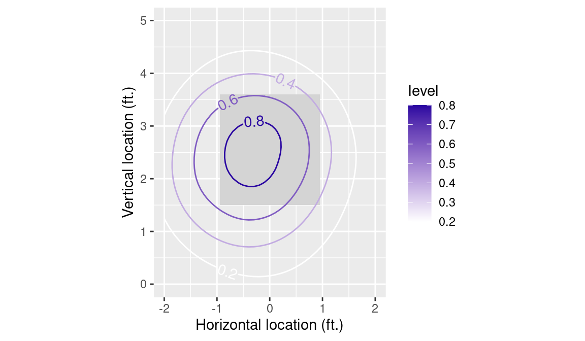
The results are quite consistent with what one would expect: the pitch right in the heart of the strike zone induces Cabrera to swing more than 80 percent of the time, while the ball in the dirt and the ball outside generate a swing at 15 percent and 8 percent rates, respectively.
We construct a contour plot of the likelihood of the swing as a function of the horizontal and vertical locations of the pitch using the geom_contour2() function in the metR package. For logical consistency, we filter() for only those contours corresponding to swing probabilities between 0 and 1. Figure 6.4 shows the resulting contour plot.
cabrera_plot<-k_zone_plot%+%filter(pred_area_fit, fit>=0, fit<=1)+metR::geom_contour2(aes( z =fit, color =after_stat(level), label =after_stat(level)), binwidth =0.2, skip =0)+scale_color_gradient(low ="white", high =crcblue)cabrera_plot
Figure 6.4: Contour plot of Miguel Cabrera’s swinging tendency by location, where the view is from the catcher’s perspective. The contour lines are labeled by the probability of swinging at the pitch.
As expected, the likelihood of a swing decreases the further the ball is delivered from the middle of the strike zone. The plot also shows that Cabrera has a tendency to swing at pitches on the inside part of the plate.
6.3.1.2 Effect of the ball/strike count
Figure 6.4 reports Cabrera’s swinging tendency over all pitch counts. Can we visualize how Cabrera varies his approach according to the ball/strike count? Specifically, does Cabrera become more selective when he is ahead and can afford to wait for a pitch of his liking and, conversely, does he “expand his zone” when there are two strikes and he cannot allow another called strike go by? We described the process of calculating the swing propensity by location in Section 6.3.1.1. Here, we generalize that procedure and iterate it over all counts.
In this case, we restrict our interest to 0-0, 0-2, and 2-0 counts. The vector counts contains these values. Next, we split the cabrera data frame into a list with three elements: one data frame for each of the chosen counts. We accomplish this by filter()-ing for those counts and using the group_split() function to do the splitting. Note that the resulting count_dfs object is a list of three data.frames.
Next, we use the map() function repeatedly to iterate our analysis over the elements of count_dfs. First, we compute the LOESS fits for a given set of data specific to the count using loess(). Second, we use predict() to compute three sets of predictions—one for each of the three counts. Third, we convert the numeric matrices returned by predict() to numeric vectors called fit, and append them to the pred_area data frame. Fourth, we use set_names() to link the counts with their corresponding data frames. Finally, we stitch all three data frames together using list_rbind(), and add variables for the count, number of balls, and number of strikes.
count_fits<-count_dfs|>map(~loess(swung~px+pz, data =.x, control =loess.control(surface ="direct")))|>map(predict, newdata =pred_area)|>map(~tibble(pred_area, fit =as.numeric(.x)))|>set_names(nm =counts)|>list_rbind(names_to ="count")|>mutate( balls =str_sub(count, 1, 1), strikes =str_sub(count, 3, 3))
This process performs the same tasks that we did before: it fits a LOESS model to the pitch location data, then uses that model to generate swing probability predictions across the entire area and returns a tibble with the associated ball and strike count.
We can then use a facet_wrap() to show the contour plots on separate panels to compare Cabrera’s swinging tendencies by pitch count (see Figure 6.5). To improve legibility, we only show the 20%, 40%, and 60% contours.
Figure 6.5: Contour plots of Miguel Cabrera’s swinging tendency by selected ball/strike counts, viewed from the catcher’s perspective. The contour lines are labeled by the probability of swinging at the pitch.
As expected, Cabrera expands his swing zone when behind 0-2 (his 40% contour line on 0-2 counts has an area comparable to his 20% contour line on 0-0 counts). The third panel in Figure 6.5 is comprised of a relatively low sample size and probably does not tell us much.
6.3.2 Pitch selection by count
We now move to the other side of the pitcher/batter duel in our investigation of the effect of the count. Pitchers generally possess arsenals of two to five different pitch types. All pitchers have a fastball at their disposal, which is generally a pitch that is easy to throw to a desired location. So-called secondary pitches, such as curve balls or sliders, while often effective (especially when hitters are not expecting them), are harder to control and rarely used by pitchers behind in the count. In this section we look at one pitcher (arguably one of the best in MLB at the time) and explore how he chooses from his pitch repertoire according to the ball/strike count.
The verlander data frame, consisting of over 15 thousand observations, consists of pitch data for Justin Verlander for four seasons. Using the group_by() and summarize() commands, we obtain a frequency table of the types of pitches Verlander threw from 2009–2012. In this case, we compute the pitch type proportions in addition to their frequencies.
NA # A tibble: 5 × 3
NA   pitch_type     N    pct
NA   <fct>      <int>  <dbl>
NA 1 FF          6756 0.441
NA 2 CU          2716 0.177
NA 3 CH          2550 0.167
NA 4 FT          2021 0.132
NA 5 SL          1264 0.0826
As is the case with most major league pitchers, Verlander throws his fastball most frequently. He uses two variations of a fastball: a four-seamer (FF) and a two-seamer (FT). He complements his fastballs with a curve ball (CU), a change-up (CH), and a slider (SL).
We see in the table that 44% of Verlander’s pitches during this four-season period were four-seam fastballs.
Before moving to exploring pitch selection by ball/strike count, we compute a frequency table to explore the pitch selection by batter handedness. The pivot_wider() function helps us display the results in a wide rather than long format.
NA # A tibble: 5 × 5
NA   pitch_type     L     R  L_pct  R_pct
NA   <fct>      <int> <int>  <dbl>  <dbl>
NA 1 CH          2024   526 0.228  0.0817
NA 2 CU          1529  1187 0.172  0.184
NA 3 FF          3832  2924 0.432  0.454
NA 4 FT          1303   718 0.147  0.111
NA 5 SL           178  1086 0.0201 0.169
Note that Verlander’s pitch selection is quite different depending on the handedness of the opposing batter. In particular, the right-handed Verlander uses his changeup nearly a quarter of the time against left-handed hitters, but only eight percent of the time against right-handed hitters. Conversely the slider is nearly absent from his repertoire when he faces lefties, while he uses it close to one out of six times against righties.
Batter-hand differences in pitch selection are common among major league pitchers and they exist because the effectiveness of a given pitch depends on the handedness of the pitcher and the batter. The slider and change-up comparison is a typical example, a slider is very effective against batters of the same handedness while a change-up can be successful when facing opposite-handed batters.
We can also explore Verlander’s pitch selection by pitch count as well as batter handedness. In the following code, the filter() function is used to select Verlander’s pitches delivered to right-handed batters. The rest of the code constructs a table of frequencies by count and pitch type. The across() function helps to divide each numeric variable by the total number of pitches.
NA # A tibble: 12 × 7
NA # Groups:   balls, strikes [12]
NA    balls strikes     CH     CU    FF     FT     SL
NA    <int>   <int>  <dbl>  <dbl> <dbl>  <dbl>  <dbl>
NA  1     0       0 0.0692 0.115  0.526 0.156  0.134
NA  2     0       1 0.0624 0.242  0.405 0.101  0.189
NA  3     0       2 0.158  0.282  0.274 0.0629 0.223
NA  4     1       0 0.0493 0.107  0.523 0.112  0.209
NA  5     1       1 0.0805 0.238  0.398 0.0960 0.187
NA  6     1       2 0.143  0.327  0.278 0.0617 0.191
NA  7     2       0 0.0174 0.0174 0.703 0.145  0.116
NA  8     2       1 0.0623 0.0796 0.512 0.142  0.204
NA  9     2       2 0.102  0.294  0.357 0.0869 0.161
NA 10     3       0 0.0833 0      0.812 0.104  0
NA 11     3       1 0.0196 0      0.784 0.118  0.0784
NA 12     3       2 0.0429 0.0429 0.693 0.116  0.106
The effect of the ball/strike count on the choice of pitches is apparent when comparing pitcher’s counts and hitter’s counts. When behind 2-0, Verlander uses his four-seamer seven times out of ten; the percentage goes up to 78% when trailing 3-1 and 81% on 3-0 counts. Conversely, when he has the chance to strike the batter out, the use of the four-seamer diminishes. In fact he throws it less than 30 percent of the time both on 0-2 and 1-2 counts. On a full count, Verlander’s propensity to throw his fastball is similar to those of hitters’ counts—this is consistent with the numbers in Figure 6.2 that indicate the 3-2 count being slightly favorable to the hitter. One can explore Verlander’s choices by count when facing a left-handed hitter by simply changing R to L in the code above.
6.3.3 Umpires’ behavior by count
Hardball Times author John Walsh wrote a 2010 article titled The Compassionate Umpire in which he showed that home plate umpires tend to modify their ball/strike calling behavior by slightly favoring the player who is behind in the count (Walsh 2010). In other words, umpires tend to enlarge their strike zone in hitter’s counts and to shrink it when pitchers are ahead. In this section we visually explore Walsh’s finding by plotting contour lines for three different ball/strike counts.
The umpires data frame is similar to those of verlander and cabrera. A sample of its contents—obtained using the sample_n() function—is shown in Table 6.2.
sample_n(umpires, 20)
The data consist of every pitch of the 2012 season for which the home plate umpire had to judge whether it crossed the strike zone. Additional columns not present in either the verlander or the cabrera data frames identify the name of the umpire (variable umpire) and whether the pitch was called for a strike (variable called_strike).
Table 6.2: A twenty row sample of the umpires dataset.
Umpire
batter_hand
balls
strikes
px
pz
called_strike
Andy Fletcher
R
1
0
0.00
1.88
1
Derryl Cousins
R
1
0
0.17
1.06
0
Gerry Davis
R
2
1
-0.83
1.91
1
Fieldin Culbreth
R
0
1
0.85
0.54
0
Brian O’Nora
L
0
0
0.06
1.96
1
James Hoye
L
1
0
0.61
2.56
1
Tony Randazzo
R
1
0
-1.19
3.37
1
Greg Gibson
R
1
1
-2.35
2.80
0
Laz Diaz
R
0
1
0.51
1.43
0
Tim McClelland
L
1
0
-1.00
2.31
1
Larry Vanover
R
0
0
-0.24
2.85
1
Ted Barrett
R
0
1
-0.29
1.98
1
Andy Fletcher
L
0
2
0.55
4.37
0
Bill Welke
R
2
2
1.06
4.31
0
Brian Knight
L
1
0
0.00
1.62
1
Bill Welke
R
1
0
-0.12
2.65
1
Alfonso Marquez
L
1
1
-0.27
2.18
1
Jim Reynolds
R
1
2
-0.36
0.60
0
Jim Wolf
L
1
0
0.29
2.35
1
Chris Guccione
L
2
2
-1.59
3.73
0
We proceed similarly to the analysis of Section 6.3.1.2, using the loess() function to estimate the umpires’ likelihood of calling a strike, based on the location of the pitch. Here we limit the analysis to plate appearances featuring right-handed batters, as it has been shown that umpires tend to call pitches slightly differently depending on the handedness of the batter.
By slightly modifying the code above, the reader can easily repeat the process for other counts. In this section we compare the 0-0 count to the most extreme batter and pitcher counts, 3-0 and 0-2 counts, respectively.
To do this, we can re-purpose our map() pipeline from above, incorporating the pred_area data frame. Note that the response variable in the LOESS model here is called_strike. In addition, the loess() smoother is applied on a subset of 3000 randomly selected pitches, to reduce computation time.
ump_counts<-umpires_rhb|>mutate(count =paste(balls, strikes, sep ="-"))|>group_by(count)counts<-ump_counts|>group_keys()|>pull(count)ump_count_fits<-ump_counts|>group_split()|>map(sample_n, 3000)|>map(~loess(called_strike~px+pz, data =.x, control =loess.control(surface ="direct")))|>map(predict, newdata =pred_area)|>map(~tibble(pred_area, fit =as.numeric(.x)))|>set_names(nm =counts)|>list_rbind(names_to ="count")|>mutate( balls =str_sub(count, 1, 1), strikes =str_sub(count, 3, 3))
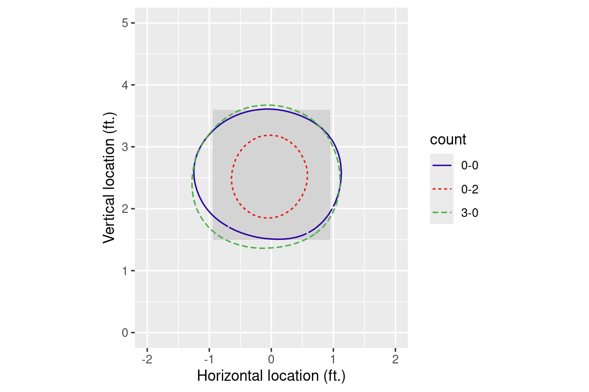
Figure 6.6 shows that the umpire’s strike zone shrinks considerably in a 0-2 pitch count, and slightly expanded in a 3-0 count. To isolate the 0.5 contour lines, we filter() the fitted values for those near 0.5, and then use geom_contour() to set the width of the bins to be small.
k_zone_plot%+%filter(ump_count_fits, fit<0.6&fit>0.4)+geom_contour(aes(z =fit, color =count, linetype =count), binwidth =0.1)+scale_color_manual(values =crc_fc)
Figure 6.6: Umpires’ 50/50 strike calling zone in different balls/strikes counts viewed from the catcher’s perspective.
6.4 Further Reading
Palmer (1983) is possibly one of the first examinations of the balls/strikes count effect on the outcome of plate appearances: it is based on data from World Series games from 1974 to 1977 and features a table resembling Figures 6.1 and 6.2. Walsh (2008) calculates the run value of a ball and of a strike at every count and uses the results for ranking baseball’s best fastballs, sliders, curveballs, and change-ups. Walsh (2010) shows how umpires are (perhaps unconsciously) affected by the balls/strikes count when judging pitches. In particular, he presents a scatterplot showing a very high correlation between the strike zone area and the count run value (see Figure 6.2). Allen (2009a), Allen (2009b), and Marchi (2010) illustrate so-called platoon splits (i.e. the different effectiveness against same-handed versus opposite-handed batters) for various pitch types.
6.5 Exercises
1. Run Value of Individual Pitches
Calculate the run value of a ball and of a strike at any count. For 3-ball and 2-strike counts you need the value of a walk and a strikeout respectively (you can calculate them as done for other events in Chapter 5).
Calculate the length, in term of pitches, of the average plate appearance by batting position using Retrosheet data for the 2016 season.
Does the eighth batter in the National League behave differently than his counterpart in the American League?
Repeat the calculations in (a) and (b) for the 1991 and 2016 seasons and comment on any differences between the seasons that you find.
3. Pickoff Attempts
Identify the baserunners who, in the 2016 season, drew the highest number of pickoff attempts when standing at first base with second base unoccupied.
4. Umpire’s Strike Zone
By drawing a contour plot, compare the umpire’s strike zone for left-handed and right-handed batters. Use only the rows of the data frame where the pitch type is a four-seam fastball.
5. Umpire’s Strike Zone, Continued
By drawing one or more contour plots, compare the umpire’s strike zone by pitch type. For example, compare the 50/50 contour lines of four-seam fastballs and curveballs when a right-handed batter is at the plate.
OPS is widely used as a measure of offensive production because—while being very easy to calculate—it correlates very well with runs scored at the team level.↩︎
The website https://www.regular-expressions.info is a comprehensive online resource on regular expressions, featuring examples, tutorials, references for syntax, and a list of related books.↩︎
Note that applying the str_length() function to the newly created variable pseq gives the number of pitches delivered in each at-bat.↩︎