
NA Rows: 124,199
NA Columns: 16
NA $ game_pk         <dbl> 718773, 718774, 718778, 718773, 718781…
NA $ game_date       <date> 2023-03-30, 2023-03-30, 2023-03-30, 2…
NA $ batter          <dbl> 613564, 643446, 453568, 641584, 527038…
NA $ pitcher         <dbl> 656605, 645261, 605483, 656605, 543037…
NA $ events          <chr> "triple", "single", "single", "single"…
NA $ stand           <chr> "L", "L", "L", "L", "R", "R", "R", "R"…
NA $ p_throws        <chr> "R", "R", "L", "R", "R", "L", "R", "R"…
NA $ hit_distance_sc <dbl> 134, 9, 162, 254, 51, 56, 42, 185, 171…
NA $ hc_x            <dbl> 215.1, 164.8, 90.7, 196.9, 110.2, 153.…
NA $ hc_y            <dbl> 107.2, 105.1, 133.9, 95.2, 148.4, 209.…
NA $ launch_speed    <dbl> 94.2, 93.7, 59.1, 111.7, 94.8, 69.5, 1…
NA $ launch_angle    <dbl> 9, -19, 27, 13, 1, 81, -2, 9, 9, 7, 76…
NA $ home_team       <chr> "CIN", "MIA", "SD", "CIN", "NYY", "SD"…
NA $ away_team       <chr> "PIT", "NYM", "COL", "PIT", "SF", "COL…
NA $ Season          <dbl> 2023, 2023, 2023, 2023, 2023, 2023, 20…
NA $ HR <dbl> 0, 0, 0, 0, 0, 0, 0, 0, 0, 0, 0, 0, 0,…13 Home Run Hitting
13.1 Introduction
Home run hitting has always been associated with the great sluggers in baseball history, such as Babe Ruth, Roger Maris, Hank Aaron and Barry Bonds. But since the introduction of Statcast data in 2015, there has been an explosion in home run hitting with a remarkable 6776 home runs hit in the 2019 season. That raises the general question of what variables contribute to home run hitting. Many of the possible explanatory variables for the increase in home run hitting are contained in the Statcast data.
This chapter focus on the exploration of home runs using Statcast data on balls in play from the 2021 and 2023 seasons. Section 13.2 describes the variables from a subset of the Statcast data. Launch variables such as launch angle, exit velocity and spray angle are collected for each ball put in play and this section explores the association of these variables with home runs using data from the 2023 season. Team abbreviations for the home and away teams can be used to compute ballpark effects. The identities of the pitcher and batter are collected for each ball in play and by use of random effects model, one can see if the variation in home run rates is attributed to the batters or to the pitchers.
There is much interest in the potential causes behind changes home run hitting across seasons (see Albert et al. (2018), Albert et al. (2019)). Section 13.3 focuses on the changes between the 2021 and 2023 seasons. Although on the surface there appears to be little difference in home runs hit, this section shows how one can detect changes, both in batter behavior and in the carry properties of the baseball.
13.2 Exploring a Season of Home Run Hitting
13.2.1 Meet the data
We begin by reading in the data file sc_bip_2021_2023.rds which contains information on all balls put in play for the 2021 and 2023 seasons. Please see Section 12.2 for details on how to acquire these data. Using the year() function in the lubridate package, we define a Season variable, and we define HR to be 1 if a home run is hit, and 0 otherwise. The filter() function is used to define sc_2023, the balls in play for the 2023 season. The glimpse() function is used to identify the data type for all 14 variables in this Statcast dataset.
The game_date variable provides the date of the game and the batter and pitcher are numerical codes for the identity of the batter and pitcher respectively for the particular ball put into play. The events variable is a description of the outcome of the ball in play. The stand and p_throws variables give the sides (L or R) for the batter and pitcher. The hit_distance_sc variable is the distance (in feet) that the ball goes before it hits the ground. The hc_x and hc_y variables gives the location of ball put in the field. The launch_speed and launch_angle variables give the exit velocity (in mph) and launch angle (in degrees) of the ball when it leaves the bat. The home_team and away_team variables give abbreviations of the home and visiting teams in the game. See Appendix C for more details on the variables available through Statcast.
13.2.2 Home runs and launch variables
To begin, we use the summarize() and mutate() functions to compute the number of balls in play, the home run count and the home run rate in the 2023 season.
S <- sc_2023 |>
  summarize(
    BIP = n(),
    HR = sum(events == "home_run")
  ) |>
  mutate(HR_Rate = 100 * HR / BIP)
S
NA # A tibble: 1 × 3
NA BIP HR HR_Rate
NA <int> <int> <dbl>
NA 1 124199 5868 4.72We see that 4.72 percent of batted balls were home runs.
We use a model to understand the relationship between home run hitting and the launch angle and launch speed variables. The generalized additive model of the form \[ \log\left(\frac{\Pr(HR)}{1 - \Pr(HR)}\right) = s(LA, LS) \] is fit where \(\Pr(HR)\) is the probability of a home run, \(LA\) and \(LS\) denote the launch angle and launch speed measurements, and \(s()\) is a smooth function of the two measurements.
Recall the variable HR is defined to be 1 if a home run is hit, and 0 otherwise. We fit the generalized additive model by use of the gam() function from the mgcv package.
This model can be used to predict the home run probability for any values of the launch variables. For example, suppose a batter hits a ball at 105 mph with a launch angle of 25 degrees. We use the predict() function with the type argument set to response to predict the home run probability. We see from the output that a batted ball hit at 105 mph with a launch angle of 25 degrees has a 77.2% chance of being a home run.
fit_23 |>
  predict(
    newdata = data.frame(
      launch_speed = 105,
      launch_angle = 25
    ),
    type = "response"
  )
NA 1
NA 0.772One can display these home run predictions by use of a filled contour graph. Using the expand_grid() function, we define a 50 by 50 grid of launch variables where the launch angle is between 15 and 40 angles and the launch speed is between 90 and 100 mph. We use the predict() function to compute home run probability predictions on this grid.
Using the geom_contour_fill() function from the metR package, we construct a contour graph displayed in Figure 13.1, where the contour lines are at the values from 0.1 to 0.9 in steps of 0.2.
library(metR)
ggplot(grid) +
  geom_contour_fill(
    aes(
      x = launch_angle,
      y = launch_speed,
      z = prob
    ),
    breaks = c(0, .1, .3, .5, .7, .9, 1),
    linewidth = 1.5
  ) +
  scale_fill_viridis_c(option = "H") +
  theme(text = element_text(size = 18)) +
  labs(x = "Launch Angle", y = "Launch Speed") +
  guides(fill = guide_legend(title = "Prob (HR)"))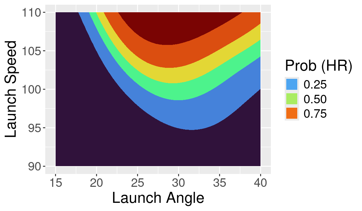
Certainly, high launch speeds are a contributing factor in home run hitting. But certainly the launch angle is also an important variable. From the contour graph, we see that the chance of home run at 105 mph and 20 degrees is approximately the same as the probability when the launch speed is 95 and the launch angle is 30. Batted balls hit over 105 mph with a launch angle between 25 and 35 degrees are likely to be home runs.
13.2.3 What is the optimal launch angle?
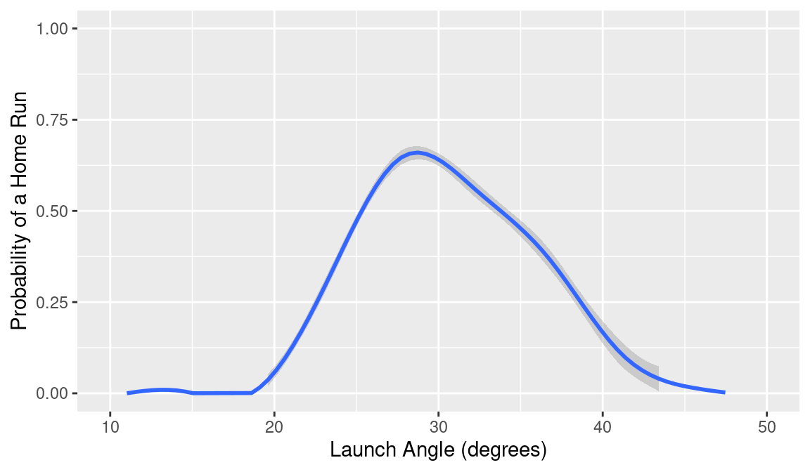
The previous graph raises the question—what is the optimal launch angle for hitting a home run? To address this question, let’s focus on batted balls hit between 100 and 105 mph. Using the geom_smooth() function from the ggplot2 package we display the smoothed home run probability in Figure 13.2 when HR is graphed against launch_angle for these batted balls. The message from this graph is, for these hard-hit balls, the home run probability is maximized at 28 degrees.
13.2.4 Temperature effects
Another contributing factor to home run hitting is temperature. Generally the ball carries further in warmer temperatures. To see this effect, we need to collect some additional data. Using the mlb_game_info() function from the baseballr package, we collect the game-time temperature and park name for all games in the 2023 season—these data are stored in the data frame temps_2023 in the abdwr3edata package. Since the temperature is only variable for parks that don’t have a dome, we collect another data frame parks_2023 that contains the park name and the dome status for all parks used in the 2023 season.
We read in these two additional data files and by two applications of the inner_join() function, merge them with the Statcast data.
library(abdwr3edata)
temps_parks_2023 <- temps_2023 |>
  inner_join(parks_2023, by = c("Park"))
sc_2023 <- sc_2023 |>
  inner_join(temps_parks_2023, by = "game_pk")
We use the filter() function to restrict attention to games where the Dome variable is “No”. Then we use the group_by() and summarize() functions to compute the count of balls in play and home runs for each day in the 2013 season.
Using ggplot2, we construct a scatterplot of the home run rate against the temperature and overlay a smoothing line in Figure 13.3. We see that there is a general tendency for the home run rate to rise for increasing game-time temperature.
temp_hr |>
  filter(temperature >= 55, temperature <= 90) |>
  ggplot(aes(temperature, HR_Rate)) +
  geom_point() +
  geom_smooth(method = "lm", formula = "y ~ x") +
  labs(
    x = "Temperature (deg F)",
    y = "Home Run Rate"
  )
To measure this temperature effect, we fit a least-squares model of the form \[ HR \, Rate = \beta_0 + \beta_1 (Temp - 70) \]
NA         (Intercept) I(temperature - 70)
NA               4.652               0.041
From the output, we predict the home run rate to be 4.65% at a game-time temperature of 70 degrees and the rate increases by 0.041 for each additional one-degree Fahrenheit increase in temperature.
13.2.5 Spray angle effects
Besides the launch speed and launch angle, we have measurements that can be used to construct the spray angle, which is the radial angle that is set to 0 for balls hit up the middle, -45 degrees for balls hit along the third base line and 45 degrees for balls hit along the first base line. Statcast doesn’t provide the spray angle measurement directly, but one can compute this angle from the location of the batted ball measurements hc_x and hc_y. Please see Section C.7 for a detailed explanation of the calculation. Using the mutate() function, we compute the spray_angle, measured in degrees and define sc_hr to be the Statcast measurements for the home runs hit in the 2023 season.
We construct a scatterplot of spray_angle and batted ball distance variable hit_distance_sc shown in Figure 13.4. Since the distances to the fences are greatest in center field, the batted ball distance tends to be greatest for home runs hit for spray angle values near zero and the distances tend to be smallest for balls hit along the first and third base lines. From the graph, we identify five home runs that had a distance exceeding 475 feet. There is one curious outlier—a home run with a distance of 300 feet and spray angle close to 25 degrees. This turns out to be an inside-the-park home run hit by Bobby Witt, Jr. of the Kansas City Royals.
ggplot(sc_hr, aes(spray_angle, hit_distance_sc)) +
  geom_point(alpha = 0.25)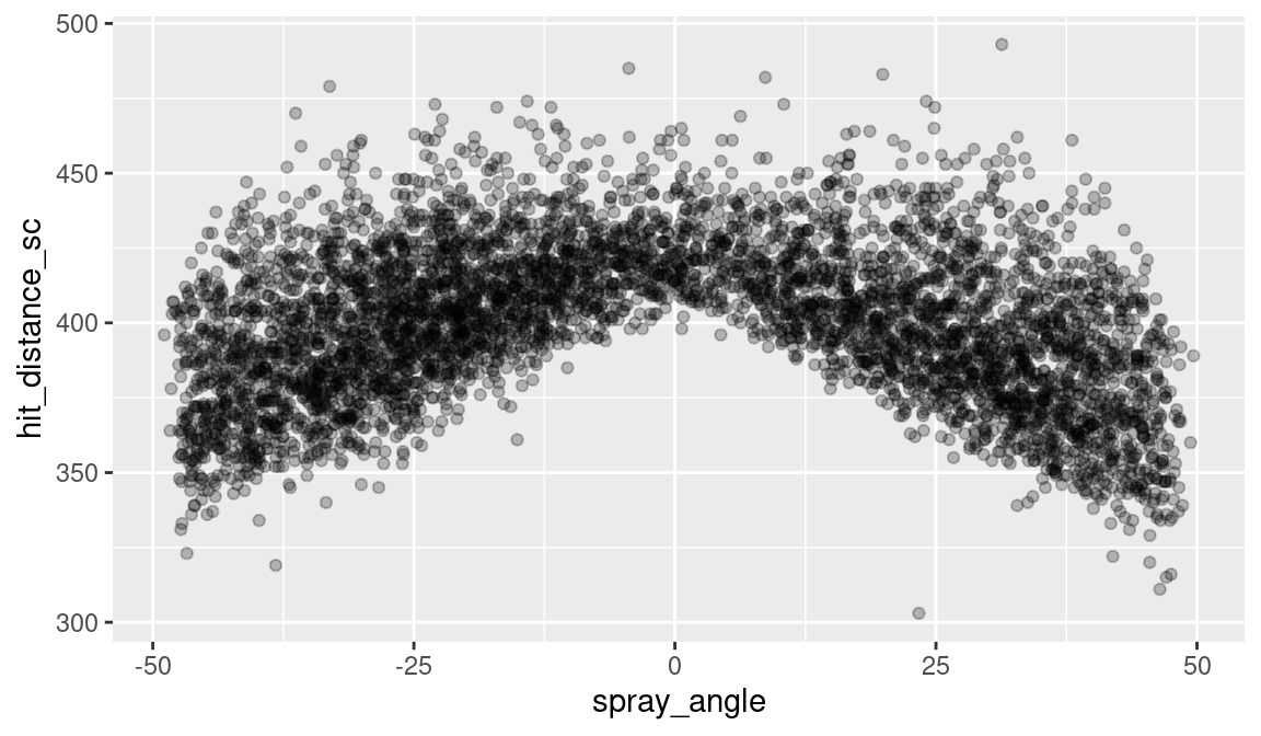
Batters tend to hit home runs in the “pull” direction. We can verify this graphically. In Figure 13.5, we divide the hitters by the batting side, either L or H, and then display density estimates of the spray angle for each group of hitters. As expected, left-handed hitters tend to hit home runs to the right (positive spray angle) and right-handed hitters tend to hit home runs in the negative spray angle direction. What is interesting is that the degree of pull is strongest for the left-handed batters—the modal (most likely) spray angle value is 37 degrees for left-handed hitters compared to -25 degrees for right-handed hitters.
ggplot(sc_hr, aes(spray_angle)) +
  geom_density() +
  facet_wrap(vars(stand), ncol = 1)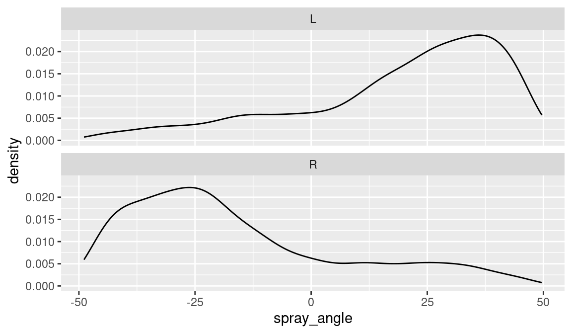
13.2.6 Ballpark effects
As baseball fans know, all ballparks are not the same with respect to home run hitting. The parks differ with respect to the distances to the fences and climate, so it is easier to hit home runs in some MLB parks. One way to define a ballpark effect with respect to home runs for, say Atlanta, is to compare the ratio of all home runs hit by the Braves and their opponents at Truist Park and all home runs hit by the Braves and opponents when the Braves are on the road. (See Section 11.7 for in-depth example of how to calculate ballpark factors.)
One can compute home run ball park effects for all 30 teams by use of the home_team and away_team variables. Using the group_by() and summarize() functions, we compute the count of home runs hit for all teams (and opponents) when they are at home. Similarly, we compute the home run count for all teams when they are on the road. The Home and Away data frames are merged using the inner_join() function and the variable Park_Factor is used to define the park factor.
These park factor values are graphed using dotplots in Figure 13.6, where a vertical line at 1 is added that shows a “neutral” ballpark. Several parks stand out as being home run friendly, the Texas Rangers (TEX) and New York Yankees (NYY) have park factors exceeding 1.5, while the Cincinnati Reds (CIN) have a park factor close to 1.4. It should be said that park factors for a single season tend to be unstable and so Baseball Savant will typically display park factors over a three-season period.
ggplot(pf, aes(Park_Factor, home_team)) +
  geom_point() +
  geom_vline(xintercept = 1, color = crcblue)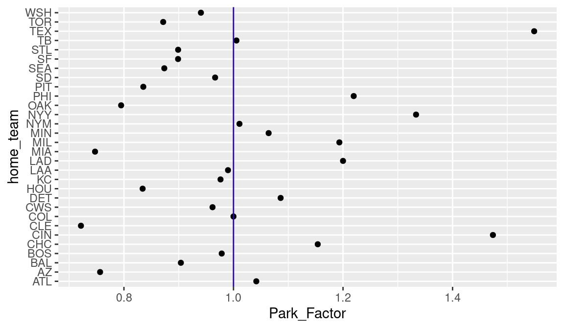
13.2.7 Are home runs about the hitter or the pitcher?
When we think of home run hitting, we tend to think of batters with high home run counts and not think as much about pitchers who allow many (or few) home runs. That raises the question—when one looks at the variation of home run rates among batters and pitchers, is more of the variation attributable to the hitters or does more of the variation come from the variability among pitchers?
This question can be addressed by use of a non-nested random effects model. Let \(p_{ij}\) denote the probability that a batted ball is a home run depending on the \(i\)th batter and the \(j\)th pitcher. We consider the logistic random effects model written as \[ \log \left(\frac{p}{1-p}\right) = \mu + \beta_i + \gamma_j \] where \(\mu\) is an overall effect, \(\beta_i\) is the effect due to the \(i\)th hitter and \(\gamma_j\) is the effect due to the \(j\)th pitcher. We let the batter effects follow a normal distribution with mean 0 and standard deviation \(\sigma_b\) and the pitcher effects be normal with mean 0 and standard deviation \(\sigma_p\).
This random effects model is conveniently fit using the glmer() function from the lme4 package. The syntax for the formula is similar to lm() function where the | indicates that the pitcher and the batter identities are random effects. We are interested in the estimated values of the random effects standard deviations \(\sigma_b\) and \(\sigma_p\) that are displayed using the VarCorr() function.
NA  Groups  Name        Std.Dev.
NA  pitcher (Intercept) 0.188
NA  batter  (Intercept) 0.523
Note that the estimated value of \(\sigma_b\) is much larger than the estimated \(\sigma_p\) indicating that most of the variation in home run rates is attributable to the hitter, not the pitcher. So our instincts are correct—it is best to focus on leaderboards on home run hitting instead of home runs allowed by pitchers.
13.3 Comparing Home Run Hitting in the 2021 and 2023 Seasons
13.3.1 Introduction
We are interested in comparing home run hitting for the 2021 and 2023 seasons. On the surface, home run hitting for the two seasons was similar since 1.21 home runs were hit per game per game in 2023 compared with 1.22 in 2021. But we will see that there have been changes both in batter behavior and in the carry properties of the baseball between the two seasons, and we’ll explore these changes by comparing specific rates.
From Figure 13.1, we see that most home runs are hit when the launch angle is between 20 and 40 degrees and the exit velocity is between 95 and 110 mph. In this section, we divide this launch variable space into subregions and consider two rates computed on each subregion. We consider the BIP rate \[ BIP \, Rate = 100 \times \frac{BIP}{N}, \] the percentage of batted balls \(BIP\) hit in the subregion where \(N\) is the total number of batted balls. Also we consider the percentage of home runs hit in the subregion \[ HR \, Rate = 100 \times \frac{HR}{BIP}. \]
Section 13.3.2 describes the process of binning the launch variable space into subregions and Section 13.3.3 describes how one can plot measures over the bins. Sections 13.3.4 and 13.3.5 explain how one compares rates across two seasons using a logit reexpression. Associated graphs show how players are changing their batting behavior and how the ball’s carry properties have changed from 2021 to 2023.
13.3.2 Binning launch variables
We write a special function bin_rates() to compute the balls-in-play and home run rates across regions of the launch variable space. One inputs the Statcast data frame sc_ip, a vector of breakpoints for launch angle LA_breaks and a vector of breakpoints for the exit velocity LS_breaks.
The mutate() and cut() functions are used to categorize the launch speeds and launch angles using the breakpoints vectors. Then by use of the group_by() function, the number of balls in play and the home run count is computed for each bin. The mutate() function is used again to compute the BIP and home run rates for all bins.
bin_rates <- function(sc_ip, LA_breaks, LS_breaks) {
  Total_BIP <- nrow(sc_ip)
  sc_ip |>
    mutate(
      LS = cut(launch_speed, breaks = LS_breaks),
      LA = cut(launch_angle, breaks = LA_breaks)
    ) |>
    filter(!is.na(LA), !is.na(LS)) |>
    group_by(LA, LS) |>
    summarize(
      BIP = n(),
      HR = sum(HR),
      .groups = "drop"
    ) |>
    mutate(
      BIP_Rate = 100 * BIP / Total_BIP,
      HR_Rate = 100 * HR / BIP
    )
}
To illustrate the use of bin_rates(), we use values of launch angle equally spaced from 20 to 40 degrees and values of launch velocity spaced from 95 to 110 mph. The output of bin_rates() is a data frame with the launch angle and launch speed intervals LA, LS, the counts BIP, HR, and the rates BIP_Rate and HR_Rate. We display the first six rows of this data frame.
NA # A tibble: 6 × 6
NA   LA      LS          BIP    HR BIP_Rate HR_Rate
NA   <fct>   <fct>     <int> <dbl>    <dbl>   <dbl>
NA 1 (20,25] (95,100]   1459    64    1.30     4.39
NA 2 (20,25] (100,105]  1572   459    1.40    29.2
NA 3 (20,25] (105,110]   932   646    0.828   69.3
NA 4 (25,30] (95,100]   1494   311    1.33    20.8
NA 5 (25,30] (100,105]  1382   861    1.23    62.3
NA 6 (25,30] (105,110]   684   637    0.608   93.1
13.3.3 Plotting measure over bins
We write the function bin_plot() to display a measure over bins over the launch variable space. The inputs are the data frame S containing the bin frequencies and rates, the vector of breakpoints LA_breaks, LS_breaks, and the measure to be displayed label.
As a first step, we write a function compute_bin_midpoint() to compute the midpoints of the intervals. The parse_number() function from the readr package strips away unwanted characters.
compute_bin_midpoint <- function(x) {
  x |>
    as.character() |>
    str_split_1(",") |>
    map_dbl(parse_number) |>
    mean()
}
We use the function geom_text() to display label over the bins and applications of geom_vline() and geom_hline() are used to overlay lines at the bin boundaries.
bin_plot <- function(S, LA_breaks, LS_breaks, label) {
S |>
mutate(
la = map_dbl(LA, compute_bin_midpoint),
ls = map_dbl(LS, compute_bin_midpoint)
) |>
ggplot(aes(x = la, y = ls)) +
geom_text(aes(label = {{label}}), size = 8) +
geom_vline(
xintercept = LA_breaks,
color = crcblue
) +
geom_hline(
yintercept = LS_breaks,
color = crcblue
) +
theme(text = element_text(size = 18)) +
labs(x = "Launch Angle", y = "Launch Speed")
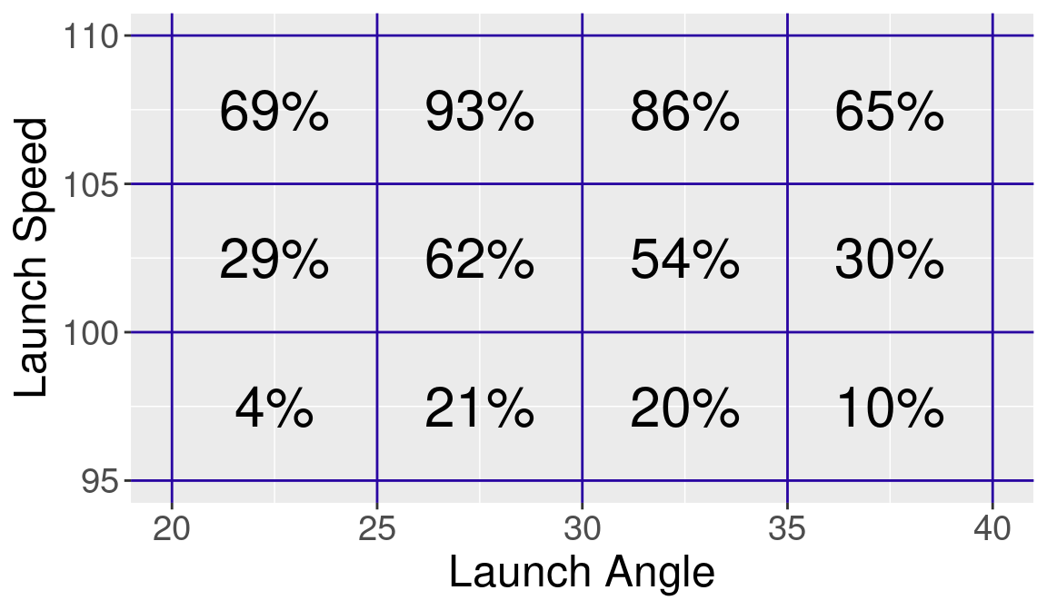
}We illustrate the use of bin_plot() on the 2023 Statcast data in Figure 13.8. We use the data frame S containing the binned frequencies and indicate that HR is the variable to display. This figure shows that 861 home runs were hit where the launch angle is in (25, 30) and the exit velocity is in (100, 105).
bin_plot(S, LA_breaks, LS_breaks, HR)
Instead suppose we wish to display the home run rate HR_Rate. In Figure 13.8, we see the chance that a batted ball with launch angle between 25 and 30 degrees and exit velocity between 100 and 105 mph has a 62% chance of being a home run. As one would expect, the home run rates increase for larger values of launch speed.
13.3.4 Changes in batter behavior
We apply the functions bin_rates() and bin_plot() to compare batted ball and home run rates between the 2021 and 2023 seasons. Using the same vectors of breakpoints for launch angle and launch speed, we bin the 2021 and 2023 Statcast data frames using two applications of bin_rates() via map(). Then we combine these two summary data frames using the list_rbind() function.
S2 <- sc_two_seasons |>
  group_split(Season) |>
  map(bin_rates, LA_breaks, LS_breaks) |>
  set_names(c(2021, 2023)) |>
  list_rbind(names_to = "year")
We want to compare the balls in play rates for 2021 and 2023. One issue with rates is that rates near 0 and 100 percent tend to have smaller variation than rates near 50 percent. One way of addressing this variation issue is through the use of logits. If \(R\) denotes a rate on the percentage scale, then we define the logit of \(R\) to be: \[
logit(R) = \log \left( \frac{R}{100 - R}\right)
\] Logits tend to have similar spread across all rate values. If we have two rates measured for two seasons, say \(R_{2023}\) and \(R_{2021}\), then we compare the rates by use of the difference \(d_{logit}\) of the corresponding logits: \[
d_{logit} = \log \left( \frac{R_{2023}}{100 - R_{2023}}\right) - \log \left( \frac{R_{2021}}{100 - R_{2021}}\right)
\] If the difference \(d_{logit}\) is positive (negative), this indicates that the 2023 rate is higher (lower) than the 2021 rate. We write a special function logit() to compute a logit. The pivot_wider() function helps us reorganize the data so that we can easily subtract the ball in play rates across years. Then by use of mutate(), we define the variable d_BIP_logits to be the difference of the logits of the two balls-in-play rates. We use the bin_plot() in Figure 13.9 to display the values of d_BIP_logits over the launch variable space.
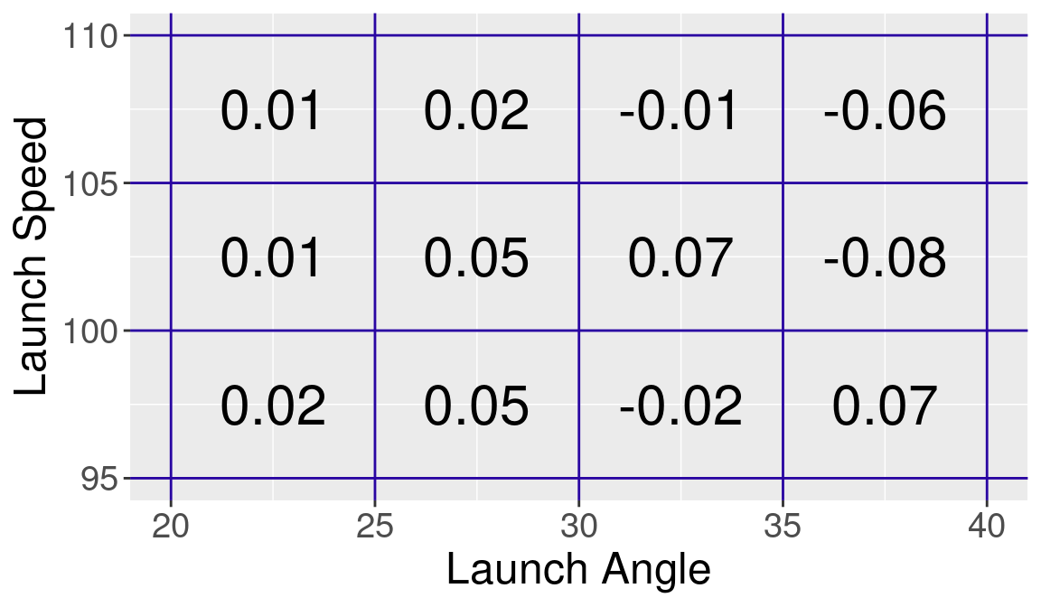
Note that most of the difference in logit values across the regions are positive, especially for exit velocities between 100 and 105 mph and launch angle values between 20 and 35 degrees. The takeaway is the 2023 rates are higher—the 2023 hitters are more likely than the 2021 hitters to put more balls in play in launch variable regions where home runs are likely.
13.3.5 Changes in carry of the baseball
The last section focused on the behavior of the batters—they are hitting at higher rates of hard-hit balls with high launch variables. A second question relates to the carry properties of the baseball. Given values of the launch variables, what is the chance the batted ball is a home run?
We compare the home run rates in bins for the two seasons using the logit measure. We define the measure d_HR_logits which is the difference between the logit home run rate for 2023 and the corresponding rate for 2021. Again we use the bin_plot() function to display these differences in logits in Figure 13.10.
S2 |>
  select(year, LA, LS, HR_Rate) |>
  pivot_wider(
    names_from = year, names_prefix = "y",
    values_from = HR_Rate
  ) |>
  mutate(d_HR_logits = logit(y2023) - logit(y2021)) |>
  bin_plot(
    LA_breaks, LS_breaks,
    label = round(d_HR_logits, 2)
  )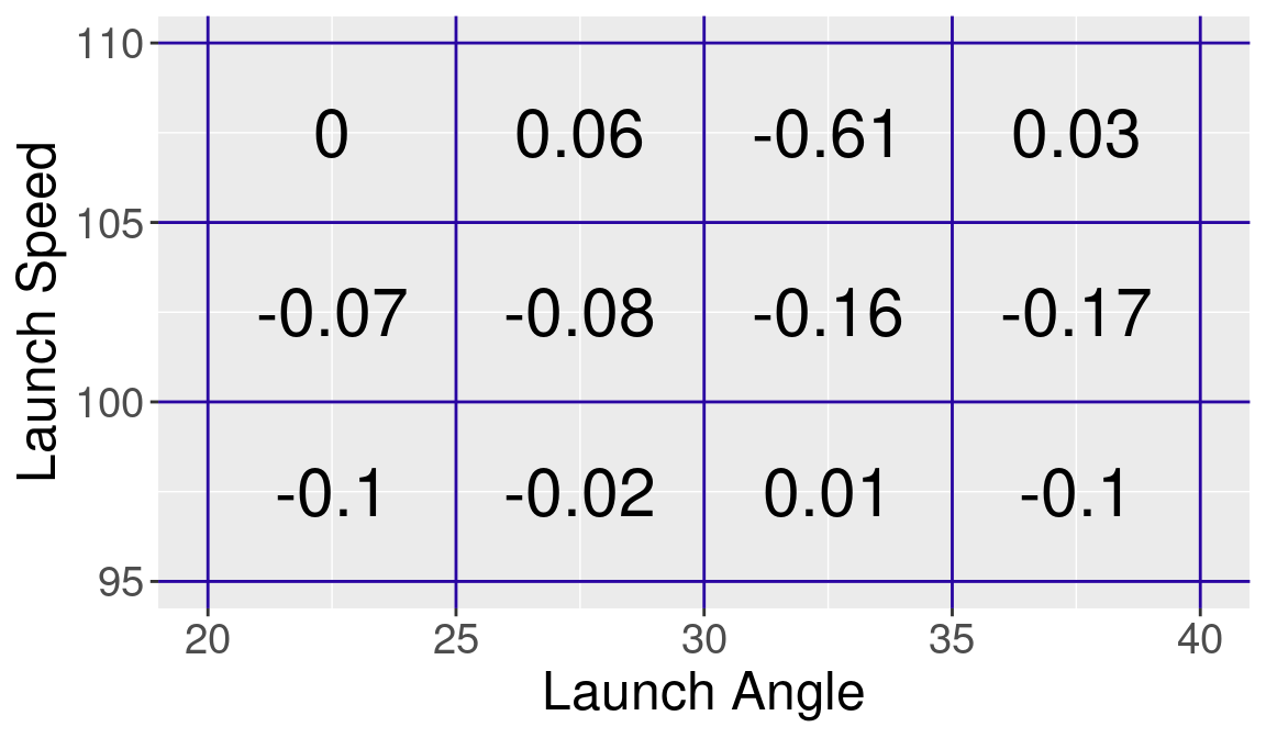
Here we see that most of the difference values are negative which indicates that the logit of the HR rate for 2023 is smaller than the corresponding logit for 2021. For example, when the launch speed is between 100 and 105 mph and the launch angle is between 30 and 35 degrees, the 2023 home run rate is 0.16 smaller than the 2021 home run rate. This indicates that the 2023 baseball has less carry than the ball used during the 2021 season.
Although the 2021 and 2023 have similar overall home run rates on balls put in play, there are interesting differences between the two seasons. There is an increasing tendency in 2023 for batters to hit the ball harder in high launch angles, but this is offset by a slightly deader baseball with less carry in 2023.
13.4 Further Reading
Major League Baseball commissioned an independent study to investigate the causes of the home run increase during the period 2015–2017. The MLB commission released two reports: Albert et al. (2018) and Albert et al. (2019). A more recent study based on 2022 data is found in Albert and Nathan (2022).
13.5 Exercises
1. Modeling Probability of Hit
Using a similar generalized additive model as in Section 13.2.2, fit a model to the logit of the probability of a hit as a smooth function of the launch angle and launch velocity.
Using this model, predict the probability that a ball hit at 20 degrees at 100 mph will be a base hit.
Construct a contour plot of the fitted probability of a hit over the region where the launch angle is between 15 and 40 degrees and the launch speed is between 80 and 110 mph.
2. How Does P(HR) Depends on Spray Angle?
Construct a smooth scatterplot of the home run variable HR as a function of the spray angle similar to what was done in Section 13.2.3. Use this plot to show that it is hardest to hit a home run hit to dead center field.
3. Optimal Launch Angle for a Single
Define a new variable \(S\) that is equal to 1 if a single is hit and 0 otherwise. Fit a generalized linear model where the logit of the probability of a single is a smooth function of the launch angle. By looking a predictions from this model, find the launch angle which maximizes the probability of a single.
4. Nonnested Model for Launch Angle and Launch Speed
In Section 13.2.7, we fit a non-nested random effects model for the probability that a batted ball is a home run. Using the
lmer()function in the lme4 package, explore how the launch angles depend on the batter and the pitcher. Find the random effects standard deviations.Fit a similar non-nested random effects model using launch velocity as a response variable. Again find the random effects standard deviations.
Looking at the results from parts a and b, is the variation in launch angles attributable primarily to the hitter or the pitcher? What about launch velocities—what is the primary source of the variation?
5. Comparing Home Run Hitting for Two Seasons
In Section 13.3, batted ball and home run rates for the 2021 and 2023 seasons were compared using a particular choice of bins for launch angle and launch speed. By using a different set of breakpoints for the two variables, compare batted ball rates and home runs for the two seasons. Compare your findings with the conclusions stated in Section 13.3.
6. Ratios in Rates for Two Seasons
In Section 13.3, batted ball and home run rates for the 2021 and 2023 seasons were compared using logits. Repeat the exercise using rates instead of logits and use ratios of rates to compare the two seasons. Explain using a few sentences how batted ball rates and home run rates have changed between the two seasons.