One of the exciting features of the R ecosystem is the relative ease in constructing web applications of R work by use of the shiny package. In this chapter, we illustrate the construction of a Shiny app by use of a baseball application where one wishes to compare the career trajectories of two pitchers from Major League Baseball history.
A good starting point to develop a Shiny app is writing a function that implements the computation that one wishes to display in the app. In Section 15.2, we use several R functions to select a group of contemporary pitchers and construct the comparison graph of their career trajectories. Section 15.3 outlines the steps of constructing the Shiny app including the user interface and server components and running the app. Once the Shiny app is completed, Section 15.4 describes several methods of getting other people to try your app and Section 15.5 concludes by providing some tips that should help interested readers get their own apps running quickly.
15.2 Comparing Two Pitcher Trajectories
We focus on comparing the career trajectories of two pitchers who played during the same baseball era. Given a particular interval of seasons of interest and minimum number of innings pitched, we wish to graphically display a measure of performance against season or age for two selected pitchers. The relevant data is in the Lahman package and a FanGraphs table containing values needed in the computation of the FIP measure.
We wrote two functions to help with these tasks. The first is a function called selectPlayers2() that returns a data frame of all of the pitchers who achieved a certain minimum number of innings pitched where the pitchers’ midcareer fell inside a particular time interval. There are too many pitchers in the history of baseball to list them all—to do so would make the app cumbersome to use. Instead, selectPlayers2() helps us narrow the list to a reasonable number of pitchers. For example, the following code returns all of the pitchers with at least 2000 innings pitched and whose midcareer fell between 1959 and 1966. These are the pitchers who are eligible to be compared by the app.
NA # A tibble: 26 × 2
NA    playerID  Name
NA    <chr>     <chr>
NA  1 bellga01  Gary Bell
NA  2 buhlbo01  Bob Buhl
NA  3 bunniji01 Jim Bunning
NA  4 cardwdo01 Don Cardwell
NA  5 chancde01 Dean Chance
NA  6 drysddo01 Don Drysdale
NA  7 ellswdi01 Dick Ellsworth
NA  8 grantmu01 Mudcat Grant
NA  9 jacksla01 Larry Jackson
NA 10 klinero01 Ron Kline
NA # ℹ 16 more rows
Inside the function itself, we begin by computing the mid-career year and number of innings pitched, where midYear is defined to be the average of the first and final seasons of a pitcher. Given the aforementioned values as inputs, selectPlayers2() queries the Lahman package and outputs the player ids and names for all pitchers that meet the criteria. The full code for the function is shown below.
selectPlayers2
NA function(midYearRange, minIP) {
NA   Lahman::Pitching |>
NA     mutate(IP = IPouts / 3) |>
NA     group_by(playerID) |>
NA     summarize(
NA       minYear = min(yearID),
NA       maxYear = max(yearID),
NA       midYear = (minYear + maxYear) / 2,
NA       IP = sum(IP),
NA       .groups = "drop"
NA     ) |>
NA     filter(
NA       midYear <= max(midYearRange),
NA       midYear >= min(midYearRange),
NA       IP >= minIP
NA     ) |>
NA     select(playerID) |>
NA     inner_join(Lahman::People, by = "playerID") |>
NA     mutate(Name = paste(nameFirst, nameLast)) |>
NA     select(playerID, Name)
NA }
NA <bytecode: 0x564254fb0768>
NA <environment: namespace:abdwr3edata>
A second helper function compare_plot() constructs the graph comparing the career trajectories of two selected pitchers. This function requires the player ids for the two pitchers, the measure to graph (among ERA, WHIP, FIP, SO Rate, BB Rate) on the vertical axis, and the time variable (either season or age) to plot on the horizontal axis.
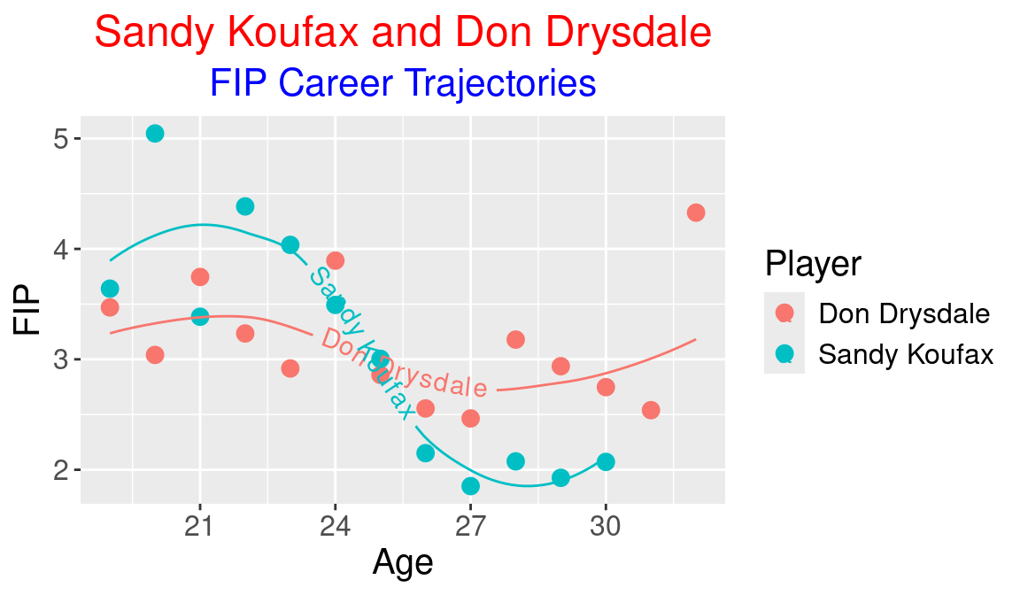
To illustrate the use of the compare_plot() function, suppose we wish to compare the FIP (fielding-independent pitching) trajectories as a function of age for the great Dodgers pitches Sandy Koufax and Don Drysdale. From the People table in the Lahman package, we collect the player ids for the two pitchers. The fg data frame contains data from the FanGraphs “guts” table. We then apply the compare_plot() function with inputs koufasa01, drysddo01, FIP, and age (see Figure 15.1).
Figure 15.1: Career trajctories of FIP for Sandy Koufax and Don Drysdale.
For each pitcher, this function constructs a scatterplot of the FIP measure against age and overlays a smoothing curve. The geom_textsmooth() function from the geomtextpath package is used to add player labels to each smoothing curve. The full code for the function is a bit long to display here, but you can access the code from the abdwr3edata package.
compare_plot
15.3 Creating the Shiny App
15.3.1 Basic structure
A Shiny app is contained in a single R script file frequently named app.R. This file contains three basic components:
a user interface object ui describing the layout of the app include all input controls
a server function server() describing the instructions needed to run the app
a call to the shinyApp() function creating the app given the user interface and server information
The following code displays the basic structure of the app.R file. Note that this file initially lists the two functions selectPlayers2() and compare_plot() followed by the Shiny component ui and the Shiny functions server() and shinyApp().
You can view the full code for the app through the compareTrajectories() function from the abdwr3edata package.
compareTrajectories
15.3.2 Designing the user interface
In the layout of this particular Shiny app, the user interface controls are on the left side of the app and the output is on the right side as shown in Figure 15.2.
Figure 15.2: Layout of one Shiny app.
The layout is defined by use of the fluidPage() function inside the ui object. The fluidRow() function defines a Shiny output window that is 4 units wide for the user interface and 8 units wide for the output.
The user interface controls for this application consist of sliders, pull-down menus and radio buttons. Functions from the shiny package are used to construct the different input types in the app.
Slider controls are used to input the range of mid-career and minimum innings pitched (IP) values. The sliderInput() function is used to define the first slider input midyear. The inputs to this function are the input label, the text to display, the range of slider values, and the current value. Since value is a vector of two values, one is inputting a range of values in the slider.
sliderInput("midyear", label ="Select Range of Mid Career:", min =1900, max =2010, value =c(1975, 1985), sep ="")
A selectInput() function is used to construct a pull-down menu input item. We display below the code for inputting the player_name1 variable. Note that the selectPlayers2() function is used to produce the list of player names that have specific midcareer and minimum PA values.
selectInput("player_name1", label ="Select First Pitcher:", choices =selectPlayers2(c(1975, 1985), 2000)$Name)
Radio buttons are defined by use of the radioButtons() function. Below the code is displayed for the type variable. The inputs to this function are the label, the string that is displayed and the possible input values.
One special feature of this particular Shiny app is the use of dynamic UI where the values of the input controls can be modified by other input controls. Dynamic UI is achieved by use of the observeEvent() function in the server() function. In the following code snippet, in observeEvent(), the values of the player_name1 input are modified when values of the midyear input are changed. The observeEvent() function is used several times so that the values of player_name1 and player_name2 are modified whenever the values of midyear or midpa are changed.
The server() function also contains the actual work for the Shiny app. The following snippet shows how the output component output$plot1 is defined. From the user inputs input$midyear, input$midpa, input$player_name1 and input$player_name2, the selectPlayers2() function is applied to access the player user ids. Then the compare_plot() function is used with these inputs to construct the plot. The renderPlot() function controls how what is drawn on the app changes when these inputs change.
output$plot1<-renderPlot({S<-selectPlayers2(input$midyear, input$minpa)id1<-filter(S, Name==input$player_name1)$playerIDid2<-filter(S, Name==input$player_name2)$playerIDcompare_plot(id1, id2, input$type, input$xvar)$plot1}, res =96)
15.3.5 Running the app
In usual practice, the app.R script containing the Shiny code is placed in a separate folder. One runs the Shiny app by typing in the RStudio console window
Alternatively, one can press the “Run App” button at the top of the screen. Figure 15.3 displays a snapshot of the completed Shiny app. Because this particular app is part of an R package, you can run the app by typing:
In Figure 15.3, one is selecting the mid-career interval 1985–2000, a minimum PA value of 2000, and comparing the ERA trajectories of the Hall of Fame pitchers Greg Maddux and Tom Glavine.
Figure 15.3: Snapshot of the career trajectories Shiny app.
We note that while their career trajectories were similar, Maddux had a superior ERA during his peak years.
15.4 Sharing the App
There are several ways of sharing your Shiny app with others.
Share the app.R file. Since the app is contained in a single file app.R, one can simply share this script file with other people.
Put it in a package. This is the method illustrated by the compareTrajectories() function in the abdwr3edata package.
Share the app via Github. Another way of sharing the app is to create a Github repository and store your Shiny app in that repository. Then the user can use the runGitHub() function to run the Shiny app from your repository. To illustrate this method, one of the authors created the Github repository testshinyapp and then stored the career trajectories app in this repository. Thanks to the runGitHub() function, the interested reader can run this app by typing in the Console.
Host the app on a Shiny server. Posit currently has a hosting service which allows a user to see your app as a web program. To use the Posit service, one needs to set up an account on https://www.shinyapps.io/.
Then once you have your Shiny app running, there is a Publish button on the app display that uploads your app to the server. One of the authors recently did this for the career trajectory Shiny app and the live version of the app is current available at the following URL:
An easy way to get started is to start with a template, a script to a Shiny app that has a similar user interface to the one that you are interested to making. For example, if you are interested in plotting career trajectories for batters, you can modify the CareerTrajectoryPitching app described in this chapter.
There are many illustrations of the code for producing different types of Shiny apps on the Posit Shiny Gallery. By starting with a sample app.R script, one can avoid the small coding errors that are easy to make when one is constructing a program from scratch.
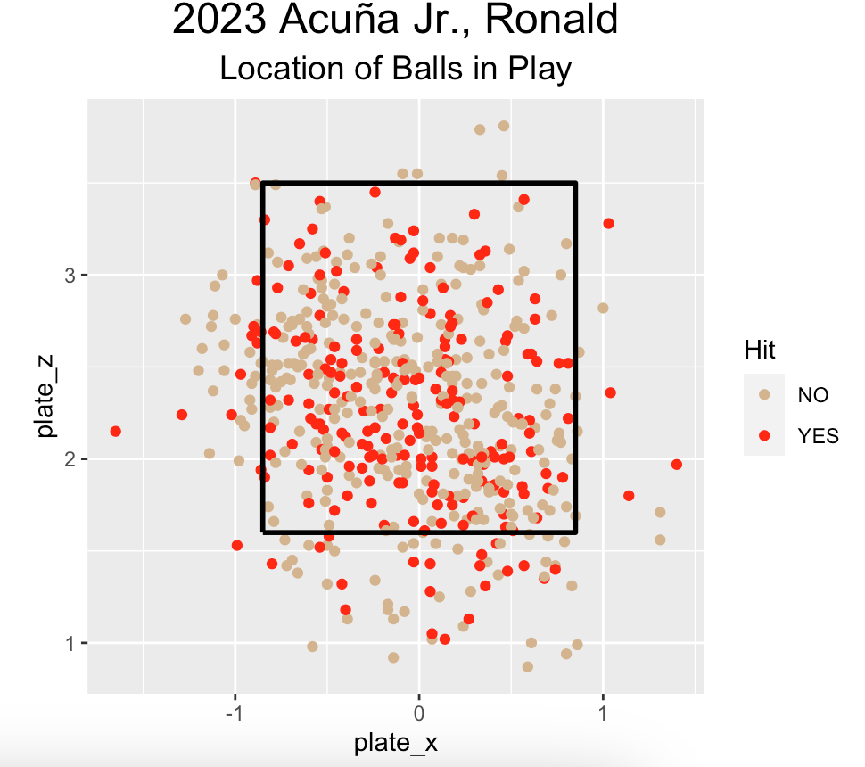
The following function construct_zone_plot() produces a plot of the zone locations of balls in play for a player where the color of the plotting plot depends on the outcome. The inputs to the function are the Statcast dataset of balls in play sc_ip, the name of the batter p_name and the outcome type (either “Hit” or “Home_Run”). For example, if sc2023_ip is a data frame of balls in play for the 2023 season, then one can display the locations of all of Ronald Acuña’s balls in play colored by hit by use of the function
Construct a Shiny app using this function where the player name is input through a select list and the outcome type is input using radio buttons.
construct_zone_plot<-function(sc_ip, p_name, type){require(dplyr)require(ggplot2)add_zone<-function(){topKzone<-3.5botKzone<-1.6inKzone<--0.85outKzone<-0.85kZone<-data.frame( x =c(inKzone, inKzone, outKzone, outKzone, inKzone), y =c(botKzone, topKzone, topKzone, botKzone, botKzone))geom_path(aes(.data$x, .data$y), data =kZone, lwd =1)}hits<-c("single", "double", "triple", "home_run")sc_player<-filter(sc_ip, player_name==p_name)|>mutate( Hit =ifelse(events%in%hits, "YES", "NO"), Home_Run =ifelse(events=="home_run", "YES", "NO"))ggplot()+geom_point( data =sc_player,aes(plate_x, plate_z, color =.data[[type]]))+add_zone()+coord_equal()+scale_colour_manual(values =c("tan", "red"))+labs( title =paste(substr(sc_player$game_date[1], 1, 4),p_name), subtitle ="Location of Balls in Play")+theme( plot.title =element_text( color ="black", hjust =0.5, size =18), plot.subtitle =element_text( color ="black", hjust =0.5, size =14))}
2. Plotting Locations of Balls in Play using Other Outcomes
In Exercise 1, the color of the plotting point can depend on the outcome “Hit” or “Home_Run”. Revise the construct_zone_plot() function so that the type outcome can be one of the the continuous variables launch_angle, launch_speed or estimated_ba_using_speedangle. Revise the Shiny app so that the user can input one of these three variables.
3. Plotting Locations of Balls in Play with Brushing
Shiny allows one to interactively select portions of a graph by brushing. The following code in the user input section modifies the plotOutput() function by adding the brush option.
In a new output$data component of the server section of the Shiny app, the following code will take a subset of the sc_player data frame which is defined by the selected rectangle that is brushed.
By using this code, modify the Shiny app in Exercise 1 to allow brushing of the scatterplot. In a separate region of the display, compute the balls in play, the hits, the home runs, and the corresponding hit and home run rates for points in the selected region.